Piece by piece
A series of modern interventions over several yearsproves that for this house, the whole is greaterthan the sum of its parts


It's a common scenario over a period of years the needs of a family change and a house is no longer a perfect lifestyle fit. At this point, there are two solutions to purchase another house or significantly remodel the existing property.
For many homeowners, the remodeling option provides the best way to tailor a house to suit their requirements. It's often an on-going solution that may take place over a period of time as owners respond to gradual lifestyle changes.
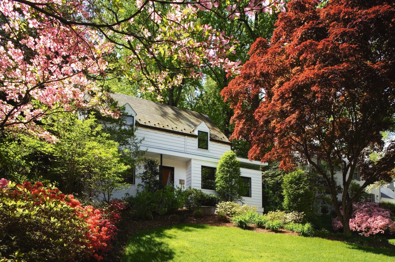
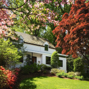
For the owners of this 60-year-old colonial-style house, there were three remodeling projects over a period of seven years. Architect David Jameson says the first transformation saw the entrance re-designed.
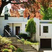
"The front door originally opened directly into the living room a typical feature of houses built at the time. By moving the door into the center of the house we were able to create an intimate, yet articulated, entrance, which is further defined by English slate flooring and a cantilevered mahogany hall table."
Jameson says a new flat-roof brise soleil, or sunscreen, was designed to link the old and new elements, and to introduce the modern idiom to the traditional fabric of the house.
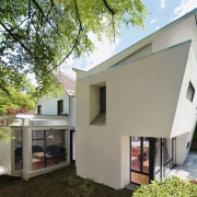
It was a philosophy that established the design direction of the following two remodeling programs the first, an expansion of the living room into a porch; and the second, a large, modern addition to the rear.

"The main consideration was in marrying the modern interventions with the vocabulary of the existing house," says Jameson. "The new elements needed to respect the scale and not overwhelm the gabled form of the house, hence the decision to create an inverted roof."
The new material palette also references the traditional painted brick and clapboard siding of the existing building.
"Using the same materials was a way to stitch together the modernist interventions and the original elements," says Jameson. "The clapboard on the existing second story reappears on the cladding of the box-like forms of the living room addition. As the new building's form becomes more dynamic at the rear, the surface is planar and modern. The new stucco cladding still recalls the masonry that clads the lower story of the original house."
The footprint of the new extension is modestly scaled, but its sharply angled rear wall provides a greater floor area on the second level. Further drama is provided by the visual tension created between the inverted roof and a second flat roof immediately below.
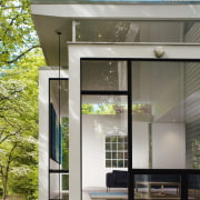
While the overhanging second story helps to screen the direct sun, Jameson says introducing light into the formerly dark interior was a priority. The living room extension features extensive glazing, including a line of high windows above a wall that hides a neighboring property. These windows draw the eye up to the tree canopy.
"As you move through the spaces into the modern additions, the glazing increases significantly, in keeping with the modern idiom of blurring the bounds of inside and out," says Jameson.

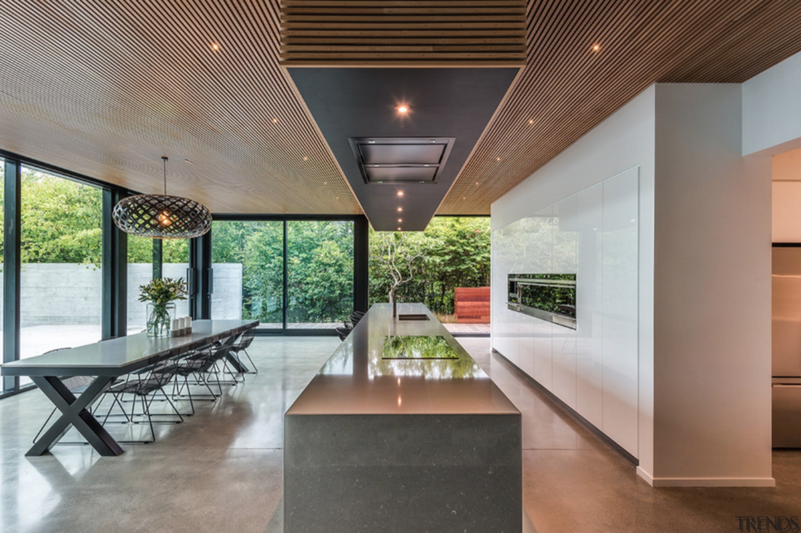
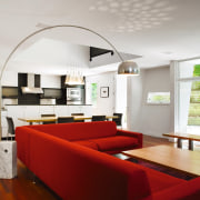
The new addition at the rear accommodates a large, open-plan family living space. A double-height void and clerestory windows provide a light shaft directly above the dining area. There are also mezzanine bridges that allow easy communication between the kitchen and second floor.
"The original layout presented a succession of small rooms with tiny windows, with little connection between these spaces and the exterior," says Jameson. "The remodeling project was not so much about designing specific features as it was about creating interior spatial elements, and ensuring the home has a dialogue with the site. With its large doors and expansive glazing, it is much more at one with nature."
The new layout also reflects the changing lifestyles of the family. While designed to recede into the background of the family living area, the kitchen is positioned to ensure the owners can socialize with guests.
A long peninsula, which is aligned with the edge of the light shaft, provides plenty of counter space, yet its bar top is high enough to screen cooking utensils from people seated at the dining table. A lowered counter at one end provides a serving area.
The sloping wall of the new addition creates added visual interest for diners seated at the table. It incorporates a low, horizontal window at just the right height to provide a slice of the view of the outdoor living area, further enhancing the indoor-outdoor link.
Story by: Trendsideas
Home kitchen bathroom commercial design