Outside and in
Material choices help bring balance to this asymmetrical house
An important aspect of architectural design is giving consideration to the visual weight of materials. When a residence has a sculptural presence, the impact of the different surfaces in juxtaposition is even more dramatic.
Architect Jim Choate has balanced planes, cantilevered forms, and floating boxes to create this contemporary home. While the house layout is asymmetrical, with a wing running front to back along one side, careful selections of materials and forms bring it aesthetic balance.
"This three-level residence is on a hill, with neo-traditional homes on either side," says Choate. "Instead of setting it prominently on top of the rise, we dug the lower floor into the ground sweeping views from the top of the hill are appreciated from the upper stories at the rear of the home."
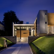
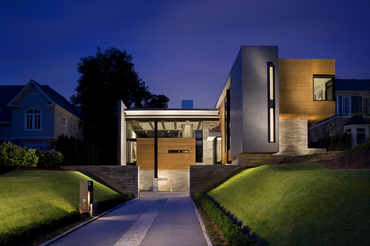
Nestled behind a stone wall, the house presents a composition of abstract forms and overhangs to the street. In some areas, roof lines don't quite meet wall planes and in others, glimpses of ceiling panels become part of the exterior aesthetic equation all encouraging the eye to read the house as a series of volumes.
While there is much to look at, the design also brings privacy, with elements strategically placed to shield the interiors from the street. Within the living room, a horizontal slit at eye level offers a view back out to the sidewalk.
Choate says that while the home's design is modern, the materials used in its construction and cladding are more traditional.
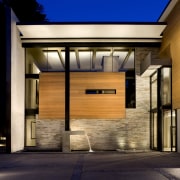
"Stone, zinc and stucco finishes, along with wood surfaces, all feature," says the architect. "The materials have different physical weights and strengths and correspondingly different visual influences on the design.
"Stone strong, solid and impervious to ground moisture was a logical choice to anchor the home, while wood, metal and glass create a lighter, floating effect on the upper facades."
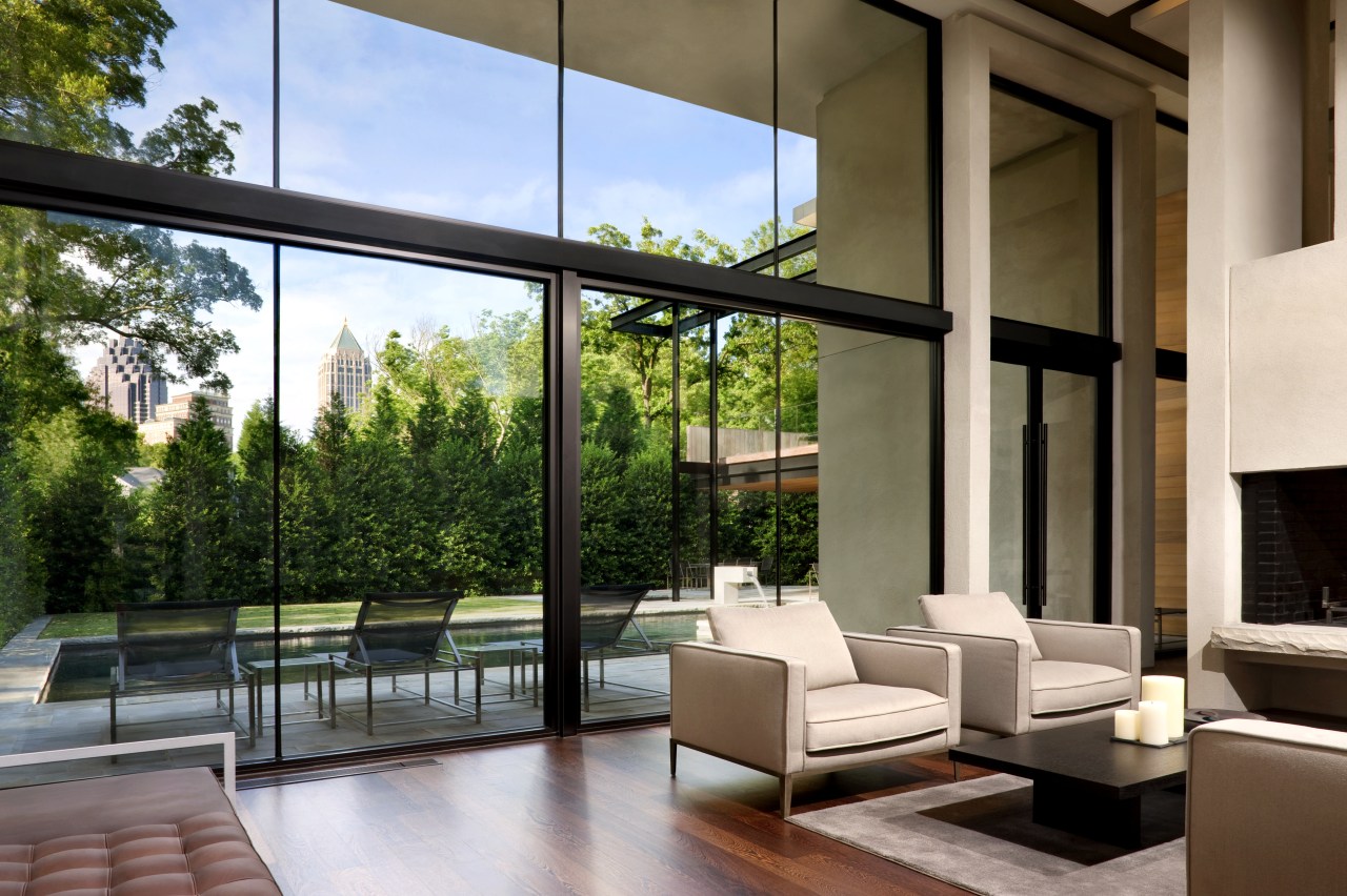
Attention to perspective and detail was exhaustive, so the house would look good from every angle each view creating an individual composition. This also applied inside the home, as the large picture windows bring, in visual terms, the outside in.
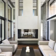
The same materials are used in the interior. A stone wall that rises the full three levels on the outside of the home is echoed in the central double-height living area, and exterior wood paneling finds continuity with the wooden floors. Floor-to-ceiling windows present an extensive use of glass, and this is continued on the glass balustrades on the upstairs corridor, the circulation staircase and the rear deck.
"Repeating materials, as well as architectural forms, sets a rhythm that breaks up the mass of the home and gives it a sense of dynamism," says Choate. "Water is another recurring feature there are fountains at the front and back of the home and all rear views take in the swimming pool. The fountains also help mask traffic noise from the street frontage."
Besides its strong aesthetic presence, the home provides adroit functionality for day-to-day living. There are three living areas: the formal double-height central space, a more intimate family room beside the kitchen, and a large media room on the lower level.
The bedrooms are all set along one side of the house, with one at ground level and the others on the floor above, reached by the central circulation stair. The master suite is to the rear of the home, both for added privacy and for the views over the city.
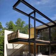
A deck projects out from the master suite and connects with the garden via a suspended exterior staircase. Overhead, a slender iron framework echoes the form of the deck. The underside is finished in the same natural wood featured elsewhere on the home adding to the sense that the house is designed to be admired from all angles. Together, the deck and steel frame above it cantilever toward the back of the property, much like two diving platforms.
"The upper metal structure is a shadow caster," says Choate. "Through the day, this framework casts ever-changing shadows across the lawn and pool."
Story by: Trendsideas
Home kitchen bathroom commercial design
'Hygge' in the highlands
Playing with blocks
Holidaying at home
