Modern kitchen connects with traditional home through materials appropriate to the time
This main floor living zone benefits from a strategic renovation that opens up the spaces and creates a new kitchen empathetic to the home’s origins

Creating a new kitchen in a traditional home requires a balance between acknowledging the history and delivering modern functionality. Of course, referencing the setting can mean choosing elements that are in the spirit of the architecture rather than delivering a detail-for-detail match.
This early 1920s terrace house still had many of its original features, such as access to what was the ice box, says designer Meghan Browne.
“Needless to say, the main floor’s living room and kitchen were in need of an update. The existing modest galley kitchen was cut off from the rest of the home by two intervening rooms, used as a pantry and a rear hallway.
“To create a more open-plan kitchen, we took the wall down between the kitchen and living spaces, along with the small pantry and hall.”
However, with this wall removed, Browne then had to contend with the exposed structural posts and a dropped beam.
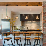
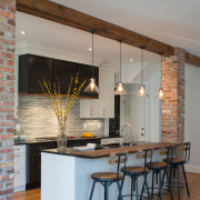
“We dressed these structural elements as architectural details with a refined industrial style,” says Browne. “The dropped beam in the ceiling was wrapped in reclaimed barn wood and the vertical posts were clad in reclaimed brick from old row homes of a similar period.”

The result is an implied history – as though the renovation had exposed the brick and the wood. While the home isn’t industrial in style, this look complements the 1920s architecture.
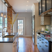
The choice of finishes in the kitchen furthers the refined, semi-industrial aesthetic. Elements include a custom hot rolled steel hood with a live edge walnut apron, as well as oiled soapstone countertops – also popular in the 1920s.
“One of my favourite pieces is the custom black pantry with an X across it, reminiscent of old carriage house doors,” the designer says

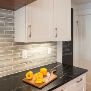
Sources and inspiration can come from all quarters and the equally in-keeping green tile splashback was chosen by one owner as it reminded her of her grandmother’s hearth.
The black-stained central cabinet component ties in with the steel hood and the freestanding pantry, while the contemporary, efficient stainless steel ovens and fridge offer a timeless finish.
Plus, the pendants over the island call to mind Edison lamps seen in factories of the time.
“We gave the bumped out black cabinetry flat, modern faces while the cream cabinetry to left and right is panelled – a perfect metaphor for the wider classic-meets-modern aesthetic.”
Credit list
Designer
Hood
Countertops
Faucets
Cooktop
Dishwasher
Kitchen stools
Cabinetry
Ventilation
Splashback
Oven
Refrigeration
Lighting
Story by: Charles Moxham
Photography by: John Cole
Home kitchen bathroom commercial design
'Worthy of Architectural Digest'
Classic dovetails contemporary
Tranquil waters
Home Trends Vol. 35/1
We talk a lot about kitchens today being at the heart of a home – a focal point where everyone can gather and be part of...
Read More
