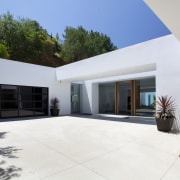
Mid-century Modern house makeover with white exterior opens to pool terrace
Trousdale house in Beverly Hills gets extensive remodel in keeping with its Mid-century Modern origins decorative screens, pool, wide openings
Mid-century Modern architecture can be a perfect fit for the way we live today, but there's no doubt the original examples of such homes built in the '50s and '60s do benefit from an extensive makeover.
This Southern California house, in a prestigious Beverly Hills location, had a Mid-century Modern decor, but it wasn't designed to maximize the spectacular views from the property.
Developer Izzet Levi Uzyel of DIJ Group, working with Xten Architecture, says he took on the project because of the views and the distinctive architecture of the Trousdale neighbourhood.
"We envisioned creating a home with vast walls of glass opening to a pool a home that would epitomize the true California indoor-outdoor lifestyle," he says. "At the same time, great consideration was given to the exterior architecture, to make sure it would blend with the existing Mid-century Modern architecture in the neighborhood. It was very important that this house fit the mould while creating a new-generation family home."
Building contractor Jon Mut of Boswell Construction says the changes began with the exterior and the street elevation.
"The original house had many small windows facing the road, which gave the facade a rather chopped-up look. We removed all of these, creating a single large circular window that better reflects the Mid-century Modern style. The new plastered exterior was also extended to enclose a gated entry, and the entire house painted white. With new landscaping, it has a much more dramatic presence."
The remodeled forecourt also provides a strong sense of arrival. The design team created a highly symmetrical entry to the house, over a linear pond. The facade incorporates a substantial beam that crosses in front of the house. The space between the beam and the building has the same dimensions as the pond, which brings sunlight right down to the water.
"We introduced a fully glazed entry, so there is a direct sightline to the view, right through the house and out across the pool terrace on the other side," says Mut.

On the inside, several structural walls were removed to open up the space and provide a more flowing interior.
"The existing house had a lot of very confined small spaces it was very compartmentalized, which didn't fit with the way most people like to live today."
Arched openings, an ornate fireplace, wood paneling and a parquet floor were also banished, and the living room was stepped down from the entry to create an airy, spacious living space.
"We added powdercoated aluminum screens to divide the living area from the entry," says Mut. "These are double screens with custom patterns cut by a laser water jet. They are backlit with LED lighting, so they are especially decorative at night."
But one of the biggest changes is the improved connection with the outdoors. The original 15ft opening to the pool terrace was extended to 27ft. Huge pocket doors slide out of sight within the walls, so the living room appears to be part of one enormous terrace.
"The weather in Southern California allows us to enjoy the outdoors all year round, so the entire house was reoriented to maximize this," the builder says. "We also painted all the walls and ceilings white so they would reflect the light and reinforce the resort ambiance."
Even the kitchen was moved from its original position at the rear of the house. This room is now at one end of the living space, and the entire corner opens up to the sunny terrace and the pool.
"We chose a galley-style kitchen with a long island and bar stools," says Mut. "It's a very social space, well suited to entertaining. A short feature wall separating the kitchen from the dining room is clad in porcelain tiles that resemble natural stone. These were chosen to resist the heat given off by the double-sided fireplace in the wall. Having this fireplace means these two rooms are not completely isolated you can catch a glimpse of what's happening on the other side."

But it's not just the public areas that were the focus of attention for the remodel. The master suite was also repositioned to the front of the house. Here again, there is an extra-wide opening to the terrace, with pocket doors sliding out of sight.
"We wanted to minimize the visual impact of the doors throughout the house," says Mut. "The goal was always to concentrate on the view."
Pocket doors also feature in the new master bathroom, which is an extension to the original house. Two 4ft-wide openings provides slices of the view, one towards the pool and the other providing a more distant vista. This opening is directly aligned with the door to the bedroom, so the owners can see right through the bathroom and out the other side.
However, the piéce de resistance of the marble-lined bathroom is the opening right beside the pool.
"The owners can get up in the morning and literally dive off the doorstep and into the pool," says Mut.
Other features of the bathroom include a sculptural, freestanding tub and an open, wet-area shower.
Story by: Trendsideas
Home kitchen bathroom commercial design
Curvaceous and connected
Silver moons rising
Vibrant spiral stairs improve penthouse connections
US Kitchen Renovation Trends Vol. 30/11
Kitchen Trends is dedicated to providing inspirational design ideas, products, services, and information for kitchen bra...
Read More


