Living in the '70s
Rather than eradicate all traces of the decade taste forgot, the ownersof this 1970s-era house were inspired to create a modern retro home
Widely regarded as a time in our recent history without much going for it fashionably speaking, the 1970s is perhaps best left behind. However, the great thing about hindsight is it gives you the opportunity to improve on past errors.
When the owners of the property featured on these pages were looking to renovate, they made the decision to embrace elements of 1970s design and update them for a modern lifestyle, says designer Andrea White of Yellowfox.
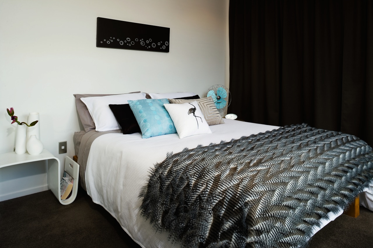
"Certain elements, such as geometric accents, have remained, but gone are the intense orange, brown and avocado colours in favour of neutrals and more subtle, earthier hues."
Texture, pattern and colour have been reinstated in a pared-back manner that allows the clean lines of contemporary fashion to lead the way.
"Earthy browns, greys and seafoam blue-greens on a white backdrop showcase individual objects without overpowering the scheme as a whole. Dark floor-to-ceiling drapes frame the view when open, and create a dramatic backdrop when closed," says White. "A dark plush-pile carpet, by Norman Ellison, creates another textural element and grounds the room."
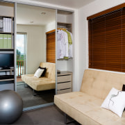
The home's third bedroom has become a multi-purpose space, and has been opened up to provide the all-important indoor-outdoor flow, says White.
"The third bedroom is a combination spare bedroom and study. A canny wardrobe system allows for storage and study to be contained within the one space without losing any of the functionality of the bedroom. A small window has been replaced with aluminium sliders giving access to the deck and flooding the room with natural light."
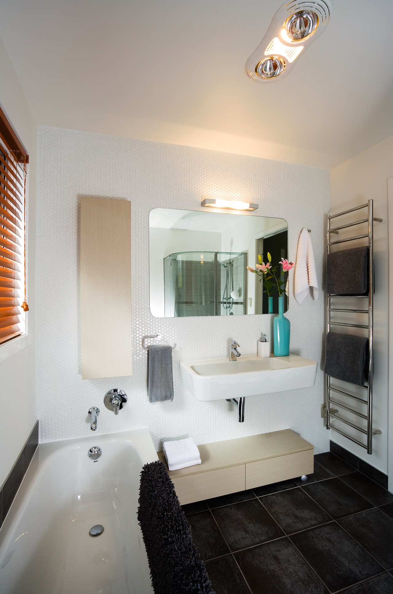
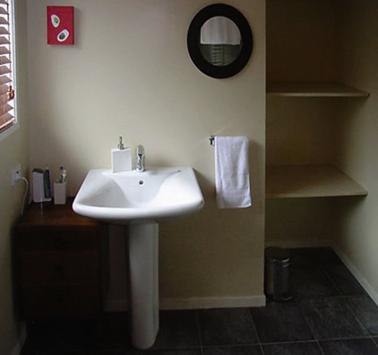
The home's main bathroom also reflects the merging of the two eras. New circular wall tiles play off the existing floor tiles, as do the curved mirror and basin. The timber-grained cupboard and storage unit hark back to 1970s wood-grain panelling, but have a contemporary Scandinavian feel that lightens the overall aesthetic. They're also examples of designing to maximise space.
"Yellowfox is designed to provide a comprehensive service for all exterior and interior design requirements. Strong industry associations with well-known and high-profile companies in the building sector means if there is anything we can't provide our clients, we can refer them to a specialist in that field," says White.
For further information, contact Yellowfox, phone (09) 525 3450. Email: design@yellowfox.co.nz.
Story by: Trendsideas
Home kitchen bathroom commercial design
Wonder wall
Natural feel, natural outlooks
Walnut and weatherboards


