Laps before breakfast
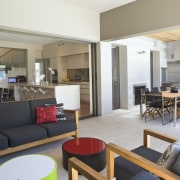
An extension to this 1890s house provided space for a large kitchen, scullery and family living room, and seamlessly integrated the interior with a new pool and outdoor living area

Marrying the character and charm of a century-old house with the needs of a busy family doesn't have to be a compromise. For an increasing number of homeowners, the best solution is an addition to the rear of the house.
This renovation project, was designed by architect Carl Huston of Huston + Associates and interior designer Jane Agnew of Agnew Interiors. It has more than doubled the size of the Federation-style house, and created a spacious, open-plan kitchen and family living area, which open to a new terrace and 16m lap pool.
"This L-shaped space is the centre of all family activities," says Huston. "In addition to a new kitchen, scullery and laundry, the extension needed to provide a number of spaces where the family could sit and experience the outdoors casual family seating and dining areas, a more formal living room, and separate outdoor seating and dining areas. All these spaces are interconnected, with extra-wide openings providing a seamless link between inside and out."
The galley-style kitchen is positioned at one end of the space, with a scullery and laundry behind. A full-height window ensures the owners have a clear view of the pool while working at the bench.

Taupe-coloured cabinetry with flush doors and recessed handles was chosen to provide a neutral backdrop.
"We wanted the kitchen to look like part of the structure of the house, rather than an obvious food preparation area," says Agnew. "A bronze mirror splashback reflects the living area, integrating the two spaces visually."
Agnew says having extra appliances in the scullery also helps keep the more functional aspects to a minimum in the kitchen.
"The scullery is the engine room for baking, and for food preparation when the owners are entertaining. Any mess can be hidden from sight. We also reduced clutter in the main kitchen by providing a tap for extra-hot and chilled water, so there is no need for a kettle to sit on the bench. The coffee machine and television are tucked into a side wall so they are not obtrusive, and the refrigerator and dishwasher in the kitchen are integrated."

A number of customised storage solutions help retain the streamlined look, including a mini pull-out pantry for everyday items in the main kitchen.
Agnew says CaesarStone was specified for the benchtops. This wraps the long island with a deep edge that imparts a sense of substance.
"Although the extension has a very contemporary feel, we introduced some elements that are a visual reference to the original part of the house. For example, the chesterfield sofa has a period style, but it is upholstered in aubergine leather for a modern feel. The reproduction rug is another visual link. There is also a modern interpretation of a decorative Swiss clock, and a pendant light with an ornate plaster interior reminiscent of a traditional ceiling rose."
Story by: Trendsideas
Home kitchen bathroom commercial design
Light-hearted by the sea
In tune with the land
Surface attraction


