House design resolves challenges of tricky access and a steep and awkwardly shaped site
Multi-level sandstone home includes top-floor glazed living pavilion with expansive terrace to capture spectacular city and harbour views

Designed by designer James Cooper of Sanctum Design
A steep, narrow site with poor access is not always the ideal starting point for a new build – however, out of adversity can come great things.
This site is part of a battle axe allotment situated on Sydney’s Balmoral slopes, offering views over beaches and the harbour headlands, says designer James Cooper of Sanctum Design.
“The design had to maximise the sweeping views and resolve the difficult access created by the battle axe-shaped site. At the same time, the home had to appeal to a family with teenagers, maximise the recreational potential of the land, and reflect a luxurious treatment throughout.”
The site’s steep nature imposed a limiting building footprint to achieve the required floor space of around 365m² for the new home.
“First, we resolved the tricky site entry and egress by a car turntable set within a large entry courtyard,” says Cooper. “This saves on turning space and allows visitors and occupants to always exit the property in a forward direction.”
Also responding to the steep lie of the land, Sanctum opted for a stepped house form.
“Essentially, we created the home as a series of horizontal layers to assist in reducing its bulk and to settle the design into the landscape.”
“The shape of the house has its architectural precedents, too, with its vertical form inspired by the work of mid-century Sydney modernists such as Bruce Rickard, Russell Jack and Peter Muller,” says the designer. “This home emulates their soaring cantilevered roof planes and solid anchoring plinths that, together, support a lightweight living pavilion – elements that provide balance and yet lightness upon the steep site.”
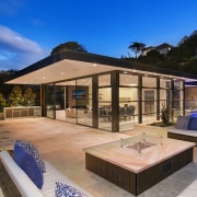
To this end, the home presents as a floating wedge of sandstone, capped with a lightweight modernist pavilion, which belies its solid concrete superstructure anchored deep in the earth.
The home dovetails with its setting in terms of materiality as well. Its C-shaped facade is finished in fine-sawn Sydney sandstone, which pays homage to the grand sandstone mansions of yesteryear which grace the neighbourhood.
“We complemented this golden-hued local stone with the rich tones of thermally modified timbers and Metropolis Bronze Pearl windows – creating a luxurious external palette.”
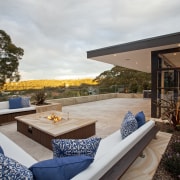
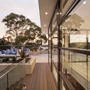
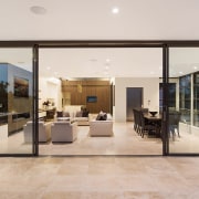
On the interior, the home is organised with the public spaces – living, dining, kitchen and expansive terrace – on the top level to capture the views. The sprawling open-air terrace takes up almost half of this uppermost floor. After all, confined by steep land and vegetation, the home has little other outdoor recreational space apart from modest lawns at the side of the residence. A swimming pool, firepit and outdoor cooking zone all occupy the top terrace.
Reached by lift from the ground level, the top-floor pavilion naturally enjoys the best outlooks. Wraparound double-glazed doors and windows, together with the vaulted kitchen ceiling and generous clerestory glazing, help ensure that the pavilion enjoys natural light and passive ventilation all year round.
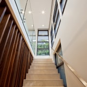
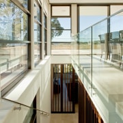
Connected to the upper floor by a generous stairway that also acts as a light well right down through the home, the first floor is comprised of the large master suite, three other bedrooms, central storage and a second lounge, or quiet space, also trained on the scenic outlooks. And below this, the ground floor contains a double garage, entry foyer, study and rumpus room
Working well with the stone exterior, the interior palette has accents of warm chocolates, seen in the timber detailing. These brown tones complement the fine quality Anatolia Beige marble used on the floors and stairs throughout.
Over and above the home’s architecture and palette, little touches optimise the livability of the home and optimise its natural assets.
“The substantial fireplace in the main living area anchors the seating area, while its dark patina also ensures the television recedes from sight,” Cooper says. “The surround is made of large porcelain panels which also complement the coppery tones in the window frames.”
Another focus on this level is the white entertainer’s kitchen. Its vaulted ceiling and clerestory windows bring drama, while the island’s chocolate-toned veneers help it stand out.
Story by: Charles Moxham
Photography by: Simon Wood
Home kitchen bathroom commercial design
Thrice as nice
Marvellous in marble
The beauty of understatement
Home Trends Vol. 34/2
Placing the kitchen at the heart of a home is not just about creating a convenient zone for easy food preparation and ea...
Read More

