Separate rental and living space made possible by reno
In uncertain times it makes sense to optimise assets. Here's how one couple subdivided their home to rent out one area and live in the other
Designed by Paul Bernier Architecte
The project
In this detached duplex of the Rosemont district, the owners wanted to transform the ground floor and the semi-basement to make it their home. The second floor was preserved for their tenant.
A garden was also laid out around the building along with a terrace in the back, which is connected to the living area.
Space and light
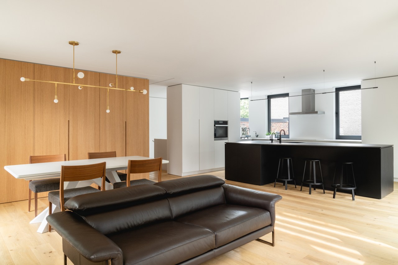
To make the lower spaces of the home independent, the renovating architects on this project first sought to reorganise the partitions to obtain fluid circulation and spaces that are well-proportioned, clean, and uncluttered. Several new openings have been made in the exterior walls to illuminate the space at any time of the day.
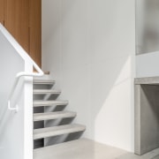
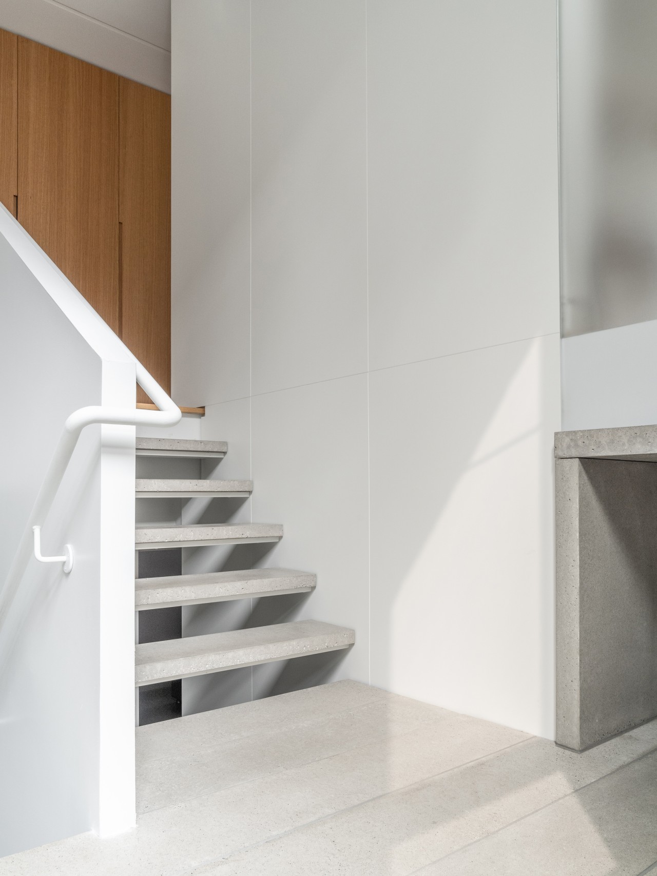
The architects also opened the floor to create a large double-height space for a new staircase, thus reinforcing an impression of continuity between the two levels.
Making a connection
As part of this renovation, a large piece of satin glass between the office and the stair allows these spaces to benefit from the light coming from the neighbouring space while ensuring privacy.
Light fantastic
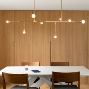
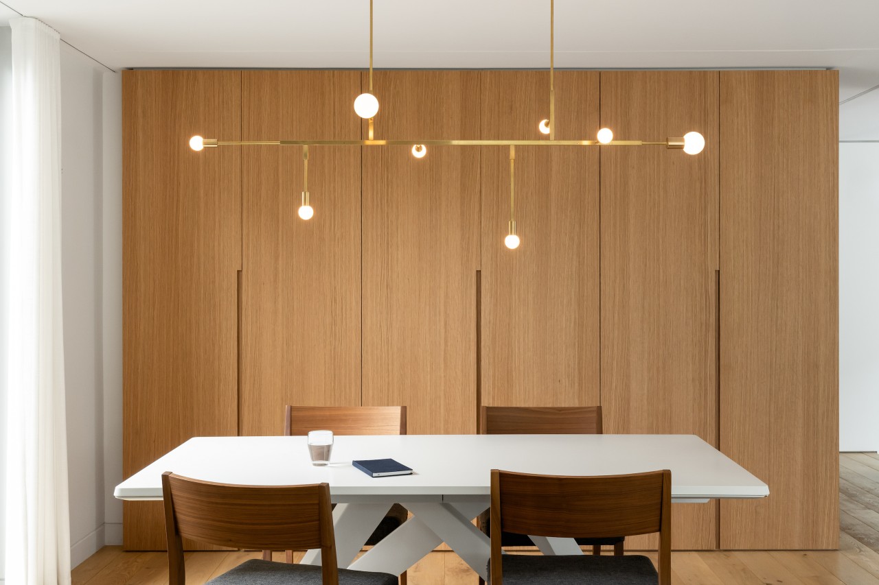
The lighting in this project – sculptural pendants included – has been thought of from a functional point of view but also for the ambience it can create.
Built-in efficiency
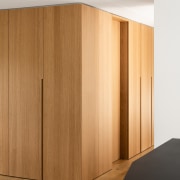
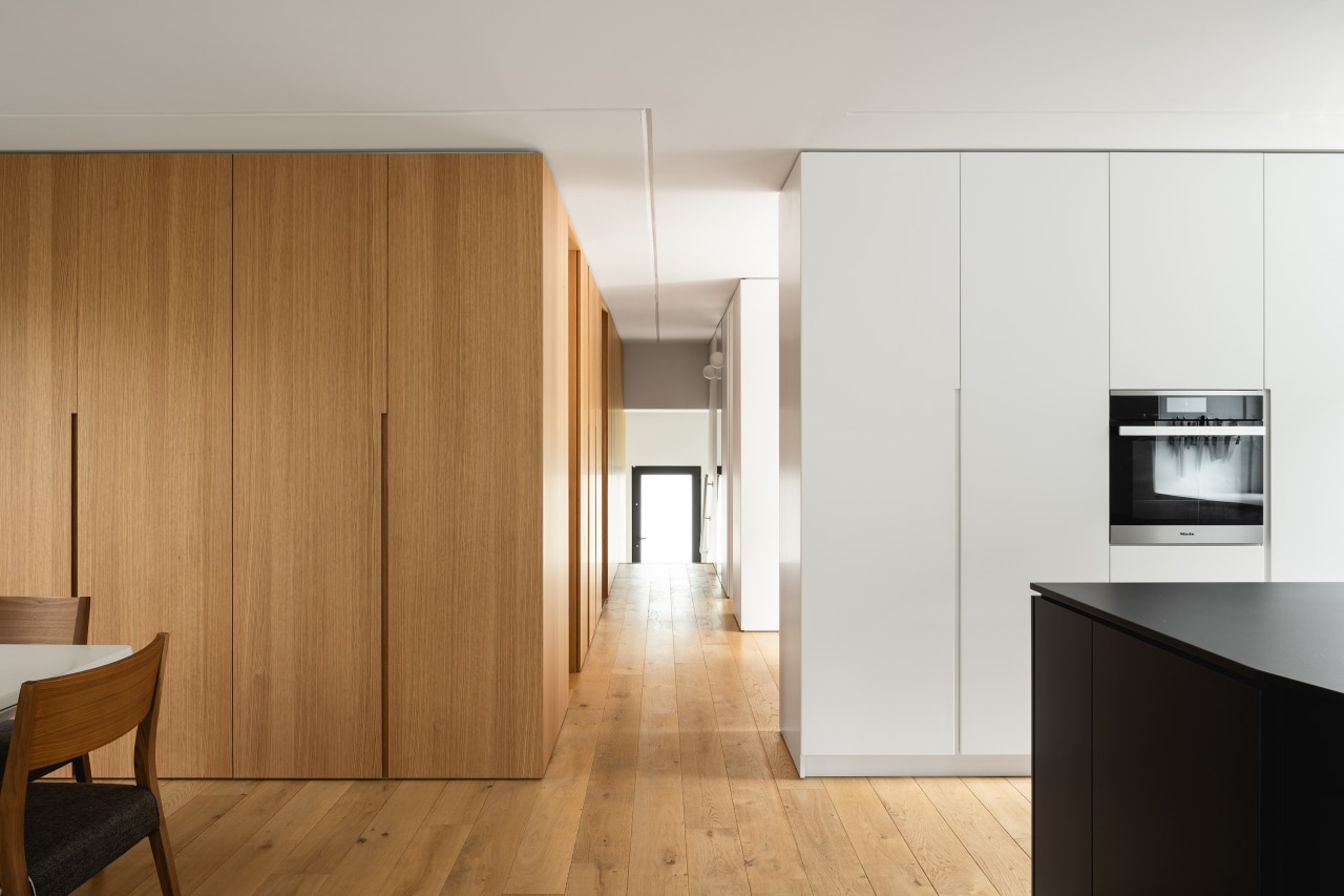
For this project, the architects designed several elements of integrated joinery that meet the needs of the clients in their daily activities. The built-in elements also acts as a partition and defines the space.
Material riches
Great care was taken in the choice of materials in this project, with white oak, polished concrete, and white or anthracite lacquered panels being the main materials used.
Let it flow
Continuity of materials throughout the house also contributes to an impression of fluidity between the spaces. The woodblock, made with white oak panels, which borders the corridor on the ground floor, turns into the living room and becomes a service cabinet for the dining table.
A touch of mosaic
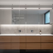
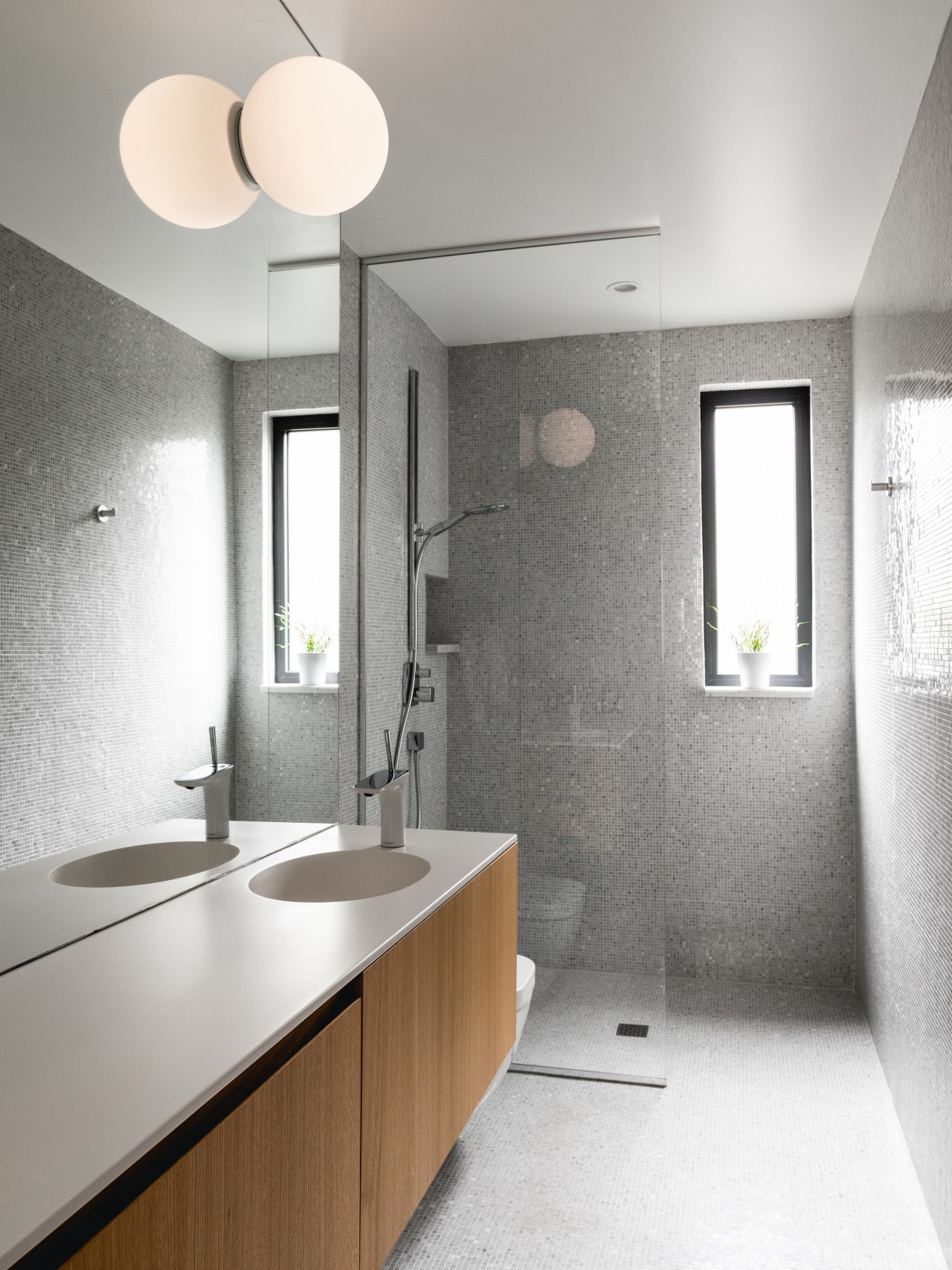
Feature materials enrich the palette of the project, such as brass lighting fixtures and Bianco Carrara marble mosaic that covers the surfaces of the bathroom on the ground floor.
Polished performance
Polished concrete is found in several areas of this project. It is used as a slab poured on-site but also as elements cast and polished in the workshop to make wall panels as well as steps and stair landings.
In the basement bathroom, polished concrete wall panels are also used, as if the floor were rising on the walls. The bathroom is visually split in two: the concrete dry area with its white oak vanity, and the wet area covered with small white ceramic tiles
Here to stay
Built-in furniture was a feature of this renovation, the elegant terrace area included.
Credit list
Architect
Structural engineer
Cabinetmaker
Architectural team
General contractor
Concrete
Story by: Trendsideas
Photography by: Raphaël Thibodeau
Home kitchen bathroom commercial design
Classic dovetails contemporary
'Worthy of Architectural Digest'
Tranquil waters
Renovations
Renovating your home is an opportunity to refresh, expand and renew. Here's all the inspiration, ideas and information y...
Read More