From the same menu part of whole building project by architect Nicholas Solomon
this space by Nicholas Solomon optimises visual links
One way to ensure an open-plan living area seems larger is to integrate the kitchen into the wider space. Form and materials can play an integral part in achieving this.
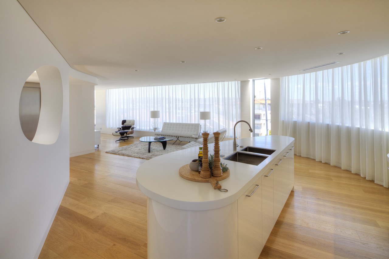
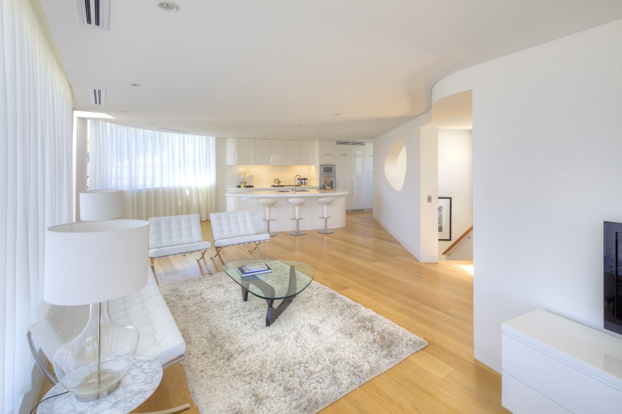
On the upper level of a two-storey penthouse designed by architect Nicholas Solomon, this pared-back kitchen is open to the living and dining areas. The open plan optimises the feeling of space and also ensures there are views to the nearby beach from all areas.
Prominent curves characterise the apartment, calling to mind aspects of the building's form, the rounded corner site, and the graceful sweep of the bay as seen from the unit's windows, says Solomon.

"The decision was made to continue this look into the kitchen to build on the sense of spaciousness. Material harmony was a key factor. For example, the American white oak flooring in the open living-dining area extends into the kitchen and the prep and storage area behind. This allows the eye to follow the wood to the very perimeters of the room."
In keeping with this concept of visual flow, the white wall and ceiling surfaces in the living area are repeated in the form of white, high-gloss polyurethane cabinet fronts and white Corian benchtops.
While material and tonal harmony were important, so too was shape. The kitchen island and the perimeter cabinets have rounded corners, referencing the soft triangle cutout of the wall that separates the circulation stairwell.

"The island's fluid lines may seem indulgent in terms of utility, but it is honed for practical use. Seating is set at the widest part of the benchtop, while shallower cabinets utilise the space at the narrower end of the piece," says Solomon.
The amalgamation of form and function can also be seen in the custom-designed cabinetry on the perimeter, with its compartmentalised drawers and tall pantry, set to the right of the double wall ovens. A wealth of prep counters and additional storage ranges back into the recesses of the kitchen. There are also two wine fridges in this area, out of sight from the living areas.
"We often find the galley-style kitchen is the most effective in our designs, and this elongated island set close to the rear wall of cabinets allows us to have the best of a galley and island kitchen combined," says Solomon. "All work triangles are tight and efficient, and we specified two sinks for the island, so a busy chef can prep or clean while still interacting with family or visitors in the living areas."
Story by: Trendsideas
Home kitchen bathroom commercial design


