Express purpose Wood & Grieve Engineers fit-out by Woodhead
Woodhead provides playful, transparent fit-out for Wood & Grieve
A contemporary commercial fit-out will go beyond creating a healthy, ergonomic workplace. New interiors can play a powerful role in public relations as well, displaying everything from wayfinding to the firm's stock-in-trade and staff practices at a glance.
When Wood & Grieve Engineers relocated to two floors of a new building, the brief to Woodhead was to unite all 230 engineering, administrative and support staff in a visually exciting and connected environment. The company wanted the new interior to have a strong sense of playfulness and fun that could be appreciated by clients, visitors and staff alike, says designer Jacqui Preshaw.
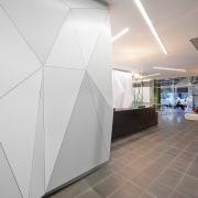
It was also important to provide clear wayfinding, starting with the entry, which is at a distance from the reception desk. The team consequently created a white 3-D multifaceted facade that starts near the entrance doors and continues behind reception. Representing the myriad facets that comprise the engineering discipline, this geometric feature translates into black frames on glass and 2-D patterns on dividing walls. The motif is also used upstairs, for continuity.
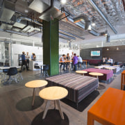
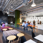
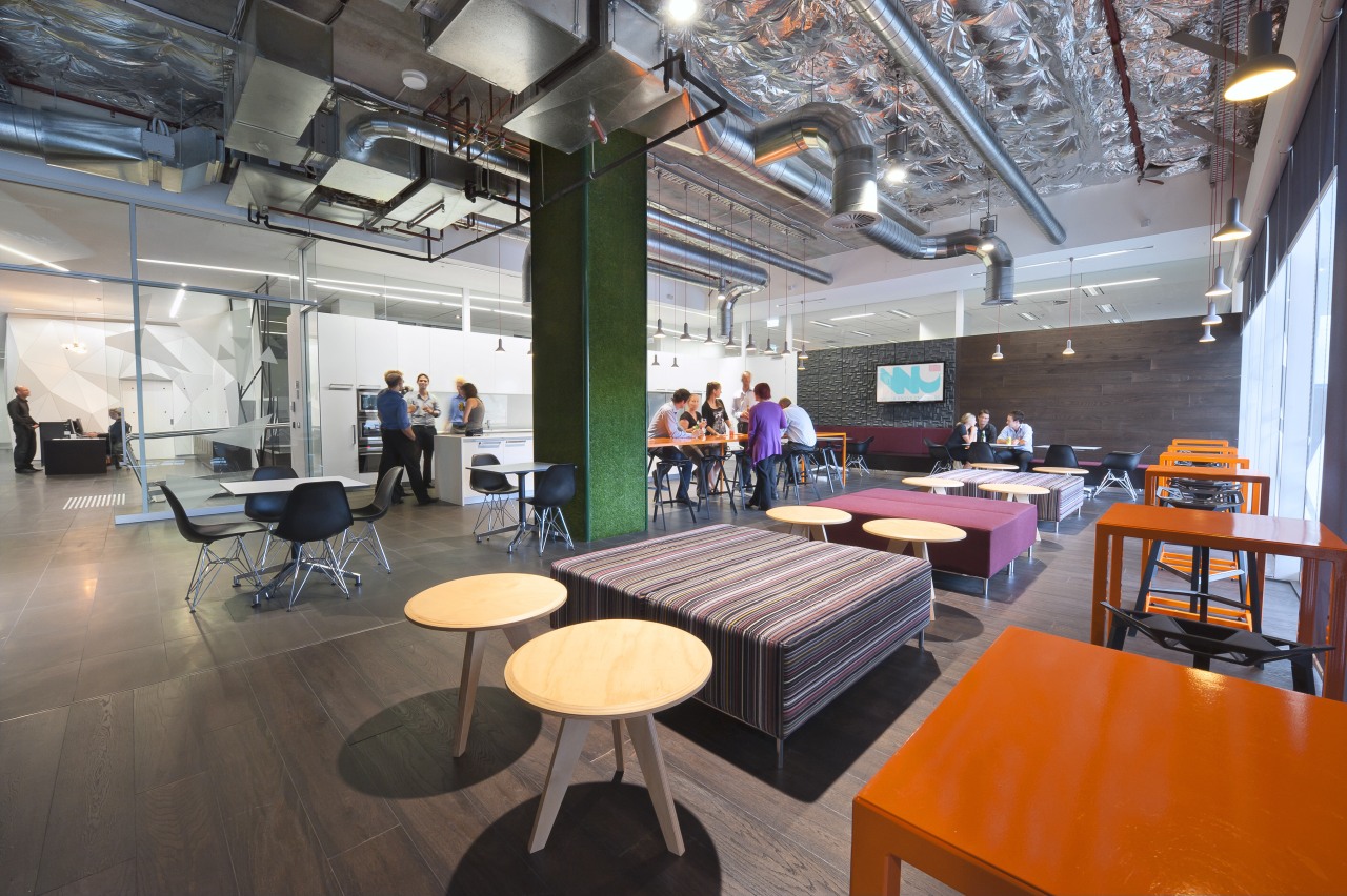
"We set a large breakout space next to the reception so that it can be seen on arrival," says Preshaw. "This area is the heart of connectivity for the company and shows a lighter, playful side not usually associated with engineering practices.

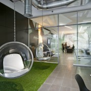
"Management took a progressive stance on this project, inviting staff suggestions for what would appear in the finished spaces. As a result, the breakout room features a column and floor area in artificial grass, a blackboard wall, dartboards, and 1960s-style suspended acrylic ball chairs. Overhead, the gleaming exposed services are an example of Wood & Grieve's own handiwork."
Preshaw says the ground floor, which was originally configured for a restaurant, had differing floor levels.
"We introduced two ramps to reconcile these and to help with wayfinding through the space."
Upstairs, near the lifts, frosted screens balance openness with a sense of privacy. Another breakout space provides a subtle buffer from the office desks beyond and serves as a meeting area for clients and engineers. Four private meeting rooms are nearby. To facilitate interdisciplinary communication, all workstations are designed with low backs and without partitions, ensuring uninterrupted sightlines across the expansive office space.

Spokesperson for Wood & Grieve, Brett Davis, says staff appreciate the group layout tables and the increased number of meeting rooms compared to the company's previous offices.
"The layout tables enable staff to rotate their chair through 180º degrees, open up drawings and converse with colleagues, while reviewing full-size plans at a glance. Due to the significant numbers of people we can fit in our downstairs training rooms and our upstairs boardrooms, we now host a far higher number of project meetings with architects, clients and other consultants in our offices. This is advantageous because it saves staff travel time and enables us to show off our office space to all clients who visit us."
An important aspect of the design was the drive to achieve a 5-Star Green Star Office Interiors V1.1 certified rating. Several environmentally sustainable initiatives throughout the project helped achieve this, says Jacqui Preshaw.
"We specified low-VOC materials and products, integrated low-energy services, reused existing base-build finishes and provided shared recycling facilities. These green strategies were combined with space planning that ensured ample natural light, convenient, easily accessed facilities and external views for one and all."
Story by: Trendsideas
Home kitchen bathroom commercial design
