English accent
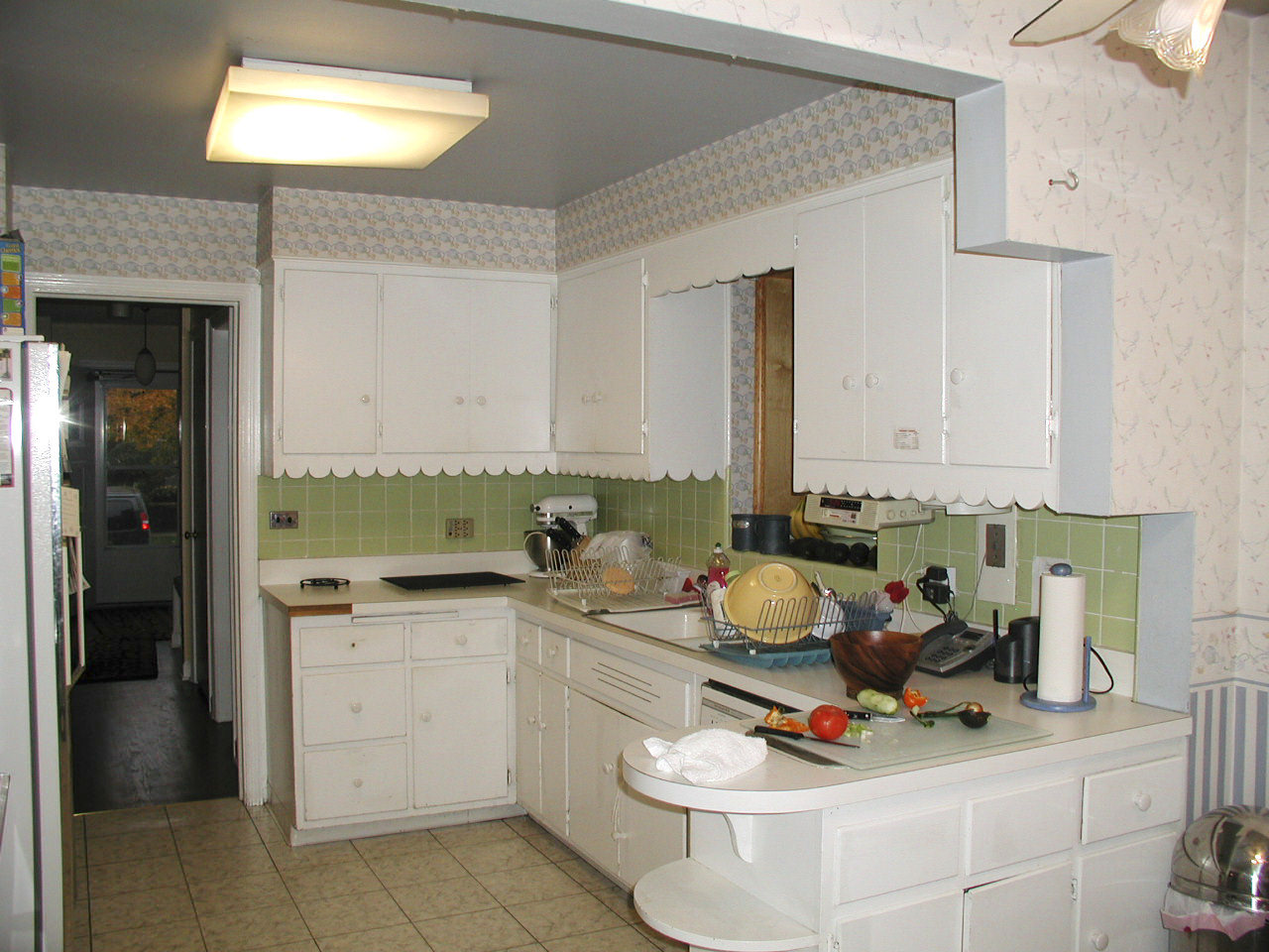
The brief for this remodeling project was to create a kosher kitchen, with a classic English look and feel

Planning any kitchen remodeling project demands careful balancing of function and design. When the brief involves creating a kosher kitchen for a family of two adults and seven children, the challenge can only increase.
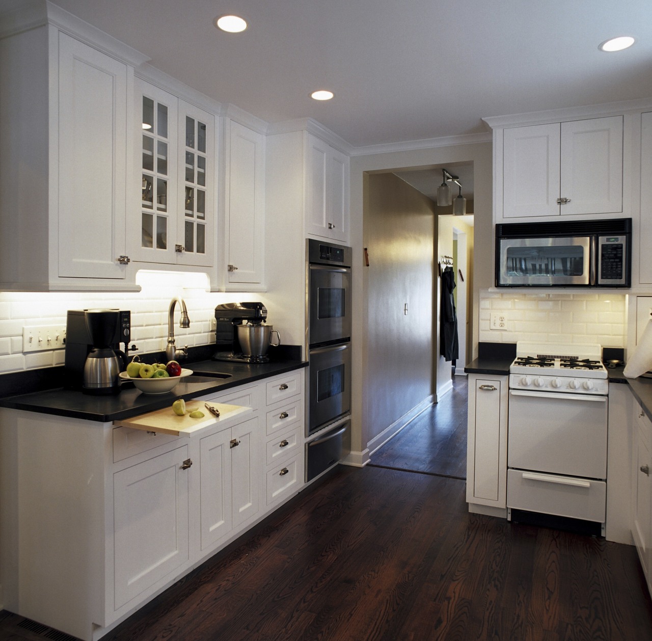
To reconfigure this room as a kosher kitchen, certified kitchen designer David McNulty of McNulty Design Group created three zones for preparing meat, dairy and other food, known as pareve, and installed two dishwashers and sinks. With 10 feet of potential storage space taken up by the dishwashers and sinks, extra upper cabinetry was added, as well as space-saving devices such as roll-out trays.
"With so many items, I needed to position the cabinetry and appliances carefully, so that doors could be opened freely and people could move around easily without colliding into each other," he says.
For display space, McNulty installed glass shelves in front of the original bay windows, and created a narrow recess within the subway backsplash tiles above the main cooktop.

Visually, the family was looking for the old-world ambiance of a traditional English kitchen. To achieve this, McNulty specified painted cabinetry with inset panels and English latches and pulls.
The color palette draws on the black-and-white theme used elsewhere in the home, and gives the illusion of a larger space. The dark-stained oak floor and countertops provide a visual contrast to the white-painted cabinetry.
"All-white cabinetry could have been bland, so I introduced clear glass panels into some of the upper cabinets and chose a dark honed granite for the countertops."
Energy-efficient lighting was installed under the upper cabinets, to cast a warm glow over the room's white tones. Recessed lighting was positioned away from the ceiling fan, to avoid strobing effects.

McNulty Design Group is a specialist kitchen and bathroom design company.
For details, contact McNulty Design Group, 708 Vernon Avenue, Glencoe, IL 60022, phone (847) 835 0868, fax (847) 835 0867. Email: dmcnulty@mcnultydesign.net.
Story by: Trendsideas
Home kitchen bathroom commercial design


