Down the garden path new home by Box Living
Box Living conquers steep site
With land in prime city suburbs scarce, it is only to be expected that every square inch will be maximised. It's no surprise therefore, that architects are finding design solutions for even the most challenging building sites.
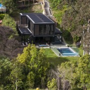
This site was one of the more tricky ones that Box Living has worked with. Not only was the land steep, but it was also long and narrow, says general manager Dan Heyworth.
"The site was just 12m wide and subject to the usual height-to-boundary restrictions," he says. "Initially, we toyed with the idea of putting a driveway down the hill, but then chose to build a cantilevered car deck at the top, with a turning carousel it is less treacherous."
Heyworth says the narrow width of the land determined the design of the house, which is based on Box Living's modular post and beam architectural concept.
"This is inspired by the work of mid-century architects, such as Pierre Koenig and Craig Ellwood, who produced beautiful, accessible and affordable modern buildings.
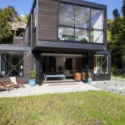
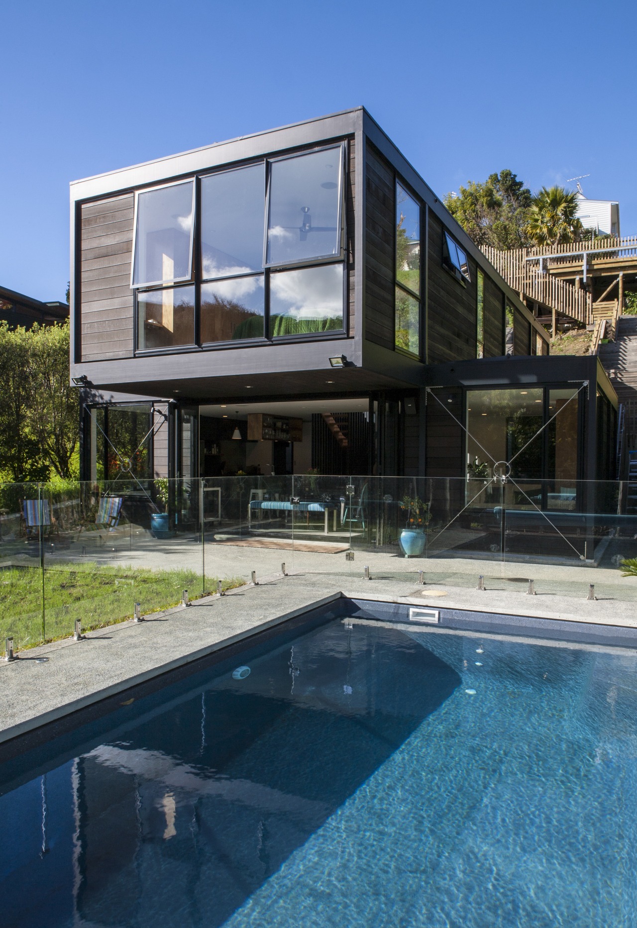
"For this project, we created a double-height, rectangular volume, flanked by single-storey wings. The plan is essentially a cross, with the upper level of the main volume extending out past the wings on either side to provide shelter for the outdoor living area beneath."
The architecture is also defined by the exposed exoskeleton. Steel bracing crisscrosses the large windows on the lower level, and the engineered timber posts and beams are also exposed, and painted in a dark shade to match the stained, rusticated cedar weatherboards.
"We positioned the main living areas on the ground floor, so we could provide a flow out to the only area of flat ground, which is where we placed the outdoor living area and pool," says Heyworth. "The upper level accommodates bedrooms and a second living area, which can be used by the children. This allows segregation between adults and children when required."
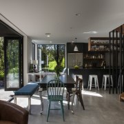
A pared-back design and a simple, natural palette of raw materials define the open-plan living area. Materials are limited to concrete, glass, steel, timber and Okuplex varnished plywood. The plywood features on shelving in the kitchen, including a suspended unit above the island, and on a bank of cabinetry in the living room. The central stairs have a similar finish, contrasted by black timber balustrades.
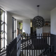
"The vertical timber battens are a distinctive sculptural element," says the architect. "They help to lead the eye up the stairs, enhancing the perceived height of the space. For this reason, also, we made the internal doors and windows in the house full height. This makes the rooms seem much bigger."
To continue the visual drama, the kitchen features dark-grey cabinets, teamed with a honey-grey benchtop on the island. The perimeter benchtops and backsplash are stainless steel.
"With the timber shelving helping to warm the space, it doesn't feel cold," says Heyworth.
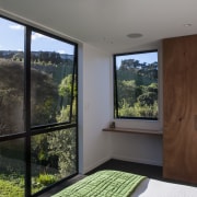
The material palette continues on the upper level, where the bedrooms and the common area feature built-in plywood cabinetry. Black carpet offsets the white walls and complements the black balustrading and David Trubridge light pendant.
Other features of the house include LED energy-efficient lighting throughout, and a heat pump that powers the underfloor heating, hot water and swimming pool.
Story by: Trendsideas
Home kitchen bathroom commercial design
Radical yet respectful
Sculptural centrepiece
Curvaceous and connected

