Colorful and connected remodel by designer Nadia Subaran
Nadia Subaran remodel brings vibrancy and space

When your kitchen remodel will be seen from adjacent spaces, it may be wiser to express a love of color with more minor elements and let classic, dark cabinetry ground the design. After all, seat covers can be replaced easily, unlike an entire set of cabinets.
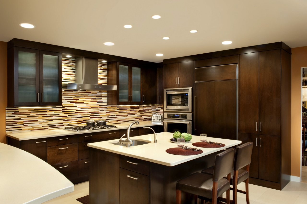
For this remodel by designer Nadia Subaran, colorful appeal and room to move were integral. The kitchen is toward the back of the home, adjacent to the dining room, family room and front foyer. In the new design, connections were improved and the wall between the kitchen and family area opened up. The wall had comprised a bank of cupboards and offered only a small opening between rooms, says Subaran.
"We replaced this wall with a peninsula worktop that opens up the space and provides some under-counter storage. A curve added to the raised counter softens the hard edges and helps it read as a freestanding element, as it is rather large. The shape was also dictated by function, with enough overhang for seating and yet providing ample walkway clearance."
White cabinets and tan work surfaces in the existing kitchen didn't reflect the warmth of the rest of the home or the clients' personalities.
"One of the first things they said to me was, No white cabinetry!'" says Subaran.

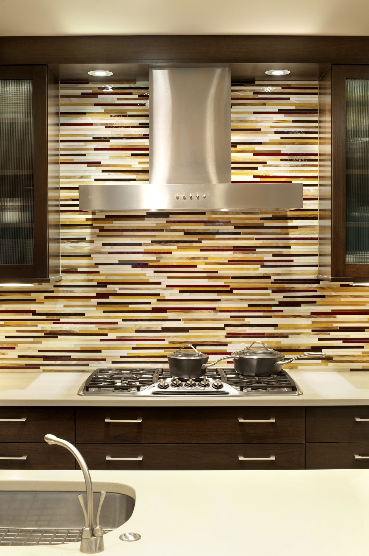
"In response, a rich wood veneer was selected and now the cabinetry, countertops and even the floor are quite neutral in tone. I knew from the outset there would be a lot of vibrancy in the backsplash and on the walls, and the dark cabinetry anchors all that color."
However, this was only one part of a design story that balances restraint with exuberance.
With a need to reclaim lost storage, the designer looked at introducing specific colorful elements to act as artworks features that wouldn't eat up wall space needed for cabinets.
The custom tile backsplash and pendant lamp in the banquette area now function as the pieces of art in the room both relatively easy to change out in the future for a different look. For the new feature glass tile backsplash, the owners and the interior designer chose each of the colors individually, echoing favorite hues seen elsewhere in the home.
The banquette opposite also underwent a transformation. This was another key focus as this area is the first thing seen in long view on entering the house.

"The old banquette area didn't work it was too shallow to allow for comfortable seating. So we bumped it out by about 18 inches and raised the windows to improve function."
Subaran designed flanking pantry units in this area to look like furniture pieces, right down to the amber glass knobs that pick up on the pumpkin color of the walls.
"The fabric chosen for the banquette again reflects the artistic personality of the owners. The rounded glass table helps to retain an open look, while the Caboche pendant light is our little bit of bling that finishes the space."
Story by: Trendsideas
Home kitchen bathroom commercial design
Tranquil waters
Small space, big impact
Continuity meets subtle separation


