Clear sighted
This reinvented kitchen responds to its spacious environment

Often a traditional design is the hardest to remodel and this is particularly true of the kitchen balancing improved flow and function against the need to meld with a classic style can be a challenge.
This spacious kitchen forms part of a whole-house remodel by architect Stuart Silk. The clients had asked him to give the home an improved connection to the outdoors, making it lighter and more user-friendly, says Silk.
"The same principles were to be applied to the kitchen upgrade. The original design had limited connection to the panoramic lake views and internal connections were also poor a single door led from the dining room through to the kitchen," says Silk. "In response, we reconfigured and reoriented the kitchen space, opening it to the dining room with a double-width void at one end and French doors to a garden courtyard at the other.
"We also built a new family room beyond the existing floor plate on the far side of the home with a generous connection to the dining area, which in turn opens to the new kitchen. Now you look through the run of rooms at a glance, with views framed at either end."
The homeowners had also wanted the kitchen cabinetry to be completely transformed.
"The existing cabinets were too ornate for their tastes and the dark marble countertops were deemed oppressive essentially, the space had the dated feel of a men's club bar."
Silk replaced this look, selecting clean-lined cabinetry with subdued detailing for a more transitional appeal.
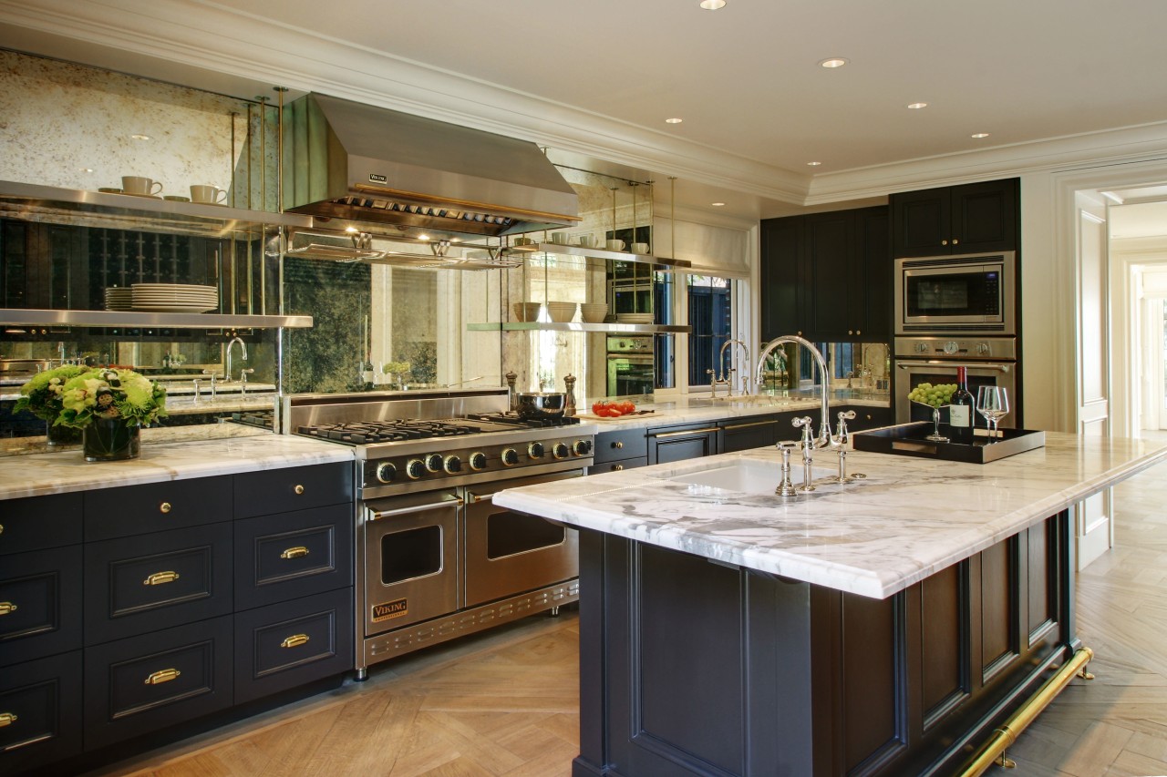
The recessed cabinets are painted anthracite gray, the dark tones balanced by the veined white marble counters and blond parquet floors. This flooring runs right through the unified living spaces.
"Part of our goal on this project was to use traditional elements in an unexpected way to create a transitional aesthetic. For instance, we used a full-height antique glass backsplash on the cooking wall and while the detailed surface has a classic feel, its height is a more modern concept."
Orienting the island in the direction of the sightlines and pushing the cabinetry to both walls helped accentuate the pedestrian flow and the views.

Silk says other highlights of the design include having old-world brass knobs and railings contrasting the more contemporary stainless steel.
In terms of function, Silk demarcated areas of use. One side of the room has the prep and clean-up stations while the island and opposite counters are for serving and socializing.
"This kitchen reflects the collaboration between owner, interior designer and myself the end result combines an airy through-space with a family and entertainer's kitchen."
Story by: Trendsideas
Home kitchen bathroom commercial design
Radical yet respectful
Sculptural centrepiece
Curvaceous and connected


