Centre court appear
An atrium creates light-filled spaces and links the living areas in this home

Filling the living spaces of a home with natural light has the immediate effect of making them feel more welcoming and warming than dark, enclosed rooms.
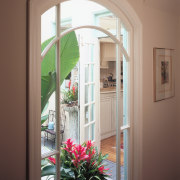
Originally, the kitchen and dining areas in this English-style home were divided into two separate rooms. Both looked out onto a small atrium, but the kitchen was quite dark and poorly laid out. The atrium, located in the centre of the house, brought light into the rooms surrounding it the kitchen, dining area, entry and breakfast nook. Prior to renovations, this internal garden was open to the elements.
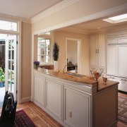
The homeowners wanted their kitchen to be more functional and have better natural light. To achieve this, architect Edward Kaplan joined the kitchen and dining rooms to create one large space that shares light from the atrium.
"Our aim was to increase the amount of natural light in both areas, and enhance the circulation between the kitchen, dining area and living spaces, as well as improve the functionality and appearance of the kitchen," says Kaplan.

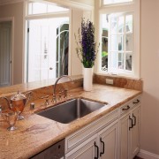
A small window in the kitchen was replaced with a new, slightly larger one. It features the same decorative architraves and transom as the rest of the house, including French doors in the dining area and an internal window in the entry foyer. The view through the atrium and into the kitchen helps visually connect the spaces in the house.
By removing and relocating an old skylight previously in a corner of the kitchen to the centre of the space, light is distributed throughout the kitchen more effectively, and cabinetry can be taken up to the ceiling.
To create a more functional kitchen, a doorway to the stairs and the garage was closed off. Work space is maximised by separating the kitchen and dining areas by a peninsular, rather than an island benchtop. Vertical elements such as tall cabinets and the refrigerator are grouped in one location, and the impact of the rangehood is minimised by building it into the cabinetry.
Interior designer Vernon Applegate, who also worked on this project, selected subtle, subdued colours and materials to enhance the English style of the home.

"Because we chose a neutral colour for the cabinetry, a bevelled edge around doors and drawers creates a more interesting look than a flat surface, and it suits the house.
"For the cabinetry, we found a paint colour that looked like teastaining, then applied a glaze over it to make sure the kitchen looked as if it had been there for some time. We didn't want a shiny new appearance," says Applegate.
A limestone benchtop and a splashback of handmade white porcelain tiles continue the theme. Door handles and a utility rack over the oven are made from wrought iron.
To make the atrium more usable, the old skylight was replaced and the walls painted in a shade of blue. Brightly coloured flowering plants create the look and feel of a Mediterranean-style internal courtyard, says Kaplan.
Story by: Trendsideas
Home kitchen bathroom commercial design
Surface attraction
Light-hearted by the sea
In tune with the land


