Black and white
Contrast is key for these townhouses between old and new, and light and dark
In a suburb of single dwellings, a set of four townhouses could look out of place. For these residences in a suburban area, it was important to create architecture that didn't contradict surrounding properties. In addition, the existing house at the front of the section was a protected 1880s Queenslander, adding another design element to the equation.
Kon Panagopoulos, of KP Architects, was approached to renovate the existing Queenslander and develop four attached townhouses to fit into the back section, a tight 1700m². Creating a set of residences that respected the existing historic house and its suburban neighbours was the top priority, he says.
"Most importantly, we didn't want to build homes that would be out of context," says Panagopoulos. "But attempting to replicate the ornate design of the house at the front of the property wasn't going to work either. In the end, we decided to build townhouses that complemented their surroundings by contrasting them. We would pay homage to the existing architecture by creating a juxtaposition of styles," he says.
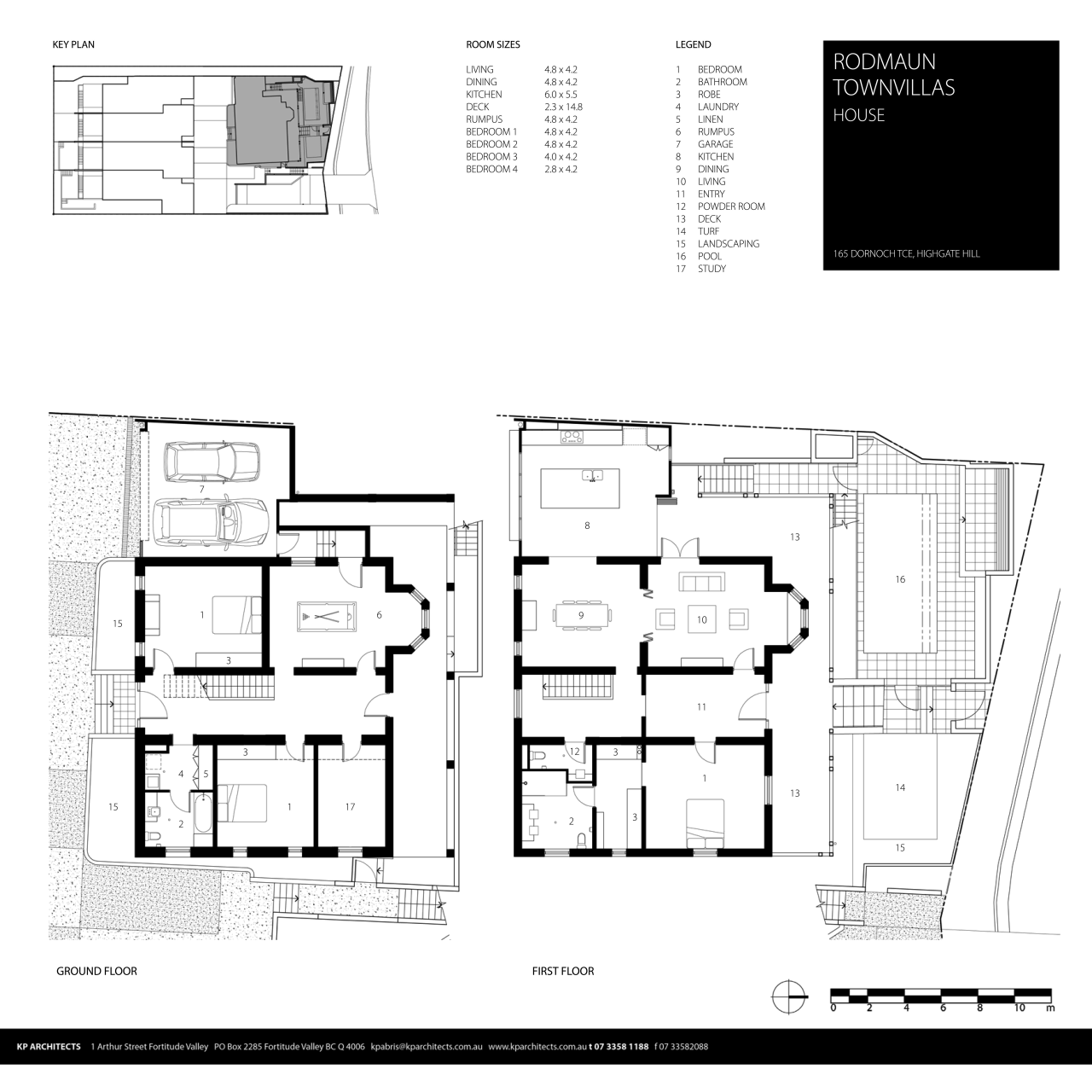
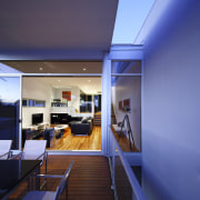
The houses were designed with two storeys at street level and an additional two on the slope below. On the top level sit the bedrooms, with louvres providing privacy from the neighbours. A kitchen and dining area is located at street level, with the main living area stepped slightly below. On the bottom level is a separate living area, designed for families with teenage children or for someone who works from home.

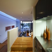
The kitchen was designed as the core of each home, with the other living spaces constructed around it.
"Although it is one of the narrowest spaces in the house, the kitchen was crucial," says Panagopoulos. "It's the first thing you see when you walk through the entrance and it connects all the other areas," he says.
"As with all terraced townhouses, the amount of space we had for windows was limited, and the site was south facing. Because of this, there was a real risk that the houses would be too dark. So another major concern was letting in as much light as possible, without creating a feeling that was too clinical."
A monochromatic colour scheme, accented with spotted gum flooring, was used throughout the interior.

"The houses are long and narrow, so the idea was to create an illusion of space without being cold. I wanted to break up the use of light colours with dramatic black and soft-hued timbers."
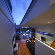
The living area was stepped down from the kitchen to create more roof space and a skylight was installed above the stairwell to let in more light.
"We used glass balustrading in the stairway to allow natural light from the skylight into the kitchen and living area, as well as into the bedrooms upstairs," says Panagopoulos.
Within the main living areas, the architect played with height, positioning the dining, living and kitchen areas on different levels of the house to create a distinction between the spaces.
Story by: Trendsideas
Home kitchen bathroom commercial design
Radical yet respectful
Sculptural centrepiece
Curvaceous and connected
