Balance of power
The juxtaposition of pattern, colour and texture creates a room's ambience

The holy trinity of visual tension pattern, colour and texture and the expression thereof is the basis in determining the ambience of a room. The designer's role in creating interiors that are inviting, relaxed and comfortable, formal or grand, is to a certain extent determined by their skill in getting the balance of all three right.
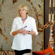
For Sydney interior designer Meryl Hare, the solution is to think inside the square.
"When selecting fabric and furniture finishes, all of a room's surfaces should be taken into account the walls, flooring, ceiling and special features."

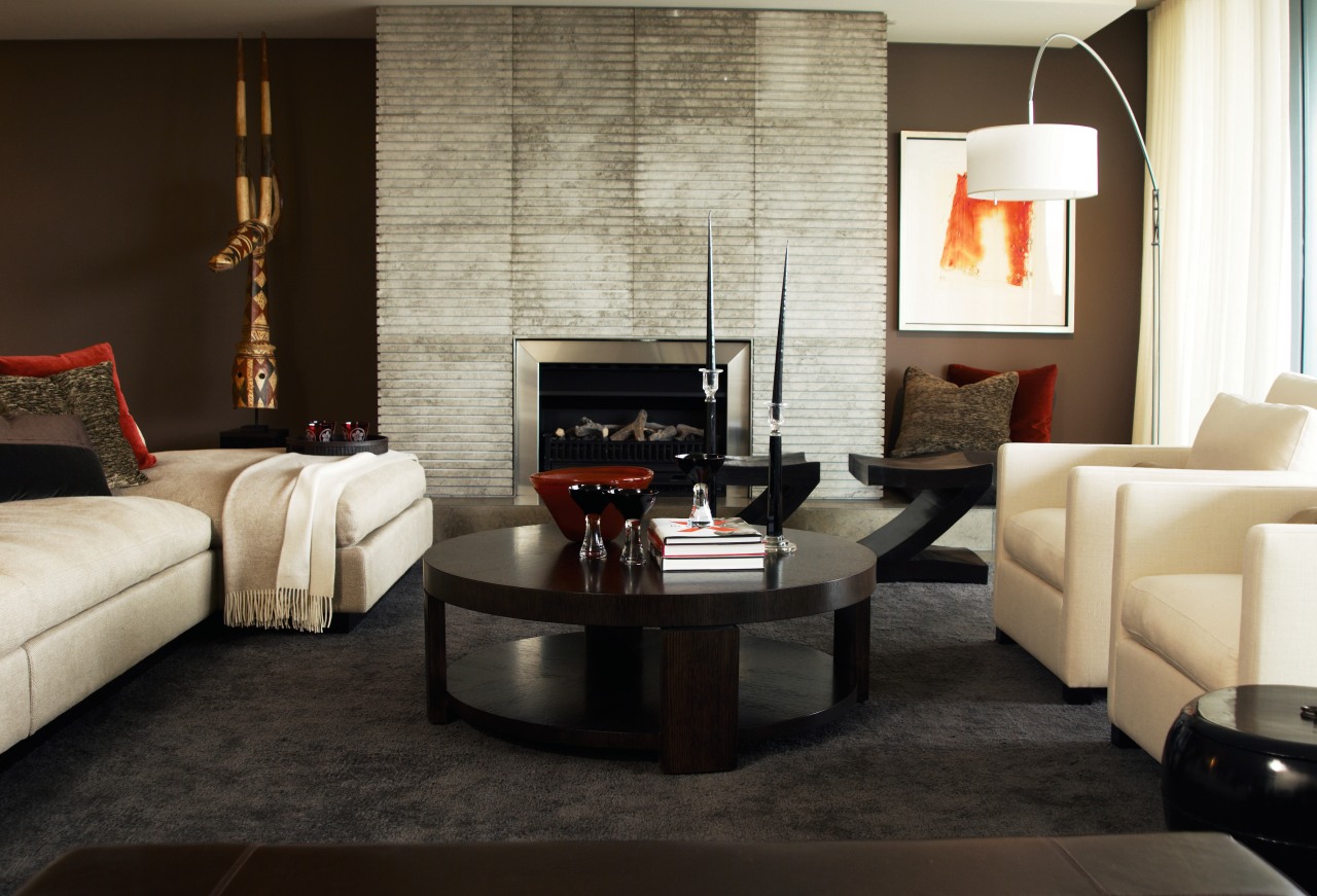
For the sub-penthouse featured on these pages Hare started with the colours of the shell particularly the stone floor tiles firstly adding a custom-made wool rug. The rug forms a dark, tonal, textured background to the seating area. This dark canvas effect was repeated in the colour of the feature wall, which runs the length of the room.
The sofa is upholstered in off-white linen which contrasts with the rug in both colour and texture. The ottoman is covered in polished leather, a smooth surface, again contrasting with the other fabrics in this area.
The tonality is punctuated by red highlights, the sparseness of which serve as anchoring points for the viewer's focus.

"Red is introduced with restraint, both in luxurious velvet scatter cushions and the glass vase on the dark walnut coffee table red is the lipstick of the room," says Hare.
Also acting as an attention grabber is the dining area, with its dynamic elements.
"The John Olsen painting, chairs and Ingo Maurer paper chandelier are the stars here," says Hare. "The contrast of colour in the graphic fabric design is deliberate, and is repeated in the chandelier, which has contrast as well as movement and texture. The table and console are deliberately dark. The overall ambience of this room is calm, but never boring."
Story by: Trendsideas
Home kitchen bathroom commercial design


