Accents in colour
Interior colours will look at home when picked out from the view, or from artwork
What is it that makes you feel everything is in its place as soon as you walk into a room? Well aside from effective storage systems colour plays a big part in the way objects fit within a space, and a space fits within its environment.
For architect Alexander Gorlin, colour choices are made in reference to the view from the window, and the level of light in the room.
"With an apartment, one whole wall is often taken up by the view. You can't ignore this as part of the room. If there was an old building of aged brick outside, I would want to integrate something of the red brick tone into the interiors. If the home catches the sunrise or sunset, I would capture the essence of this light in my paint choices or possibly in the choice of artwork."
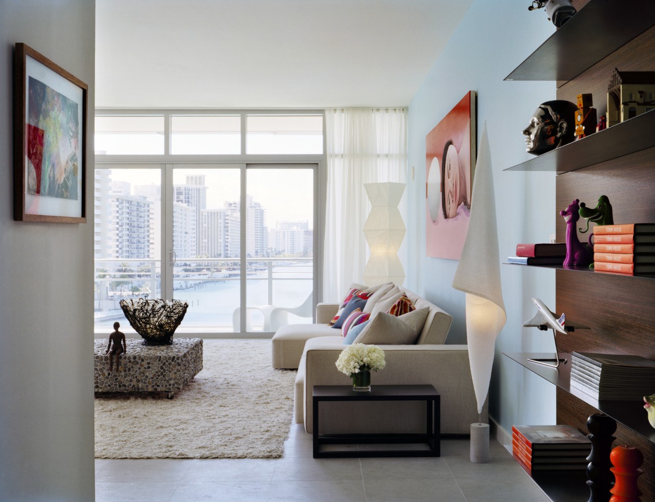
In the harbourside apartment pictured on these pages, Gorlin has chosen a pale blue for the walls, and a grey Spanish limestone for the floors. These tones relate to the colour of the sea and sky, as well as to the bleached nature of the light in the Miami area, where the apartment is situated.
"Colour accentuates the form and space of a room. White is nice as a backdrop to the colours of nature, but for me it is too harsh. I like to intensify it with a touch of either warmth or coolness. These blue-grey tones give a sense that the apartment is floating amidst its environment."
Contrast is also important. To punctuate the coolness of the walls, Gorlin chose a painting for the living room that makes use of warm, pink tones.
"I often look towards artwork for colour inspiration. The interiors in Jan Vermeer's paintings commonly come to mind when I enter a room which in turn inspire the colours I choose."
In older houses, Gorlin suggests breaking the boundaries of the existing style of the home.
"It is not necessary to follow through with the traditional look of your home's exterior. Sometimes it is better to introduce an element of surprise by steering away from what is expected. The light and view in the room are more important."
Story by: Trendsideas
Home kitchen bathroom commercial design


