Above the clouds
With pale, yet warm hues, this cliff-top kitchen appears light-filled and airy
While colour can be used to make a statement, neutral tones will withstand changing fashions.
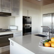
This is the theory designer Di Henshall swears by when planning kitchens such as this one. Before renovating, dark benchtops made this room seem outdated as well as dim despite the windows along one wall. Henshall installed new benchtops in a flecked white quartz.
"A tall, intrusive wine rack also blocked light to the kitchen. This segregated the space from the living room and left no allowance for interaction between the two rooms. The kitchen seemed to be purely a workspace, whereas modern kitchens are much more social places," the designer says.
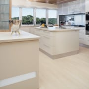
Henshall removed the wine rack, opening the living room to the kitchen, and also allowing for a larger, square island in the centre.
"A bulkhead was built above the new island, with lighting installed within. This illuminates the work area, and also acts as a decorative feature. Fluorescent panels along the underside of the bulkhead and across the front of the breakfast bar can be switched on for a soft, romantic effect."
Other lighting features are seen in the glassware cabinet. Colour-changeable RGB LED lights wrap around the corners of the shelves and project through the frosted glass door.
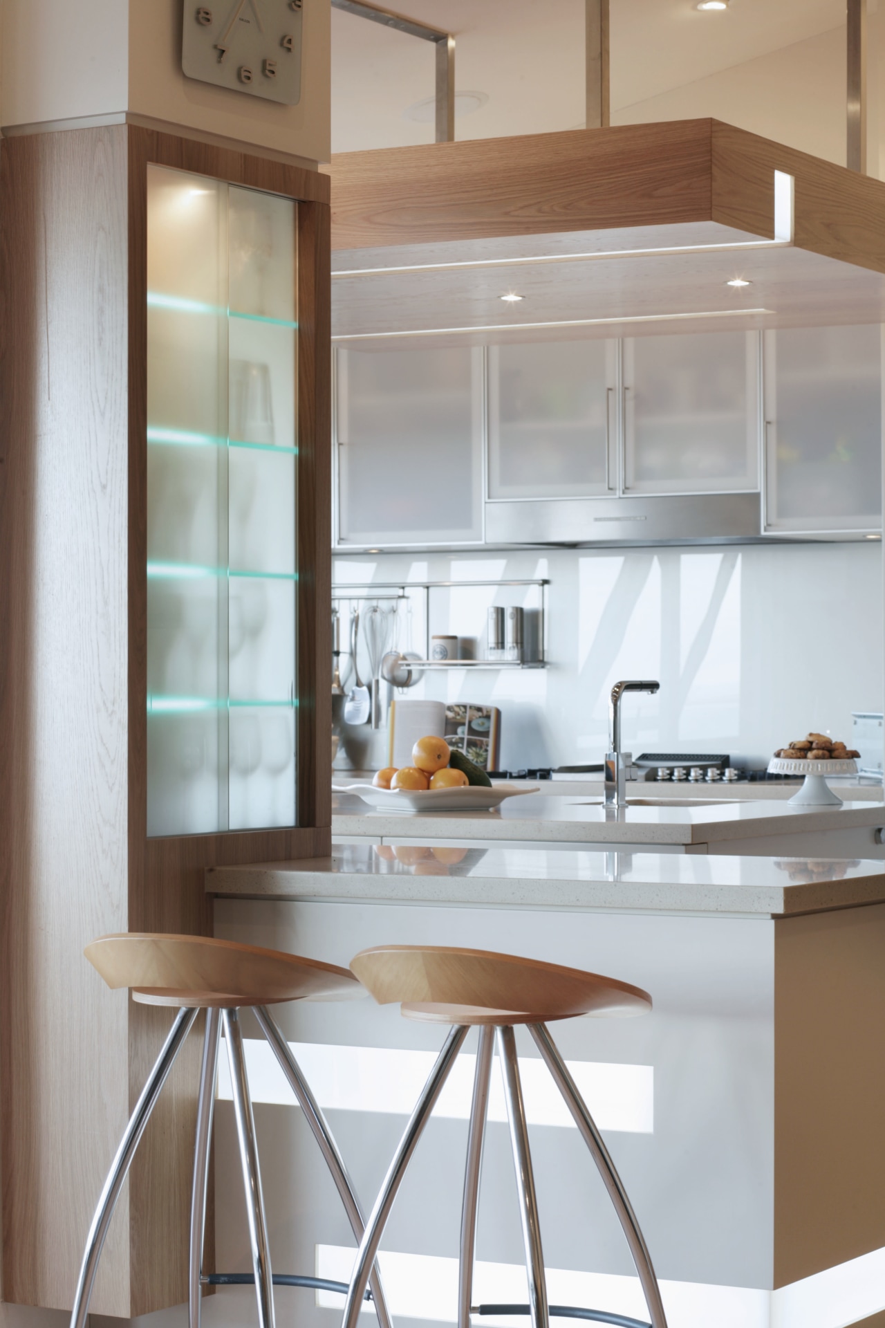
"This adds an element of drama to the kitchen great for entertaining, as it draws guests over to take a seat at the bar," says Henshall.
Frosted glass was also used for the overhead cabinets above the cooking area. As the splashback is a metallic painted glass, these aluminium-framed cabinets merge into the wall and do not visually intrude into the space.
To lend some visual warmth and prevent the kitchen from looking too stark, Henshall chose pale timbers to highlight the floors, bulkhead, glassware cabinet and bar stools.
Story by: Trendsideas
Home kitchen bathroom commercial design
Tranquil waters
Classic dovetails contemporary
Small space, big impact
