1990s home given modern design treatment
Contemporary home renovation updates 1990s house with new look, teak cladding and panelling, anodised aluminium joinery


A few simple, assertive design strokes can transform the look and feel of a home without the need for budget-breaking grand gestures.
When it comes to house and interior design, a great deal can change in a few short years. This three-level house was built in the 1990s, but its tinted green glazing and bronze window frames had given the exterior a dated feel, says project architect Tomas Jaramillo of Ong & Ong, who undertook the renovation project together with interior designer BK Teo.
"We were on a limited budget and needed to make simple changes count. Most work was on the interior, but we replaced the bronze frames with anodised aluminium, and put clear glass in the windows. The facade was simplified and reclad in teak. We also put a raised platform in the wading pool alongside the house to make it safer for children.
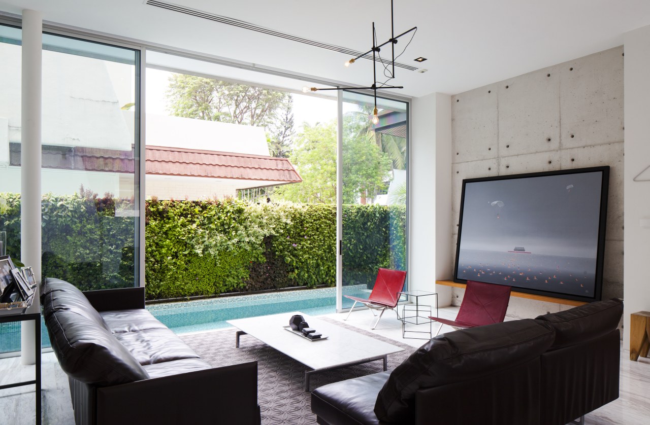
"The owners wanted the rather cluttered interiors to be given a contemporary, almost minimalist look. Consequently, we took out the walls between the kitchen, dining and living areas, and opened them up into a single large entertaining space on the ground level."
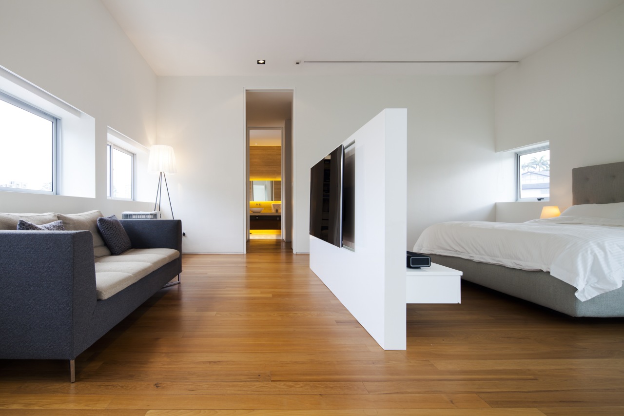
Jaramillo says some rooms were repurposed, and a new master suite with walk-in wardrobe was added into the previously under-used third floor attic. In addition, all the bathrooms were replaced.
"Much of what we did on this project was a subtle reworking of what went before," he says. "For example, the chrome and glass balustrading on the stairs had been a prominent feature. For a simpler, cleaner look, we boxed in the balustrades on both sets of stairs. We used teak panelling for this on the ground level, which we also used to conceal storage and an entry to a powder room. The upper balustrade was painted white to match the walls."
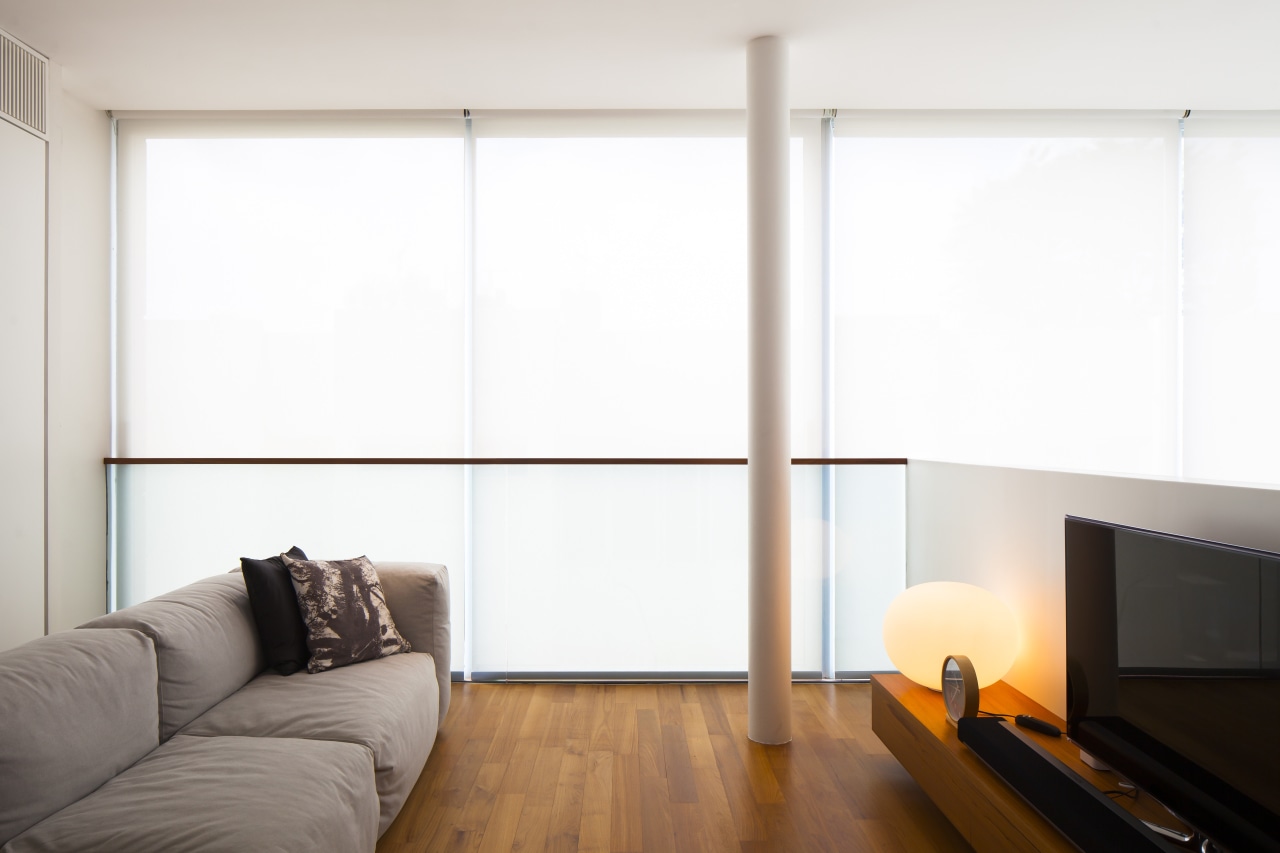
Existing marble floors were retained, along with a parquet floor in the master bedroom.
Jaramillo designed a bookcase at the top of the landing to screen the television room from the light-filled space opposite. The teak shelves do, however, allow filtered light through and let parents keep an eye on proceedings.
"We also designed a new L-shaped kitchen that would be on show to the open-plan living spaces. This has a wet kitchen that can be closed off and kept out of sight when the owners are entertaining. The dry kitchen is mainly in stainless steel and roughcast concrete, giving it an industrial edge. Similar roughcast concrete panels at the other end of the room serve to bookend the space."
BK Teo worked closely with owner Hwee Sze Lim on the furniture selections, spending days reworking and test fitting with 3-D visuals to arrive at the final selections. He says the look was to be that of classic, modern furniture.
"We chose mainly simple, iconic pieces from famous design houses. The Cassina living room sofas are a good example low furniture also adds to the impact of the open volume. We selected a mid-tone upholstery leather to complement the generous use of teak in the room."
A classic E15 Bigfoot dining table is a highlight this is robust enough to withstand the knocks from family living. Hans Wegner Wishbone dining chairs were chosen for the adults, with a bench seat for the children.
"The dining area is the only double-height space in the home and we accentuated this volume with two Raimond Lamp pendants by Raimond Puts for the Dutch designer brand Moooi," says BK Teo. "I also selected a modern chandelier from US design studio Workstead for the living room, and three pendants in the kitchen from Danish designers, &tradition."
Jaramillo says the renovation has added a sense of spaciousness and flow to the home, and given it an understated relevance for the 21st century.
Story by: Trendsideas
Home kitchen bathroom commercial design

Renovation Trends Vol. 30/5
Renovation Trends showcases innovative makeovers – big and small. The book features kitchens, bathrooms, interior makeov...
Read More