Image 2 of 8
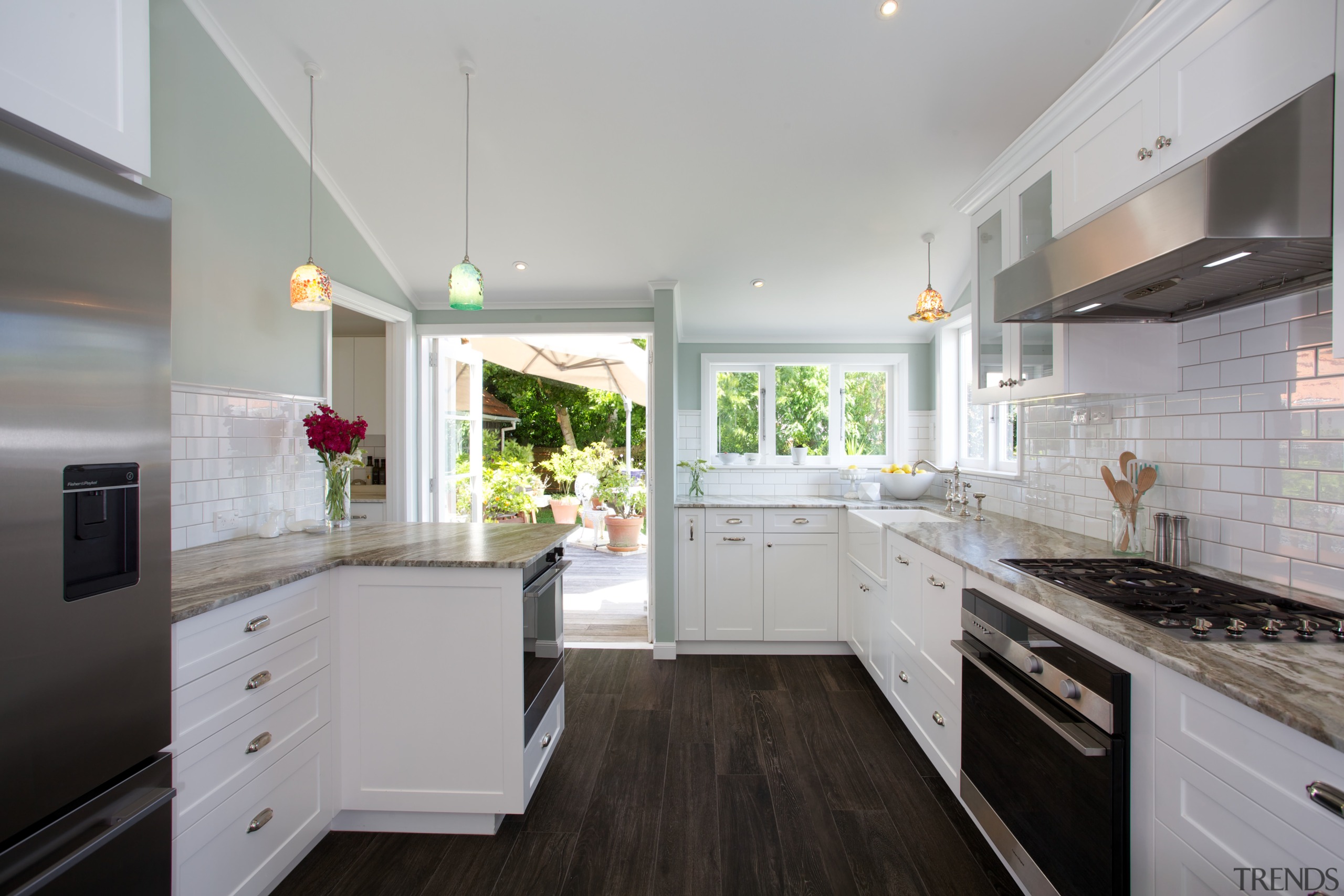
He wanted blue, she wanted white together they achieved a two-tone colour scheme that ideally suits this traditional kitchen which is open to the dining area. Grey grouting was chosen for the crisp white subway tiles to make them pop, the desi
He wanted blue, she wanted white together they achieved a two-tone colour scheme that ideally suits this traditional kitchen which is open to the dining area. Grey grouting was chosen for the crisp white subway tiles to make them pop, the designer says.
Light, white classic kitchen
04 Feb, 2015
Home kitchen bathroom commercial design


