Modernist house with contemporary art gallery interior, courtyard entry
Modernist house with simple, cube-like exterior, designed by architect Dan Wheeler and interior designer Sherry Koppel to house large art collection.


Moving houses because you need more space for a growing family is a common enough practice. Not so typical is the need to move house because you require more room for an expanding art collection.
But that was one of the motivations behind the decision by the owner of this new house to start over. The widow, who has many grandchildren, also loved the idea of a single-level home with no stairs.
"When a friend, interior designer Sherry Koppel, suggested I build a new home, a light bulb went on," the owner says. "I could see we could create a much more airy, spacious interior to show off the artworks."
After interviewing several architects, the owner asked Dan Wheeler of Wheeler Kearns Architects to design the new house.
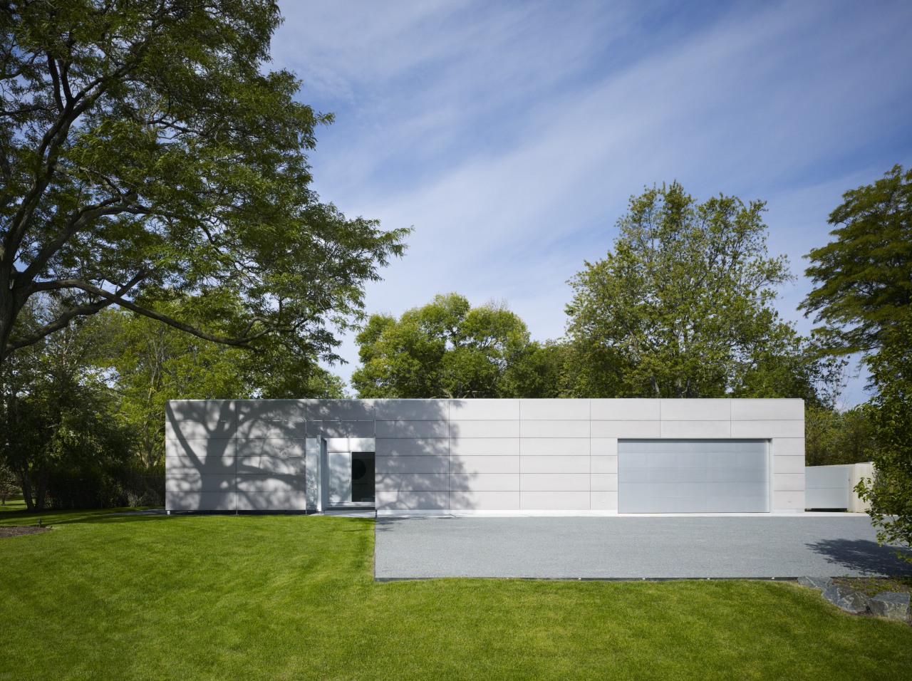
"The property is a corner lot facing two relatively busy streets and opposite several reproduction Tudor houses and typical Midwest builder homes," Wheeler says. "This house was always going to be different. We wanted to keep it as modest as possible, and super simple."
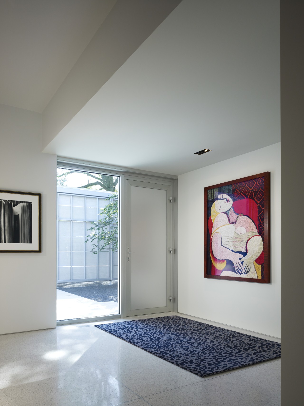
The house effectively turns its back to the street, presenting an uninterrupted cement board facade, punctuated by a simple garage door. On the left, the house steps back to reveal the front entry. Here again, the emphasis is on what lies beyond. The entry is through a walled courtyard, screened by a large door that creates a perpendicular wall when propped open.
"The high walls around the courtyard, appear as an extension of the siding panels," says Wheeler. "They help to make the entry more opaque while still letting a little light in between the panels. In a sense the courtyard is a decompression zone between the outside world and the inside of the house."
Wheeler describes the house as multi layered, much like an onion, with the various layers peeling back as you proceed through the entry.

To simplify both the design and the construction, the building was designed to work with the 8ft by 2ft cement panels.
"It's a square building defined by nine 24ft square bays, with the rigorous 8ft modules extending into the surrounding landscape."
Sherry Koppel says simplicity was also the focus for the interior design. All the ceilings in the living areas are 10ft, while the ceilings in the transition spaces are 8ft.
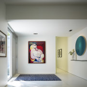
"To provide a suitable backdrop to the owner's extensive collection of contemporary art, all the walls, trim and ceilings are painted the same shade. It's a very soft gray with a subtle hint of blue, and the effect is just like being in a cloud. It is enhanced by the white epoxy flooring.
"It's the artworks that add life and a sense of humanity," the designer says. "This is a far cry from the owner's former house, where the art was so crowded it didn't have a chance to breathe, and many pieces were lost amid the clutter. Here, every piece has been given space, and works have been specifically selected for certain areas.
"For example, the photographs, that need to be kept away from sunlight, are hung in the gallery in the long circulation area leading from the front entry."
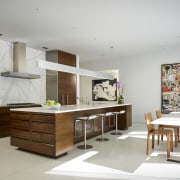
To retain visual continuity, the same material palette appears in all the rooms. All the millwork and built-in cabinets feature Hawaiian Koa wood, which was chosen for its beautiful grain.
"I like consistency in design," says Koppel. "It helps to impart a very peaceful quality to an interior. The same Koa wood can be seen throughout the house, and white Corian countertops also reappear."
These materials define the kitchen, at one end of the large living area. But here, Koppel also added a full-height Carrara marble backsplash, which has distinctive veining. Part of the leftover slab was used to build a custom kitchen table.
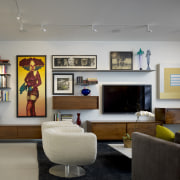
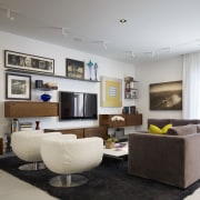
While the artworks are the key feature of each room, they are complemented by the built-in cabinets and designer furniture pieces. The dining room features a 16ft cantilevered koa wood buffet.
Cantilevered wood cabinets and shelves are also a feature of the family room, which has the "busiest" wall in the house, says Koppel.
"This wall is a composition in itself, and was designed around the artworks. Everything on the wall floats, including the cabinets and shelves. It creates a very Modernist look."
Textural contrasts in the furnishings add further visual interest. Soft mohair fabrics, shearling, chenilles and copper metallic fabrics make a dramatic statement against the shiny epoxy floor.
In the master suite, similar neutral tones keep the look tranquil, although an aubergine pillow and bright painting add a welcome richness.
Credit list
Architect
Structural engineer
Cabinet company
Roofing
Outdoor furniture
Paints and varnishes
Rug in living room
Art works
Kitchen cabinetry
Backsplash
Faucets
Refrigerator
Kitchen stools
Bathroom faucets
Interior designer
Builder
Siding
Pool
Concrete bench in courtyard
Flooring
Sheer curtains in living room
Heating
Living room chairs
Countertops
Sink
Oven, cooktop and ventilation
Dishwasher
Bathroom basin
Bedroom linens
Story by: Colleen Hawkes
Home kitchen bathroom commercial design

Trends Vol 31 No 2
Whether a large sleek contemporary, a cottage with a warm traditional aesthetic, or a glass-walled apartment high above ...
Read More