Image 23 of 31
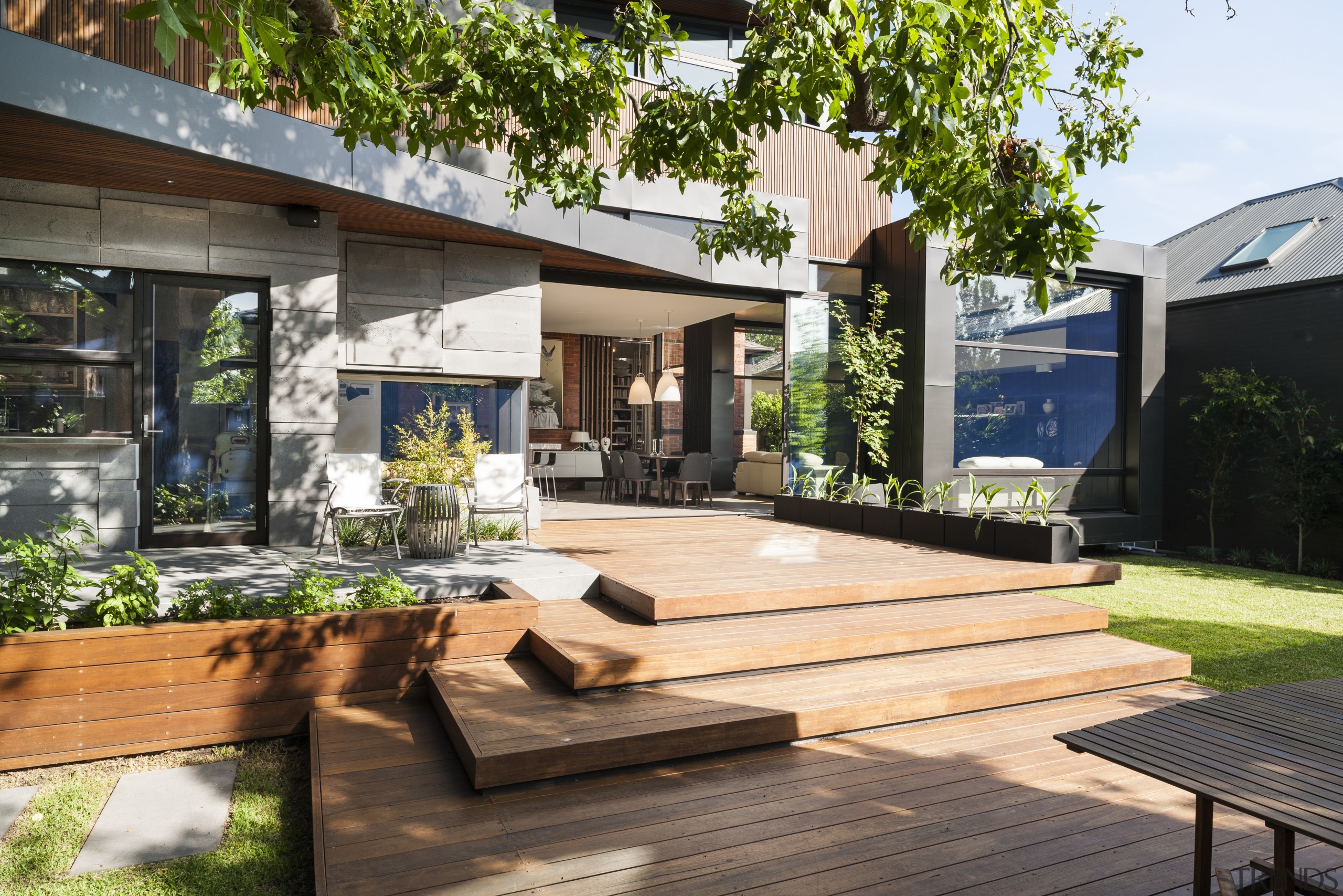
The rear of this renovated home is a composition of lines and geometric forms. The square frame element corresponds to the high-ceilinged living area on the interior. The zinc cladding is allowed to oil-can, or warp slightly for textural interest. Th
The rear of this renovated home is a composition of lines and geometric forms. The square frame element corresponds to the high-ceilinged living area on the interior. The zinc cladding is allowed to oil-can, or warp slightly for textural interest. This material zigzags down the other side of the extension, visually linking the upper and lower levels. To the left of the sliding doors that open the extension to the deck and yard is a sunny reading nook. An outdoor kitchen is further to the left. The renovation is by Nicholas Murray Architects.
Honest expression
10 May, 2014
Home kitchen bathroom commercial design


