Vanishing act
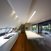
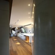
This kitchen was designed as a seamless, quiet backdrop to a dynamic living space defined by a series of sculptural elements

The idea that less is more can be readily applied to many contemporary interiors, and this house is no exception. Designed by Andrew Gutteridge and Anne Sulinski of Arkhefield, the house offers a very modern interpretation of a traditional Queenslander.
Like those early houses, the sheltering roof is a key feature, but here the roof form is extruded to wrap down one entire side of the house. In doing this, the roof effectively closes one side of the house and opens it up to the northeast on the opposite side.
Not surprisingly, the roof element informs the interior, especially the kitchen, which is tucked into the slope of the rear wall.
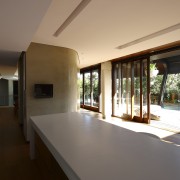
"The interior has been kept deliberately simple and uncluttered to ensure the form of the roof is legible," Gutteridge says. "When you are sitting in the dining room, or at the kitchen island, the sloping wall makes for a very contained space, even though these are spacious, open-plan areas that open to the outdoors."

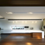
The slope is accommodated by a long, white benchtop that also acts as an ordering element. The bench runs the length of the kitchen and reappears in the formal dining area where it forms a sideboard. Both the benchtops and perimeter drawers feature crisp, white Corian.
"The real challenge was to make everything on the rear wall disappear, so the kitchen would be a subtle backdrop," says Sulinski. "The main focus needed to be on the quality of the overall space and the connection with the outdoors. Hence there are no handles on the drawers, which feature electronic touch sensors so they automatically open and close."
In keeping with the need to minimise detail, the island has a long, cantilevered Corian benchtop. This is visually anchored at one end by a seamless, bookmatched spotted gum cabinet.
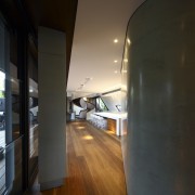
To retain the sleek look, there are no overhead or full-height cabinets in the kitchen. The refrigerator and additional storage are accommodated in the pantry. This semi-enclosed, trapezoidal room has polished plaster walls that mimic the extruded section of the roof.

Gutteridge says the pantry is one of three separate sculptural objects designed to look as though they have been dropped into the open living space. The other objects are the kitchen island and a circular staircase.
"The pantry hides all the items that would normally clutter up a kitchen," says Sulinski. "It also incorporates a drinks area, a small sink, and a laundry chute."
Appliances that need to be positioned in the main kitchen are designed to visually recede into the background. The dishwasher is integrated into the Corian cabinetry, and there is a custom-designed ventilation unit that sits flush on the sloping wall.
"We didn't want a hood projecting down from the ceiling," says Sulinski. "This unit vents the air sideways, and the design complements the clean lines of the kitchen."
Credit list
Builder
Cabinetry
Dishwasher
Sink
Water dispenser
Flooring
Benchtops
Ventilation
Refrigerator
Tapware
Story by: Colleen Hawkes
Photography by: Scott Burrows
Home kitchen bathroom commercial design


