Streets ahead
The new head office for the Department of Immigration and Multicultural Affairs (DIMA) brings together 1800 staff, in a building broken up into streets' and neighbourhoods'. It is also a government role model in energy efficiency
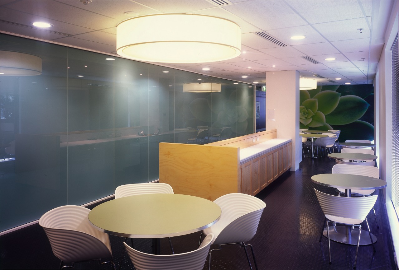
Gathering together a vast number of staff from separate addresses into one, very large head office requires careful consideration. Not only are the build logistics a challenge on such an upscale project but there is the human factor to consider how to give the space a sense of humanity.
These considerations and environmental sustainability were three key factors addressed when HBO+EMTB created the DIMA head offices in Canberra, owned by Challenger Financial Services. HBO+EMTB was responsible for the planning and design of the base building and integrated fit-out.
The director of HBO+EMTB's Canberra office, Kirsten Rodgers, outlines aspects of the project.
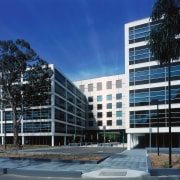
"DIMA's head office is one of the largest government projects undertaken in recent years, consolidating 1,800 staff into one location," she says. "The building's 34,100m² of floor space incorporates two separate wings, each six levels plus basement parking, connected by a central link."
The floor plates break down as 2,080m² of floor space on the northern wing and 2250m² of floor area on the southern building.
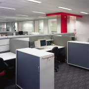
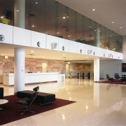
To address the need for a human scale when faced with such large floor plates, HBO+EMTB created functional environments consisting of a town square', or central atrium, with neighbourhoods' for the various departments located in each wing. The building was naturally designed from the inside out to address this concept.
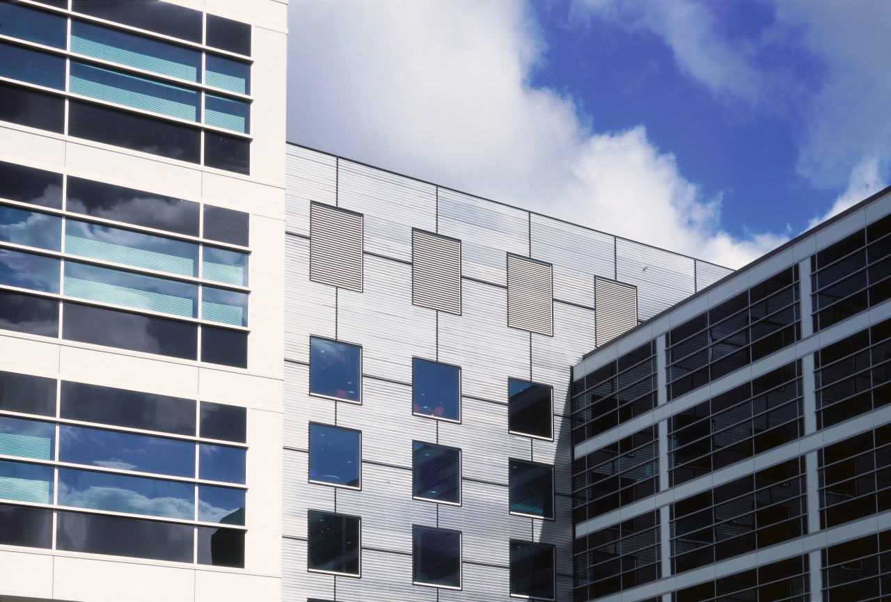
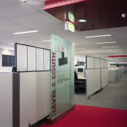
There are even colour-coded streets' running across the upper five levels of the head office's linking element. They provide speedy orientation in the vast building and also bring a feeling of localisation, even intimacy to the disparate areas.
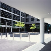
The double height atrium, or town square, features a front wall of glazing, giving it a strong visual connection with the exterior piazza in front of it. The overall effect is a welcoming one, making light of the overall scale.
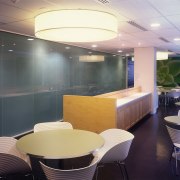
The entire building sits on columns, linked by glass, giving the structure a sense of floating and again softening its build forms. This all means that the building encourages approachability a cafe on the ground floor of the north wing, for example, is open to the public as well as staff to wander into.
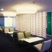
Elsewhere in the atrium and throughout the head office, there are other shared facilities such as meeting, conferencing and breakout spaces.
The building is as forward-looking in its environmental emphasis as it is in the accommodationof its staff. To this end, government reports have cited it as a flagship for Energy Sustainable Development. Several individual architectural approaches were taken.
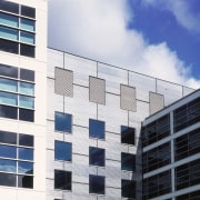
"Building on a south-to-north orientation reduced exposure to the sun's rays," says Rodgers. "The facades, broken down into window grids, use high-efficiency, solar-treated lowE glazing."
Other elements addressed include energy efficient lighting equipment, representing huge savings when specified on this scale, and environmentally in-tune plant and air handling equipment.
With site constraints ranging from existing tenanted buildings through to heritage listed trees, the upscale construction was undertaken in three stages, with the architectural firm and constructors, Bovis Land Lease, working in close collaboration.
As well as overcoming logistical problems, the staggered stages of construction allowed the influx of staff to happen in stages, helping them to come to grips with the head office's scale bit by bit. This included many staff visiting the site before it was completed and before their own relocation there.
"Even considering the building's size and capacity, the individuals at its heart were always our prime consideration," says Rodgers.
Credit list
Architect and interior designer
Project manager and main contractor
Electrical, data, security and communications
Hydraulic services
Acoustics
Surveyor
Access consultant
Cladding
Blinds
Joinery
Wallcoverings
Reception furniture
Kitchen equipment
Owner
Structural engineer
Civil engineer
Mechanical engineer
Geotechnical engineer
Quantity surveyors
Data/communications
Roof
Tiling
Flooring
Workstations
Breakout furniture
Lift services
Story by: Trendsideas
Home kitchen bathroom commercial design
Vintage tones, modern presence
Personality plus
I cover the waterfront
