Office fit-out caters for continually changing work requirements
New premises for a media and entertainment production company establish brand identity through how its employees use and interact with the space rather than through overt brand messaging
For many companies in today’s fast-paced,ever-changing business world, the most effective way to grow is often through acquisition. But when a company is an amalgamation of several small creative companies, how do you provide a unified work environment without employees feeling they’re now just a cog in a large, structured office.
That was the challenge Montreal media and entertainment company Attraction Media presented to Imperatori Design for the design of its new facilities.
Attraction’s rapid acquisition-for-growth programme had seen the company expand to 300 employees, divided into activity sectors across three floors of an industrial building, with each activity retaining its own corporate identity.
Imperatori senior designer Chantal Ladrie says Attraction wanted to change that closed office environment and move all staff to a single floor space of 4925m² that still recognised the different team activities while at the same time encouraging interaction across the whole company.
“The plan is like a small city, with neighbourhoods here and there that people can wander through and meet others,” says Ladrie.
Central to the city/neighbourhood layout was the creation of a ‘downtown’ area to act as a focal point for everyone.
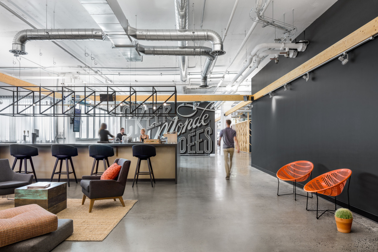
This function is fulfilled by a large lounge complete with a barista coffee station which employees, clients and collaborators first encounter when they walk into the premises. It’s a place for casual or social meetings, an alternative workplace, or just somewhere to relax.
A low stage at one end of the lounge means the space can also be used for large events.
While departments such as finance and legal have dedicated spaces in the fit-out, Ladrie says offices in those areas have no doors and so still reflect the open nature of the wider fit-out.
The rest of the space is designed to give maximum flexibility in the way it can be used.
“Because they are producers, the work programme changes all the time – and the number of people in the premises can vary greatly through the year. Teams need to be able to assemble for a project, and then the teams break up when it’s complete and assemble somewhere else.
“But because this space is so big, we didn’t want it to feel like it was a sea of workstations.”
To counter this – and to stay within the modest budget for the fit-out – the company’s existing white melamine workstations were grouped together and a black steel frame added at the end of each grouping.
“This allowed us to take power to the workstations without cutting into the concrete slab, but also meant we could add planters, TVs or white boards into the frame to give the space more character.”
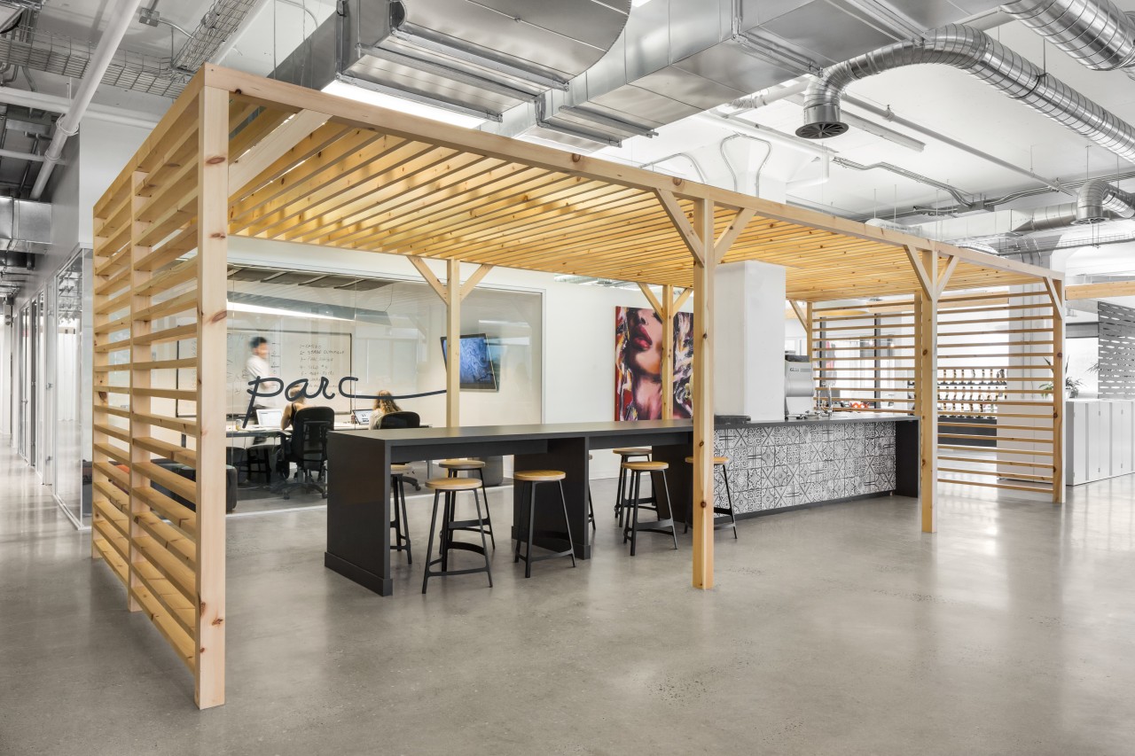
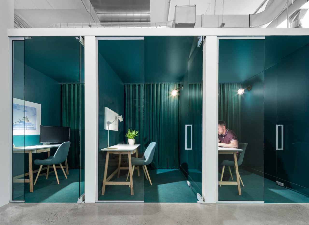
Added work flexibility comes from the variety of meeting and personal spaces dotted throughout the floor. These range from small, vibrantly coloured telephone booths to four large polycarbonate boxes configured for more focussed activities.
Ladrie says that Attraction wanted its fit-out to express its brand values rather than having them overtly portrayed in the design.
“They have a lot of artists and movie people coming to the premises and they wanted them to see and feel that they were in a friendly, creative space, not a highly structured office environment.
“It also has an identity that very closely reflects the Mile End area where it’s located, which is one of Montreal’s most hip and cool areas. So it’s an attractive place for younger generations to work.”
Credit list
Project
Interior design
Project manager
Ceiling panels
Lighting
Location
Construction
Flooring
Paints
Story by: Paul Taylor
Photography by: Stéphane Brügger
Home kitchen bathroom commercial design
Commercial Design Trends Vol. 35/1C
A new commercial office building can sometimes be more than just a place to work – it can also be an integral component ...
Read More


