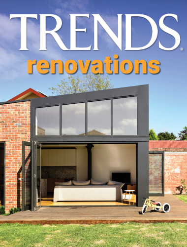
A renovation with a difference
This renovation and expansion expands on the original home's functionality while better aligning the home with neighbouring properties. Part of this was creating a new façade that skirts around a mature tree


Designed by TBA / Thomas Balaban Architecte
Located in the fast-developing Rosemont-La Petite-Patrie borough of Montréal, deNormanville is part of the first wave of post-moratorium additions exploring new avenues for the transformation of the city’s disappearing one-storey typology, commonly referred to as “shoeboxes”.
By preserving the original structure and the site’s mature trees as its primary point of departure, the project responds in a straightforward but ultimately radical way to the principal challenges of designing an addition to the small, vernacular structure set at the rear of the lot.
Delicately weaving across the site’s landscape, it reaches out to restore the continuity of neighbouring façades.
While the old structure now finds itself preserved at the heart of the new home, the project re-establishes the presence of the one storey typology in the heterogenous family neighbourhood dominated by Montreal’s renowned “missing middle” plex housing. (A concept used to describe a range of multi-family or clustered housing types that are compatible in scale with single-family or transitional neighbourhoods.)
It is a gesture that is modest, minimal, and memorable in its urban context.

Having had the property for several years, the owners wanted to expand their tiny back lot home to accommodate the growing family. This meant additional bedrooms, larger living spaces, and spatial separation between the private rooms and socially focused areas.
From the onset, both owner and architect shared the desire to conserve the single storey and its direct connection to the surrounding outdoor space.
Realising their desired home with limited means was a 3-year long process, a variety of options were explored that could reconcile needs, budget, and zoning.
In the end, the front yard extension that layered indoor and outdoor space remained the most feasible and exciting prospect.

The layered volume developed step-by-step.
The first move brought the extension forward to align with the frontage of its immediate neighbours; its façade carved out to provide a protective space around a Siberian elm that interrupts the continuity of the façades’ alignment.
This satellite volume is then connected back to the original house via a corridor that runs along the east firewall of the property. It incorporates kitchen, toilet, storage and laundry spaces, and mechanically connects old and new. The exterior wall of the corridor is blended into the street front volume with a curve that reflects the tree well on the front façade, delineating the central outdoor courtyard that showcases the original house.
The result is a sinuous boundary between interior, architecture, landscape, and urban context.
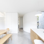
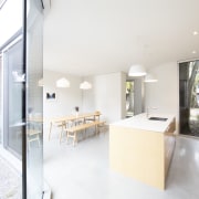
The house’s new front yard/mid yard/back yard structure clearly defines the home’s internal configuration. Quiet spaces such as the bedroom and living room are reorganised within the original masonry, and the wood structures at the rear of the lot with more intimate windows and lower ceilings are ideal for private, insulated environments.
The more boisterous family spaces move up front, street side. They are large and open, punctuated by the clean geometry of sculpted forms (a cube and a cylinder) that define the generous entrance.
The kitchen-dining room is very much at the social head of the new house – all at once communal family workspace and assembly hall.
Large glazing offers a physical and visual connection to the central garden and back to the house’s original façade.
Different approaches were taken for the new and old structures, unified through clean lines, minimal detailing, and a restrained palette of light maple, pale concrete, and white paint.

The centenary structure sits on stone foundations while the new extension floats on the soil, supported by piles to avoid damaging the root systems of the trees.
The juxtapositions continue indoors with rough and smooth textures, and warm and tough materials complementing and playing off against one another.
From the onset, the intention was to celebrate the minimal, practical qualities of the original typology, to preserve the feeling of the “maison de plain-pied”, and to give the extension an iconic quality rooted in a modern interpretation of the original one-storey structure.
In its reading from the street, the project asserts the proud but modest character of a “shoebox” house through contemporary means and geometric abstraction.
Its textured pale brick façade is curved around a tree on one side and punched with a modern, open, and bright entry on the other.
Inside, a translucent closet block separates the living space from the bicycles in the front entrance.
It unabashedly allows inventory of readily available outdoor gear, filtering of light, and obscuring passing views.
The project acknowledges the home’s heritage, its immediate context, and its contribution to the street.
Home kitchen bathroom commercial design
Renovations
Renovating your home is an opportunity to refresh, expand and renew. Here's all the inspiration, ideas and information y...
Read More