Long distance love
This responsive interior for a remote Isle of Man home was briefed for, envisioned, presented, and supplied in large part from New Zealand


Interior design by Amanda Neill, Designworx
From the interior designer:
A well designed home transcends continents and cultures – it is a reflection of the people within it, nurturing how they live, love and laugh within the spaces, reflecting their character and passions in life.
Working remotely from New Zealand on this Isle of Man residential renovation, has opened some global doors.
Technology and globalisation have given us the tools to communicate so that we can operate seamlessly with the owners to provide an overall design that they love.
It was an honour to be asked to join the UK team and collaborate on this project from the other side of the world.
Overview
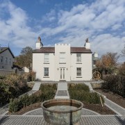
The original 18th Century house, built of Manx stone and rendered, was retained and extensions behind it demolished to create space to build a new wing, following the Manx stone style.
The original dwelling was converted into a quiet lounge and music room on the ground floor level, and two bedrooms and bathroom for the children on the first floor level.
The new extension houses family living and kitchen, with bedrooms above, and under the ground level, a gymnasium, steam room, children's media space and cellar.
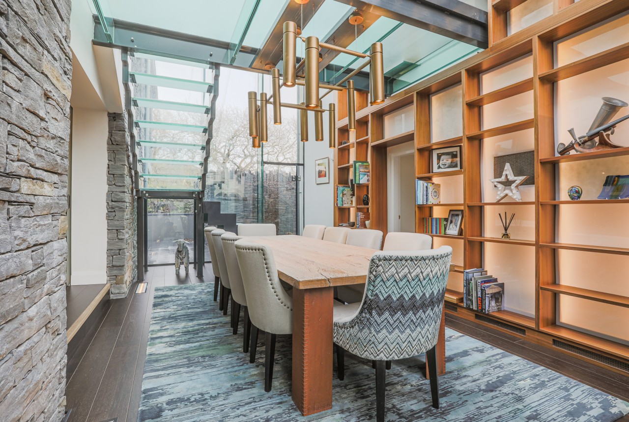
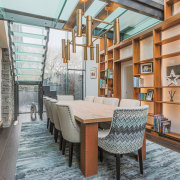
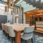
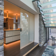
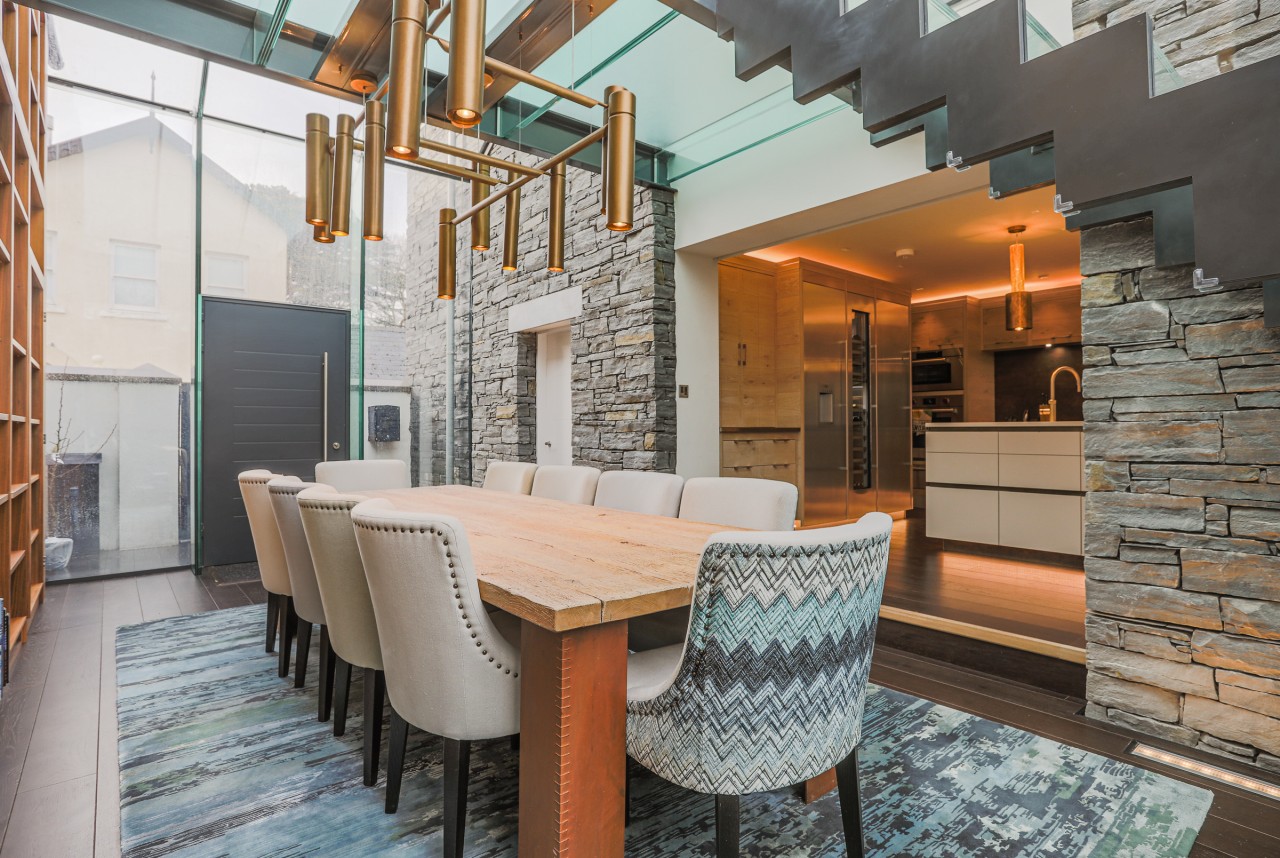
A frameless structural glass link connects the old and new buildings, with a feature glass stairway and walkway over a large dining hall.
The homeowners wanted a walk through the house be like peeling off the layers of an onion.
Public areas will have a wow factor that was to feel impressive but not be based on surface glitz.

Owners' brief:
Working with different personalities requires an integrated design to reflect both.
I asked both homeowners to pick three words that relate to their personality and that they would like the house to reflect.
One response was "cosy, sociable and relaxed" and the other was "convivial, elegant and cultured".
They both wanted the moods to change as they moved through the house, with different aspects of their house reflecting different personality traits and activities.
The owners wanted the house to tell a story and to encapsulate their personalities in a considered and generous way, but without being at all ostentatious... still below the radar.
In fact, the architect and builder as well as the glass link maker all commented that it will be a stunning house that not necessarily many people will see.
The homeowners wanted a walk through the house be like peeling off the layers of an onion.
Public areas will have a wow factor that was to feel impressive but not be based on surface glitz.

Scope of work and products
As interior designers, our role was to collaborate with the other team members to achieve the final design.
This included liaising with the architect, lighting designer, kitchen designer, bathroom designer, cabinetmaker, and window treatment manufacturer – all of whom are based in the UK.
We also worked closely with our furniture and soft furniture manufacturers in New Zealand to ensure production ran smoothly and manufacturing quality was at the highest level, organising a 12m container to be shipped to the Isle of Man from New Zealand.
Our role was to detail the furniture layout of all areas, and design spaces that pulled together all the colours and hard and soft finishes required to fill the owners' brief.
This spanned every space in the house and covered every detail in it.
Elements included: hard and soft flooring (carpet, floorboard colours); interior paint scheme; feature walls; furniture & upholstery; decor & soft furnishings; window treatments; bathroom tiles & finishes; feature lighting; kitchen & utility room finishes
Designing from afar
Because we were working remotely from the other side of the world, a huge focus was on communicating the design scheme to the homeowners clearly, through the written word, images and a lot of meetings over Skype.
We really needed to listen very carefully to how they wanted the space to feel and then translate that into the scheme.
Once the owners had approved the scheme via the schedule, we moved onto to the next step to help them visualise what the space would look like when it was completed.
Using technology, we worked with a team of graphic visualisers in India, who were able to produce a rendered image based on the architectural plans, room layouts, and the information on all the products we sent through.
They were then able to produce an accurate visual, making it easy for the owners to feel confident in what the proposal was.
The resulting design solutions – room by room
Family areas
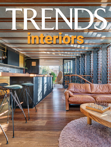
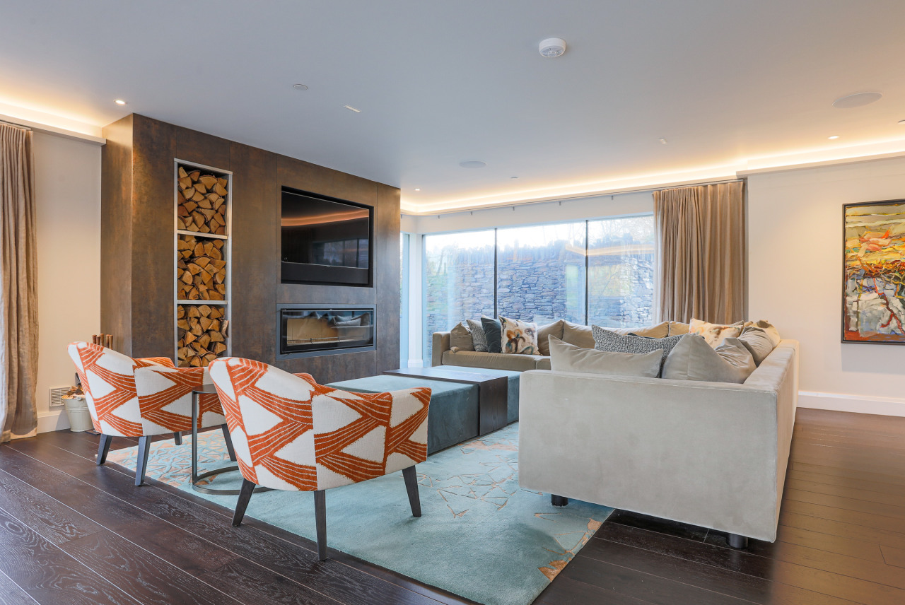
The new living and kitchen areas were to feel relaxed, cheerful and modern – inviting people to lean over the counters to pick at food, lounge about or loll in front of the fire.
Mostly, it was to be a family space; a place to eat, do homework and talk. Behind the kitchen was a utilities room which was the functional space in the area.
In response, the family areas are open plan and the sofa was upholstered in a dry velvet and selected for its large proportions and softness.
The custom-made rug in 100% NZ wool tied together the colour palette of the warm blues and burnished oranges – orange being a colour of communication and connection.
Linens with texture and woven pattern added layers of interest.
The repeated soft curves of the armchairs, barstools and dining chairs were chosen to soften the space and help create a cosy relaxed family atmosphere.
The finish in the fireplace facade and the kitchen splashback is a Neolith compact surface, being hardwearing yet organic at the same time.
The feature lighting was created in the traditional hand burnished brass finish.
Different areas were created to allow for various activities to happen easily within the space, and accommodate family needs as well as friends dropping in.
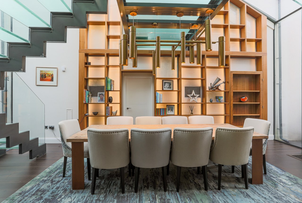
Dining hall
The new glass link dining hall was to feel light, airy and elegant; the owners' interests to be represented on built in shelving, with pieces carefully curated to inspire talking points.
It also needed to seat a large group for dining.
This was a space that was about connection, both from the old part of the house to the new part of the house... and within the space itself.
In response, the dining hall – that joins the old and the new building – features elegant chairs upholstered in a combination of colours, in linen and velvet to add a luxurious elegance, while the dining table was selected for its organic timeless appearance and can easily seat ten guests or more.
Lighting – following the lighting theme from the open plan family areas – is finished in hand burnished brass and makes for a stunning feature.
The custom-made rug pulled together the palette of blues, greens and burnished metals.
A large custom shelving unit adorns one side of the dining room and can house the owners' treasures and talking points.
Existing home/ground level
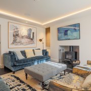
By contrast, the ground level old part of the house was much more about private passions; art, music, reading.
A respite from busy lives and a place for recharging... and a little bit quirky.
The quiet lounge is a place for reading, listening to music, reflection and stillness – a glass of brandy in front of the fire on a wintery evening.
The colour palette of blues and burnished warmth was brought through in a softer way here.
The custom-made velvet sofas exude luxury and softness.
A wallcovering was selected for its traditional feeling, yet still holds the quirkiness that the homeowners had asked for.
The pattern of the wallpaper copied is also onto the custom linen chairs.
A floor rug reflecting watery patterns was simple enough to not compete with the patterns elsewhere and this was custom-made.
A drinks cabinet was customised and the burnished brass theme from other areas followed through on the handles.
The final cabinet was built in a burr walnut.

Music room
The music room was a space to indulge passions and to recharge and escape from busy lives.
In the original brief, one owner had an old leather chair they were keen to retain in the scheme.
We worked this palette into the customised floor rug to connect it with the blues.
In this way, the colour scheme connected to the other areas, yet each space retained its individuality and reflected those who lived within it.
The cabinetry is in the same traditional style as the formal lounge which suits the old part of the house.
A large scaled wall panel introduced some quirky warmth, and the hand-blown bronze colour glass pendants and gold drapery marry with that.
The same drapery fabric was used through the ground floor in slightly different shades – it is a double weave fabric with a raw linen and wool composition on one side, and a steel fibre running though the alternate side, giving it a burnished metal finished look.
A feature chair adds an element of quirky surprise, the fabric having been printed in the UK, shipped to New Zealand and upholstered onto a customised chair, a contemporary wingback, bringing together old and new.

Master bedroom
The master bedroom was to feel luxurious and relaxed.
The apex window with the view of the garden was a main feature in the room and the ensuite was to flow on from this.
This was to be an adult's retreat that supported the well-being of those who lived in it.
The master bedroom is a very large space so larger pieces of furniture were selected to be in keeping with the generous proportions.
A soft blue palette combines a variety of hues, shades, textures and patterns to create a luxurious layered look.
The fabrics included both velvets and linens.
The fireplace breast is tiled with a full-bodied porcelain tile imprinted with pattern.
This tiling is also taken through to the ensuite.
A bio-ethanol fire brings in an ambiance and warmth, and a space to relax around.
A very large James Salmond design 3.5m drawer cabinet was custom built to fit into a recess in the bedroom.
This, along with most of the other furniture in the house, was designed and manufactured in New Zealand, and then shipped to the Isle of Man.
The bedside cabinets were also James Salmond designed and finished in a dark wenge colour.
Above these, hang two bedside pendants designed by Tom Dixon.
Behind the bed, a wall panel creates a focal point while the soft watery element of the design is reflected in the customised floor rug.
Master ensuite
The wall tiles selected were full bodied porcelain with 6 different patterns imprinted into them and randomly matched.
Created by 41 Zero 42, they tell a story of emotions being imprinted and have an organic, handcrafted softness about them.
These are carried through as a design element from the master bedroom fireplace breast.
The floor tiles have an organic texture which gives them interest and a sense of luxury.
These are also easy to keep clean and keep the space light and airy visually.
Guest bathroom
The guest bathroom is a small, functional space.
The feature tiles selected follow through from the same design as the master bedroom ensuite, in the same hand-crafted pattern but a lighter grey was chosen to keep the space as open as possible.
Guest bedroom
It is not often as designers we have a completely blank canvas to work with and in the guest bedroom, the homeowners had a number of pieces of furniture and art they wanted to use there.
We then layered a couple of pieces of new furniture over this and introduced some fabrics to pull the scheme together.
A new ottoman was custom built to cover a laundry chute that the owners could access through the lift up lid – this also gave them extra seating and storage.
The main bedroom floor tile follows on from the ensuite floor tile with the tile's organic luxurious softness keeping the connection between the spaces.
A very simple off white tile was chosen for the main wall tile.

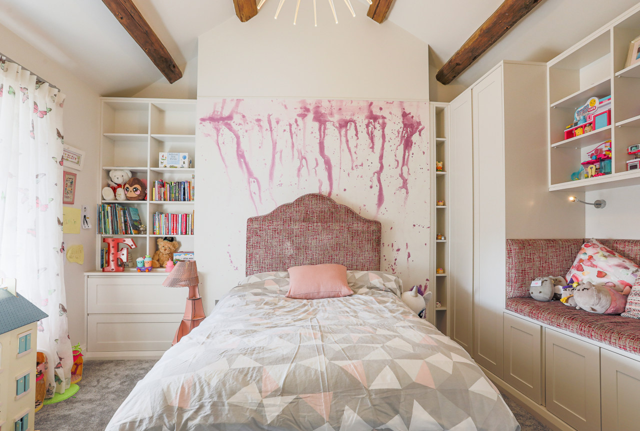
Daughter's bedroom
The original upstairs space housed the children's bedrooms that looked over the village green.
These rooms were to now strongly reflect the children's current passions by way of pictures and little collections and at the same time be cheerful to reflect their sunny personalities.
Both children were keen den makers, so reading chairs and relaxing nooks in which to squirrel themselves away were important.
The daughter's bedroom reflects the personality of the occupant with a soft pink palette and was also designed to grow with her and accommodate an older perspective as time went on.
The reading nook and desk create different places within the room.
A large scaled wall panel frames the wall behind the bed, while custom built cabinetry on either side and above the reading nook creates ample storage for toys and books.
The fabric selected were a mix of soft velvets, fresh linens and fun printed cottons.
Son's bedroom
The occupant of this room has a love of penguins and this was incorporated into the cushion fabrics, but also in the shape of the chair in which we combined two fabrics to echo the colour contrasts on a penguin.
Blue has been a connecting colour throughout all the spaces in some way.
We layered the boy's bedroom with texture and different hues.
The padded doors behind the bed, act as both a soft headboard and a storage area – this is still to be realised.
Built in cabinetry was designed to house books and toys on display.
Children's bathroom
The children's bathroom was designed with a bit of fun in mind.
The plain hex encaustic tile was used on the floor in three specified colours.
The darker colour was taken up as a feature wall and the heated towel ladder was custom coloured to work with the colour scheme. Again, using blue tones as a connector in a completely different way, this bathroom is light-hearted and fun.
Children's media room
Downstairs, at under ground level, the media room was named the 'kid cave' – a place to gossip, jump around, play noisy board games and watch movies.
It was to house sleepovers and be able to sleep friends easily.
The media room was to be a fun room that could engage the children and their friends for movies, games and sleepovers.
Some of the furniture for this space was existing and re-used.
The stools can be unfolded to provided extra sleeping as single beds, then used as seating, footstools or tables.
The wall colour is dark and moody, to create a more intimate area, and the ceiling studded with D lights to simulate a starry night sky.

Steam room
Also on the subterranean level there was to be a gym, a functional but light filled space leading to the steam room which called for exotic bliss – a wine cellar was to be designed into the mix.
The steam room was inspired by an existing set of Tree of Life Iznik tiles that the homeowners had acquired on holiday and these were incorporated into the design.
Because they are 18mm thick, they were installed into the floor so that the floor tile could have a flush look.
The wall tiles selected to accompany them are reminiscent of antique Turkish carpets and have an element of blue, so connecting the colour scheme from the rest of the house and the flavour of the Iznik tiles.
Wall sconces are hand blown glass in a warm amber colour, again, an element used elsewhere in the house.
Ambient lighting was very important in this area and was installed under the stone seating and the benchtop to give a soft warm glow when relaxing in this area.
There is a domed ceiling in the steam area, which was tiled in a mosaic that could easily curve, the curve stops the water from dripping directly down.
Gymnasium
The gym was originally also going to double as a craft space and was designed to house cabinetry where both activities could be done.
However, it was decided to create a dedicated gym area, which led through to the steam room if so desired after a workout.
This was a light filled space with daylight streaming through a large roof window, which is at ground level on the exterior and can be walked on.
The flooring is high-performance rubber, which has acoustic properties too for double benefit.
The end result is simple and functional.
Ouside firepit
The firepit design was inspired by the idea of family and friends gathering around the warmth of the flames late into the night.
We found a local New Zealand metal worker, who we worked with in developing this concept and who manufactured it using Corten.
The rust coloured metal connects through to other surfaces on the interior.
This 1.5m diameter firepit was then shipped to the Isle of Man, making it a completely bespoke item for the homeowners.
Credit list
Designer
Awards
Designed by: Amanda Neill, Designworx
Story by: Trendsideas
Home kitchen bathroom commercial design