Light-filled kitchen remodel with glass-faced upper cabinets
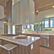
Replacing its original dark, galley feel, this renovated kitchen now has a light spacious air, accentuated by suspended, see-through cabinetry

It's a smart kitchen remodel that hangs onto the essence of a 50s home even when the plan, look, functionality and materials are transformed for 21st century living.
Part of a whole-house transformation by designer Kevin Cozen, this light-filled kitchen replaces a narrow, dark workspace that was walled off from the living area.
Cozen says he wanted to add light and a sense of space to the reinvented interior. Part of his approach was taking out the wall and raising door frames to meet the newly stripped back original wood ceiling.
"In terms of the layout, we used the extra space gained from the removed wall to push the under-counter cabinetry half a metre out widening the kitchen footprint. A cantilevered countertop accommodates stool seating on the living room side.
"We were mindful to keep the kitchen as simple and monolithic as possible to retain the home's welcoming Mid-century Modern sensibility," Cozen says. "To this end, the cabinetry forms are strong and unadorned and the reworked kitchen's material palette is intentionally restricted."
Just as the old kitchen footprint was modest in line with 50s priorities, so too had the pine cabinetry been a pragmatic choice. This was another area where Cozen was able to add more light and a sense of space. First, though he removed the upper cabinets and extended the window in front of the sink from one metre wide to three.
"With the inner wall gone and window greatly expanded, we still needed more cabinet space. My solution was to design floating upper cabinetry, suspended on steel bracketing. The front and back of the cabinets are glass letting light shine right through. They also have concealed lighting top and bottom so are features of the wider open-plan space at night as well."
The under-counter cabinetry is walnut with a contrasting matt white lacquer.

"In another move to visually optimise space, we stepped some lower cabinets out, thus avoiding the long, narrow lines synonymous with a galley-style layout."
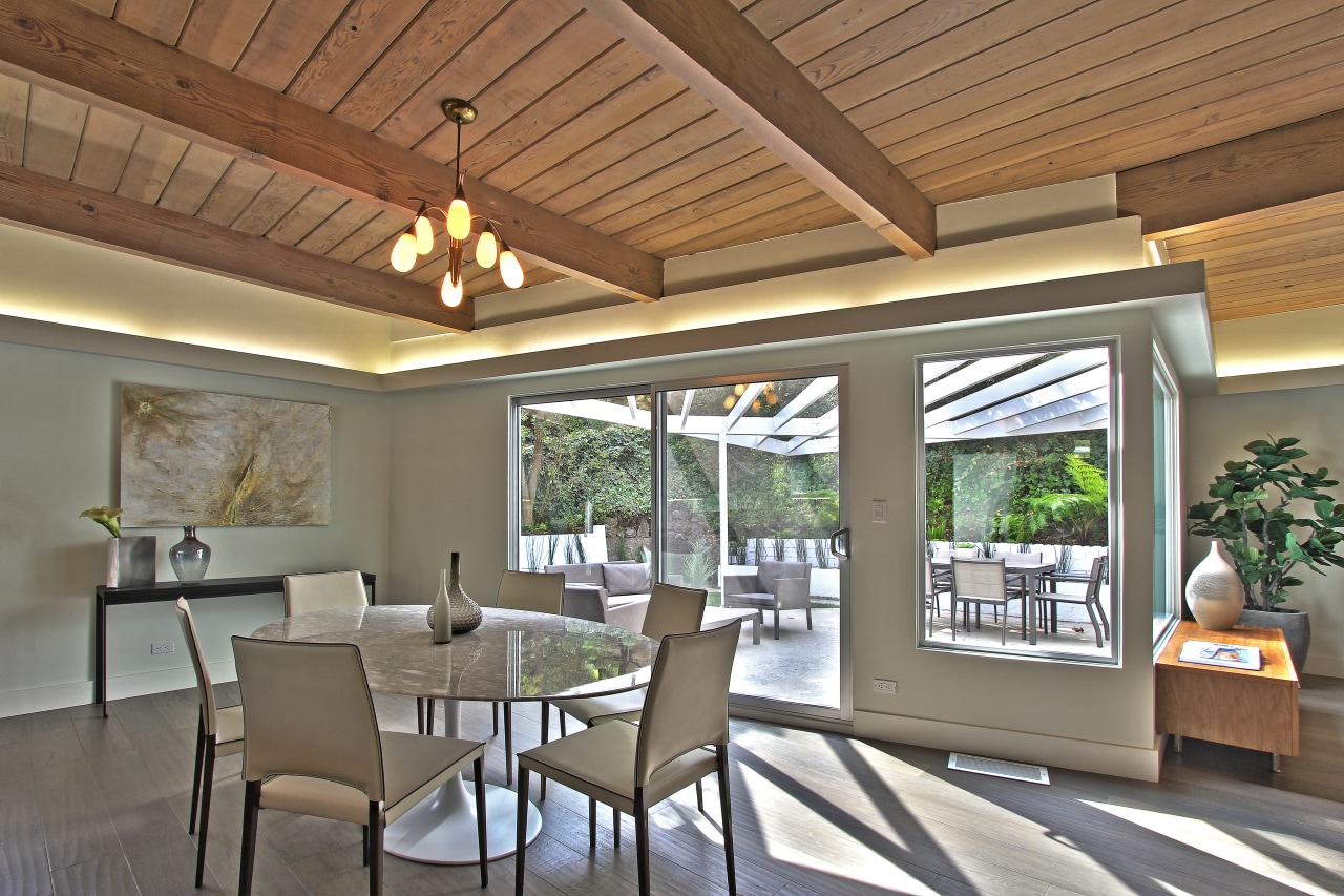
To complete the scene, Cozen found a '50s lamp in bits on site and restored it this is now a centrepiece over the dining table.
Credit list
Designer/builder
Built-in cabinetry
Countertop and splashback
Hood
Refrigeration
Lighting
Interior designer
Closet Interiors
Oven
Dishwasher
Flooring
Awards
Story by: Charles Moxham
Photography by: Chadwick Turner
Home kitchen bathroom commercial design
Home Trends Vol. 32/3
Bathrooms take centre stage in this latest edition of myTrends HOME – from an expansive master suite with spectacular de...
Read More


