Less rewarded with more
This renovation is an exploration of how to pare back and dwell in smaller spaces while providing a sense of personal connection to the wider urban context


Designed by Dean Williams, Architect George
From the renovating architects:
This Newtown, Sydney, home explores how a small footprint and floor area can create a high level of amenity, and how we can live more sustainably.
The alterations are to an existing circa 1910 single storey terrace.
Setting
The site is in a dense area surrounded by varied urban fabric, train lines, laneways, and ramshackle community gardens and park.
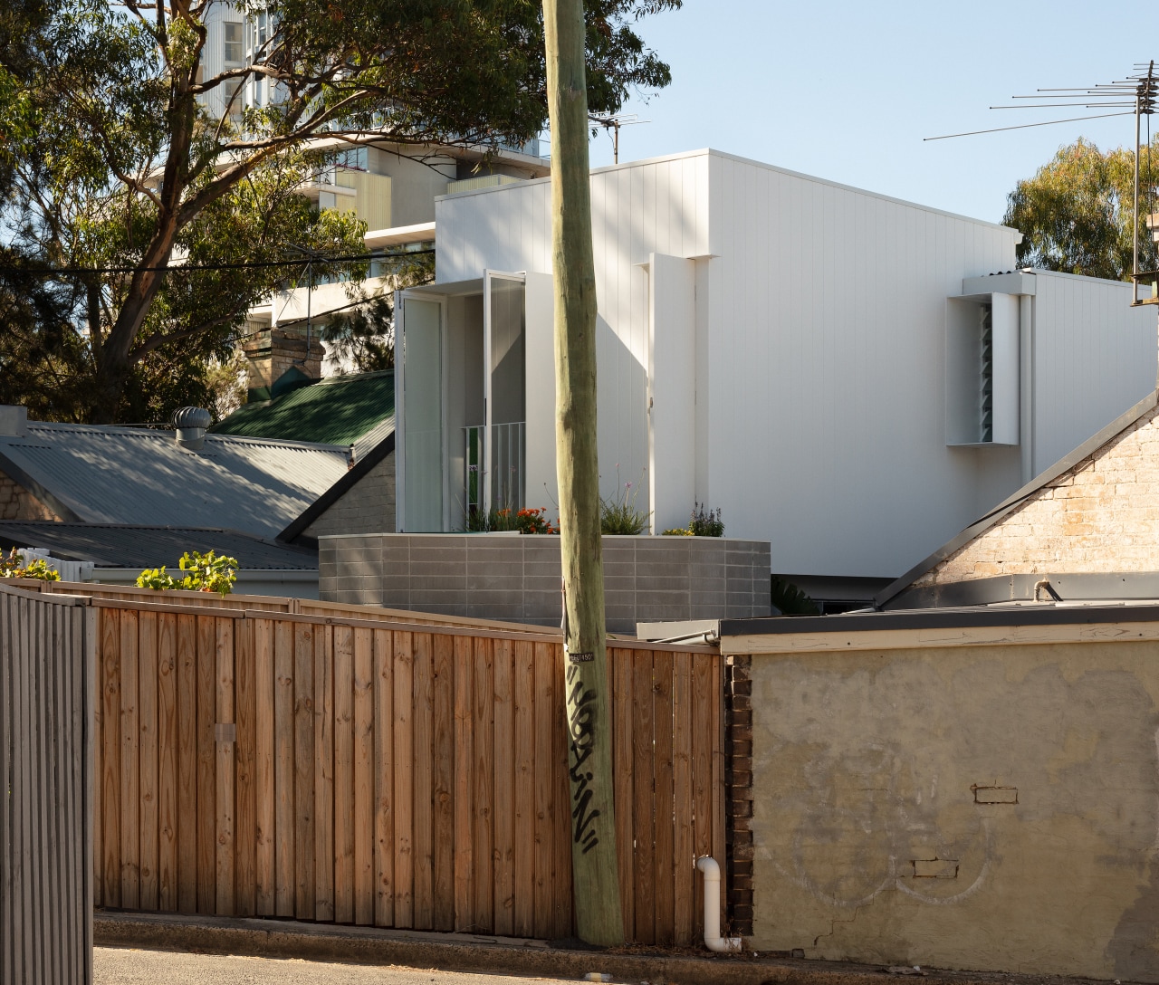
Located in the middle of busy Newtown in Sydney’s inner west, the site is tiny and awkward but benefits from good sunlight and proximity to urban amenity.
The house is in the middle of a terrace row of six.
The terrace row when viewed from the rear is a conglomeration of various materials, textures and colours.
The house is adjacent to a busy train line, underneath a (typically busy) flight path and in the middle of a varied and active urban context.
There is a lot going on in a very dense and grungy inner-city environment.
The total site area is a tiny 68m² and 3.6m wide – one of the smallest sites you will come across as an architect.
To the rear of the site is a much-loved community park and heritage listed church with mature trees and community veggie gardens.
The terrace row sits within a triangular block which results in a number of angled boundaries on the site.
The tiny 68m² site has thirteen different (and angled) boundaries as opposed to the typical four boundaries you would usually see with urban street patterns.
The design for the project needed to rationalise these angles and the tiny site and its active urban context.
Existing home
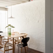
The existing house was a small single storey terrace with an attic room accessed by a pull-down ladder – the footprint was mostly original with rendered and painted brickwork.
What the owners wanted
The homeowners wanted an architecturally designed home that represented their own personality on a tight budget.
However, they willingly accepted a smaller house in order to live in this space that was ‘uniquely home’ – a home with generous visual connections and views, but modest in scale.
Design response
Our design response for the new addition was deliberately singular in colour and simple in form so as to not further overwhelm the varied surroundings – the lightweight addition sits quietly with restraint.
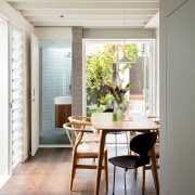
Responding to a brief for better connections from living areas to the outdoors on both levels, the design added a new first floor volume with subtlety.
Openings to the house were designed as finely framed apertures to the rear park.
Deep reveals/thresholds to the courtyard provide a fine edge to suit the scale of the house and subtly extrude the length.
These new rear thresholds explore privacy and publicness.

A rear Juliette style balcony and the green roof accessed from the first floor bedroom allow the building to open up to the rear park and urban community or close down when privacy is required.
The new first floor addition follows the set-back pattern of the ground floor.
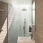
The rooms are tightly planned to provide a 2 bed, 2 bath house on the compact site.
All rooms have access to generous north facing windows and the green roof is located above the rear bathroom, providing a much loved green outlook from bed.
Sustainability and affordability
Financial decisions were embedded in the sustainable approach – to keep everything that can be kept and keep it small.
The existing painted brick walls were retained to support the first-floor lightweight addition.
This meant no additional structure was required which limited in-ground works to almost nothing and simplified construction to keep costs low.
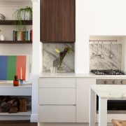
The site afforded no room to spare and we focused on utilising every millimetre available.
The 2 bed, 2 bath home has a floor area of less than 60m² and a footprint of only 35m².

A question of scale
Many design decisions were made on the basis of scale.
In these rooms, lever door handles were considered too opulent due to the 40 millimetre projection into the doorway.
Flush pulls were used instead and the doorways are only 700mm wide – like with a finely constructed boat.
With the kitchen occupying the space under the stair, the only circulation area is the small 1.5m² landing is on the first floor.
The new timber structure is exposed and detailed in a way to provide shelves for books and household belongings.
Steel framed doors were finely detailed to provide larger view openings to the rear.
The steel reveals are honest, with fine edges and again with alcoves and nooks destined to be filled with the owners' belongings over time.
Materials are robust, honest, and simple.
This project is an exploration of how to pare back, dwell in smaller spaces, in dense environments and provide a sense of personal connection for our homeowners
Home kitchen bathroom commercial design
Amongst the trees
Among the trees
A guide to choosing the perfect flooring for your home
Renovations
Renovating your home is an opportunity to refresh, expand and renew. Here's all the inspiration, ideas and information y...
Read More