Innovative colour use is the winner
Exceptional use of colour was the highlight of projects in the 2021 Dulux Colour Awards – Naumi Hotel and 22 William take out the top awards
From the 2021 Dulux Colour Awards:
Selected from an outstanding 437 entries from New Zealand and Australia, the use of colour in the award-winning projects across the six categories is testament to the commitment of the architects and designers to creativity and originality in design.
Here are the two Grand Prix winners.
Central Hotel by Naumi Hotels, Queenstown – by Undercurrent
New Zealand Grand Prix Winner
Flying into Queenstown is a surreal experience – the proportions, shadows, textures, and colours combine to create a sense of utter wonder.
All this unfolds in a single feeling, and it is this moment we set out to capture in our interior.
This moment brings to mind the snow globe—an iconic artefact of childhood that, when shaken, opens the door to a new world.
We strived for a bold aesthetic, verging on biophilic surrealism, in a bid to recreate that moment of child-like wonder, sensed with a glance to the Southern Alps or the shake of a snow globe.
The owner had one request: that we avoid whites and neutrals.
We responded by aligning the levels of the three-storey building with their outlooks.
The ground floor nods to the red tones of the flora outside; the first floor alludes to the greens of the treetops; and the second storey reflects the blue tones of the sky.
We experimented with gloss levels to contrast surfaces and build a sense of depth, matching Dulux colours across the furniture range to create harmony between interior finishes.
From the outset, we were careful in our palette selection.
The challenge was that every singular colour needed to work with every other colour from every floor’s scheme, to come together in the hotel’s bar.
We used tone-on-tone colours in corridors in-keeping with each floor’s scheme, while inside guest rooms we paired deep tones with bold pastels.
Undercurrent tapped into the work of artist Deborah Moss, whose work draws upon the power and dynamisms of nature.
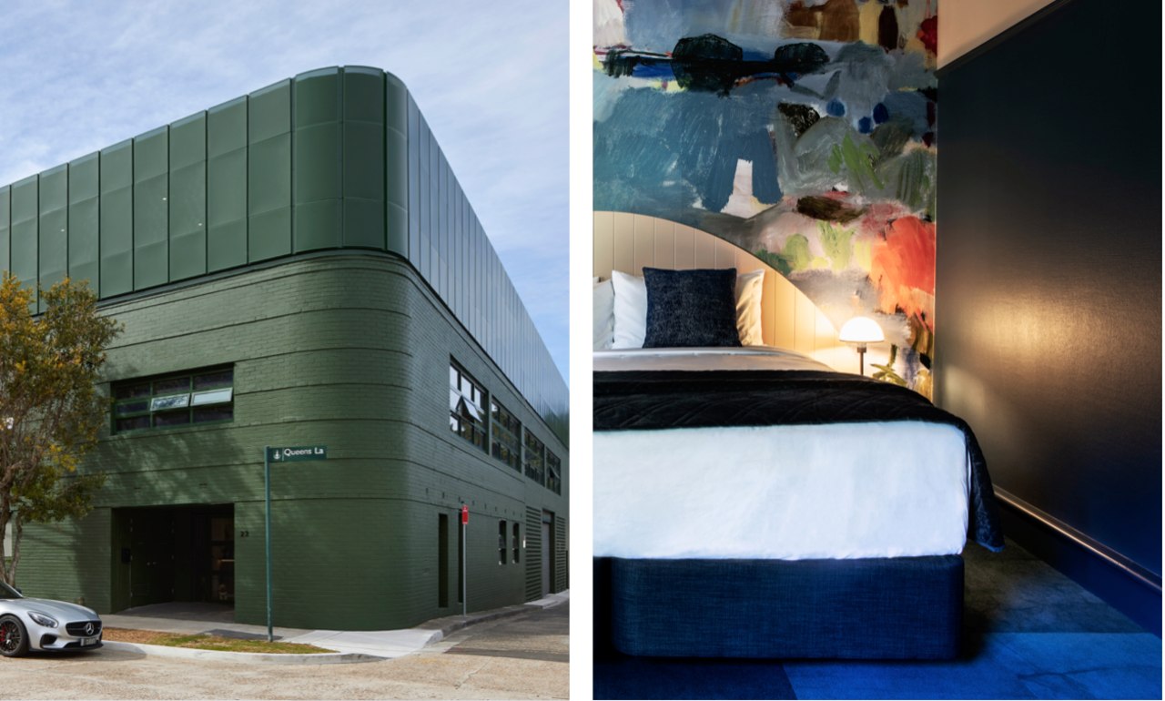
We printed a series of her works to an exaggerated scale, and colour-matched with Dulux colours, so that when guests move from the corridor to their room, they’re greeted with a stark, whimsical contrast that gives that sense of child-like wonder.
22 William – by SJB
Australian Grand Prix Winner
Commercial & Multi Residential Exterior – Winner
22 William adapts an existing two-story brick building into a contemporary creative office space and childcare centre with minimal intervention and simple materiality.
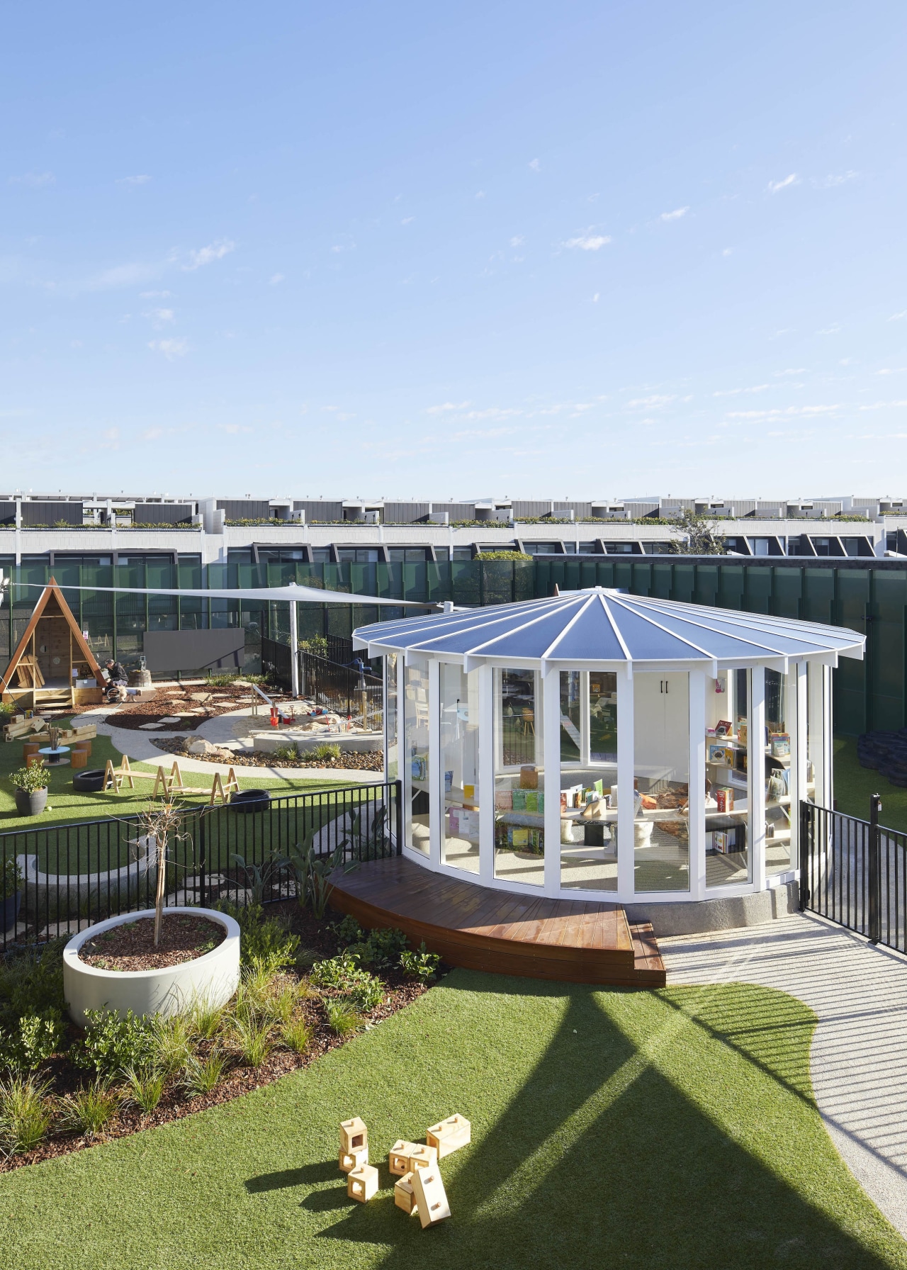
This light-touch conversion featuring a double-height space, curved concrete stairwell and polished concrete floors spans two levels with an additional mezzanine and childcare centre in a new rooftop addition.
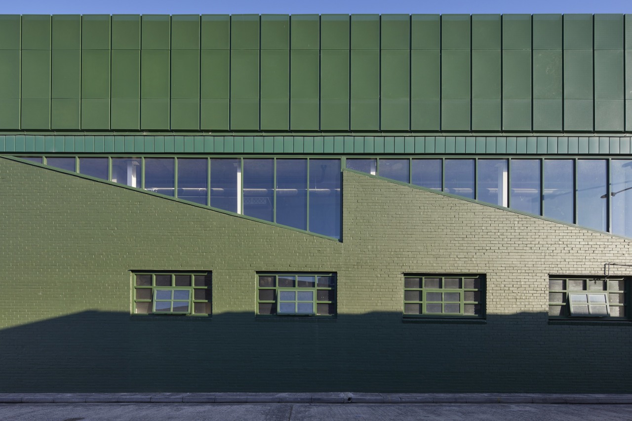
The façade, made up of existing brick and perforated screening, is finished in a bold jungle green gesturing a sense of play to the changing city fringe micro-suburb of Beaconseld.
The colour selection was inspired by the deep hued all-over Gully Green cabinetry of the project architect’s kitchen which caught the eye of the owner at Milligan Group who was intrigued by its visual impact.
Venturing to scale up this key move from the intimate domestic space of a kitchen to the very public exterior of a mixed-use commercial building, the team opted to wrap the entire building in Spinach Green.
The Spinach Green had the perfect balance of richness to contextually complement the leafy, vibrant street tree canopies along the main William Street frontage, not to mention the city’s street signage.
The full depth and scale of the green colour-blocking can be appreciated from standing at the corner of William Street and Queens Lane (Sydney), where the site is held by the soft corner curve of the existing building footprint.
New metalwork, including window framing as well as the perforated childcare screening, is accented and executed using a slightly darker toned green to distinguish the new brickwork from the old.
Maximising its north-facing aspect, the upper-level childcare incorporates open rooftop landscaping to provide an engaging and explorative outdoor play space fashioned from tactile natural materials.
Fittingly, childcare operator The Green Elephant has taken up the childcare tenancy, a perfect home for its joyful early learning environments.
Credit list
Interior designer – Central Hotel by Naumi
Interior designer – 22 William
Story by: Trendsideas
Photography by: 22 William by Mathew Densely; Naumi by Tim Pierce
Home kitchen bathroom commercial design


