Industrial look bathroom combines rugged surfaces with minimalist aesthetic
Refit in semi-industrial space features concrete, wood, and dramatic black and white theme

A simple, strong aesthetic has its own dramatic appeal in terms of looks and also functionality. It will also never date.
This suite by designer Jodi Gillespie forms part of an apartment in a 2003 multi-unit addition to an 1873 flour factory conversion in the historic mill district of Minneapolis. The relatively modern units capture the feel of the old factory with exposed concrete floors, pillars and ceiling.
Gutting the existing, builder-designed bathroom, Gillespie introduced in its place a suite in a more honest, complementary aesthetic that suited the industrial spaces.

"Privacy wasn't an issue with the client, so we created an open-plan design with a clean-lined freestanding tub on show right through the suite," says the designer.
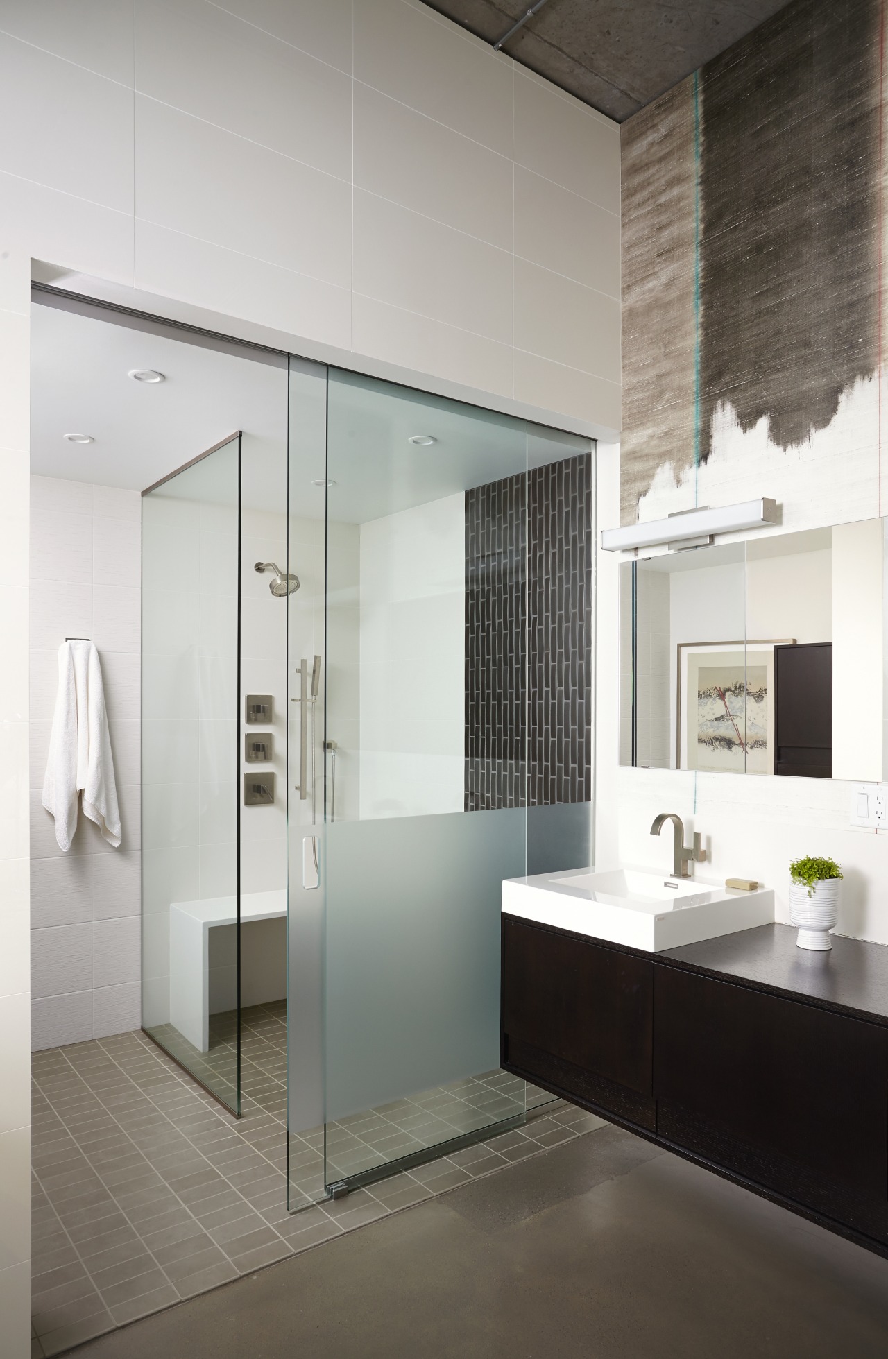
"Adding plenty of storage and hiding the services without closing off spaces was one tricky aspect. To resolve this, I added a ceiling bridge. This helped to demarcate areas of use and provided for the unobtrusive placement of cabinets and concealment of services. The minimalist sink, vanity and shower stall all respond to the pared-back setting even the shower bench is stripped back to its simplest form."
The semi-industrial look is highlighted by Kandy After All vinyl wallpaper behind the vanity. Its distressed look has hints of indigo, deep green, rusty metal and black all complementing the wider decor.
The floor is a soft grey-green close to the original concrete in the rest of the unit.
Story by: Charles Moxham
Photography by: Alyssa Lee
Home kitchen bathroom commercial design
Home Trends Vol. 32/3
Bathrooms take centre stage in this latest edition of myTrends HOME – from an expansive master suite with spectacular de...
Read More


