Connection and cohesion
This master suite picks up design detail from elsewhere in the home – bringing cohesion to an otherwise disconnected expansive interior


Designed by Debra Brockman Interior Architecture + Design
From the designer:
The wider brief
The brief for this project was very simple – to update the interiors throughout.
The exterior of the house was along the lines of a modern English country house.
However the interiors didn’t reflect this style, but instead had a mix of looks and lacked any design detail, which made the house feel outdated and disjointed.

Addressing the master suite
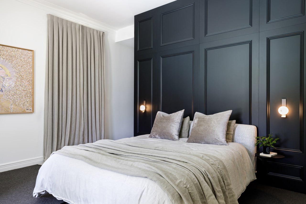
The master suite was in a good location, but was very underwhelming.
So we demolished the whole area internally, and removed the wall between the bedroom and the dressing room.
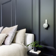
This allowed us to achieve a number of things – create the new dividing wall cabinetry block which doubles as the rear of the dressing room; create two entrances to a larger dressing room; move and centre the bed to not only maximise the view out to the pool and garden, but also so that you feel the impact of the detailed panelled wall upon entering the room (particularly in reflection of the full height entrance panelling).
Consideration was given to extend the ensuite into the powder room adjacent and make a larger room with a bath, however the owners ultimately decided against this.
Design detail inspiration
The existing entrance had a small section of wall panelling, so we chose that as one of the elements to work with.
There we extended this to line all the walls full height, with the panelling finished in white.
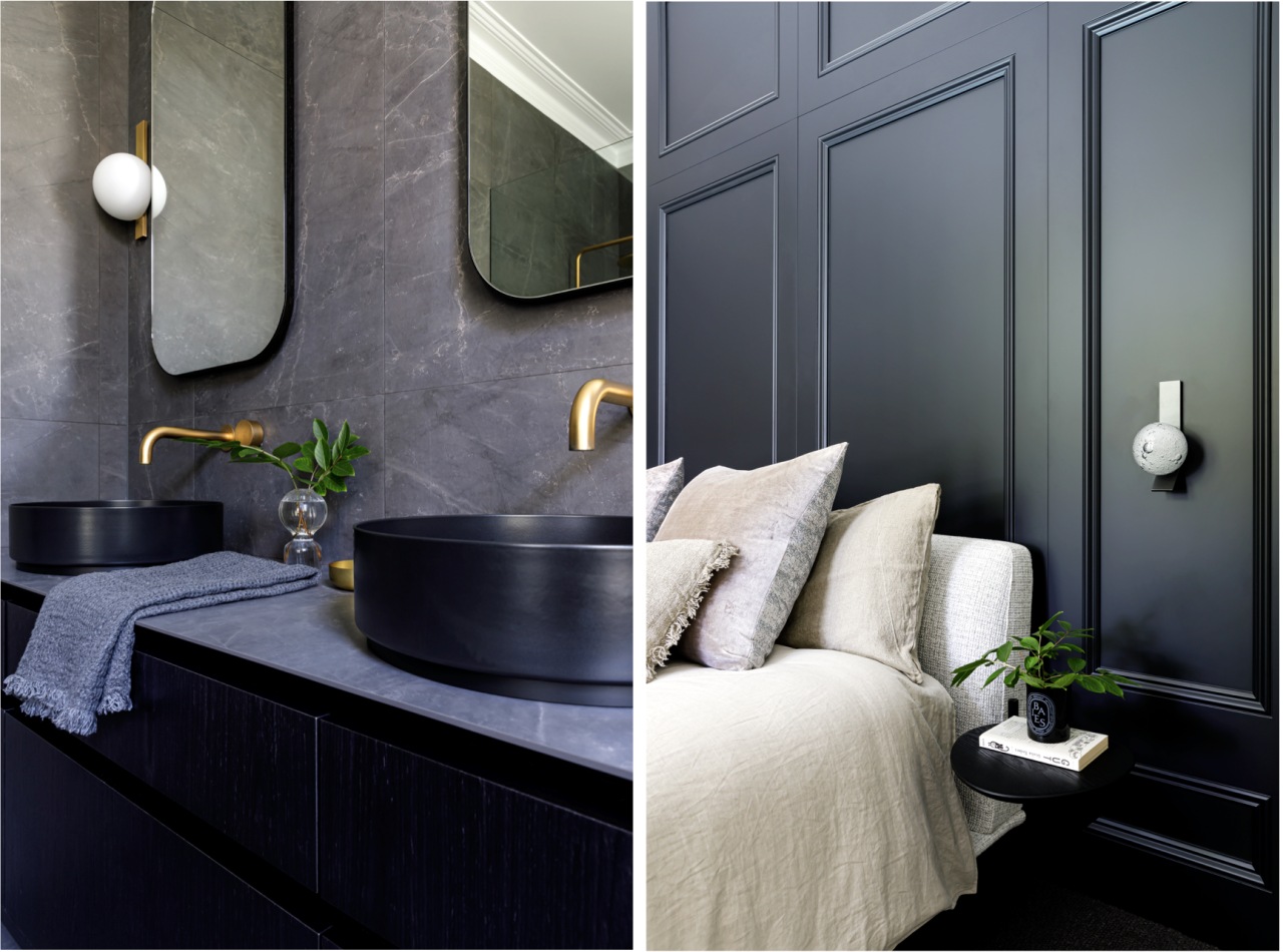
In the master bedroom we mimicked the design, but finished it in a black 2pac – and continued that into the rest of the master suite.
In the new dressing room, those details were again used, but this time on the drawer fronts.
This consistency between spaces and details was vital to the success of this project, especially given the generous size of the house.

Moody and masculine
The moody, and somewhat masculine colour scheme was taken through to the ensuite, with its large porcelain panels, black basins and dark timber veneer vanity.
This veneer worked perfectly in the master suite, and it was also used in several other areas of the house.
Midus touch adds to interior harmony
The matt gold tapware gives a luxurious touch, and as it was successfully used in the other wet areas of the home, it was another way to add to the consistency and therefore harmony between the interior spaces.
Credit list
Benchtop
Accessories
Wallcoverings
Photoshoot stylist
Vanity cabinetry
Basin
Toilet
Flooring
Lighting
Awards
Designed by: Debra Brockman Interior Architecture + Design
Story by: Trendsideas
Photography by: Denise Rix
Home kitchen bathroom commercial design
