Bold and sculptural kitchen with no fussy detailing
How to create a kitchen that has its own dramatic presence and yet doesn’t detract from the views beyond – openness and simplicity are key

In contemporary interior design, the kitchen is almost always central to the living spaces – but then so are the views. Such was the scenario for this kitchen, by designer Davinia Sutton.
The homeowners wanted a kitchen that was uncluttered and that had an urban edge – a chic design with hardy, bold materials. As part of the brief, they also asked for a scullery where any mess was out of sight from the living space, as well as ample wine storage.
“Forming part of an architectural space for entertaining, this kitchen was designed to be on display,” says Sutton. “However, the living area also has views to a striking city/seascape. So the aim was to keep the kitchen clean-lined and open to avoid it detracting from the scenery.
“Paradoxically, this was achieved with a simple, strong palette comprising expansive white benchtops contrasting dark-stained wood veneer cabinetry and a blonde wood floor.”

The body of the kitchen is a T-shape galley space, seamlessly incorporating the appliances into the main work zone. Integrating most appliances, apart from the minimalist ovens and hob, ensures the design is sharp and uncluttered.
In addition, the kitchen’s clean lines, shadow details and simplified design, plus the clever mix of horizontal and vertical lines creates a crisp, urban aesthetic.
To the rear of the kitchen, the large pantry is given even more space by having its work- surfaces and storage tucked into side niches. So while the scullery is on show to the living area, the work surfaces and shelving are not.

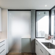
In addition, the entire area can be concealed from the main living area by closing a frosted glass cavity slider when required. The choice of translucent glass ensures a sense of connection to the kitchen even when the door is shut.
Completing the pantry zone is a dramatic wine cellar, offering a striking backdrop to draw the eye past the working area of the kitchen.
“The end result is a kitchen design that’s sleek, streamlined, and a focal point without outweighing the breathtaking outlooks.”
Credit list
Designer
Flooring
Kitchen sink
Ovens
Ventilation
Wine fridge
Awards
Cabinetry
Benchtops
Scullery splashback
Taps
Cooktop
Refrigeration
Dishwasher
Story by: Charles Moxham
Photography by: Stephen Goodenough
Home kitchen bathroom commercial design
Homes Trends Vol. 34/4
Whether space for your new bathroom is generous or modest, you'll want to create a room that not only looks good but is ...
Read More


