Bauhaus for our house
Intersecting lines and planes, a simple, robust palette and an economy of space place this home in the loose tradition of Walter Gropius' architectural legacy
Sometimes the simplest effects can require the most thought. The unadorned planes and cubes that contribute to the Bauhaus aesthetic are a good example. The subtle balance of tensions required for this simple-look architecture is itself an exercise in understated effort.
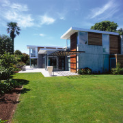
This Bauhaus-style home sits on one end of a verdant, expansive suburban property. Architectural firm Sheppard + Rout designed the home for a male owner who lives alone but receives frequent visits from his young grandchildren.
The client wanted a home with an easy interaction between living areas, including being able to keep an eye on the indoor swimming pool other than that the brief was fairly open, says architect Tim Dagg, who realised the design originally created by fellow architect Jonty Rout.
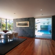
"We created a clean-lined home with Bauhaus overtones," he says. "The use of honest materials concrete, wood and glass contribute to an appropriate masculine feel. This style also affords many sight lines, including from the living spaces to the pool."
Another request of the owner was to have the master bedroom conveniently situated on the ground floor. Also on this floor are the living room, bathroom, dining, kitchen, indoor pool and master bedroom. Upstairs there are further bedrooms, an expansive office and a walk-through gallery that connects the two areas.
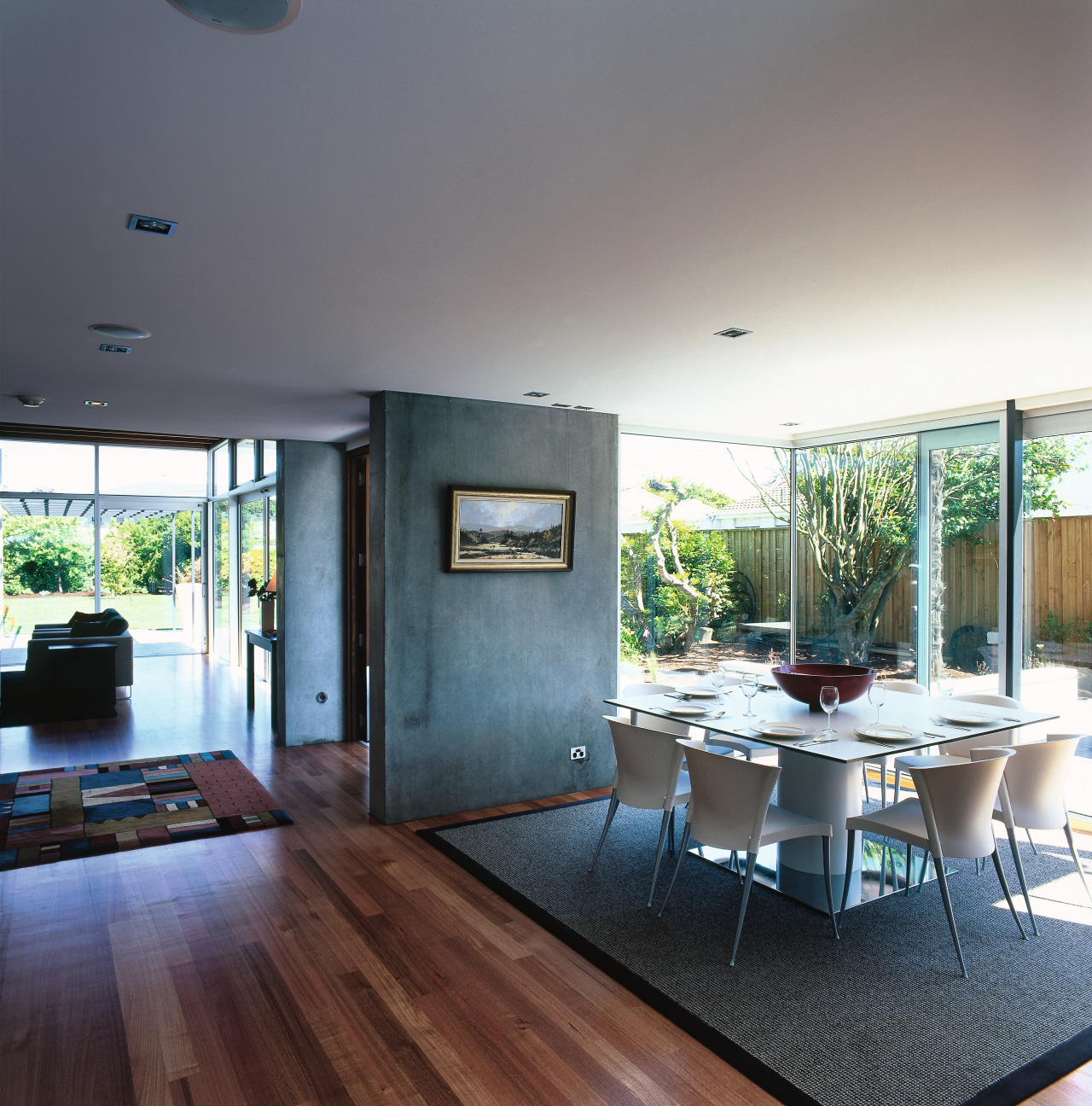
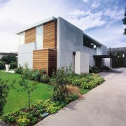
Essentially the home is comprised of massive concrete slabs, punctuated by timber planes, glass panes and window and door openings. The concrete's raw industrial feel is left exposed for the home's cladding and equally unadorned to form the interior walls.
"We used Thermomass concrete, a relatively modern product which is similar to standard concrete but with a polystyrene core," says Dagg.
"This material is extremely energy efficient. It soaks up heat from the sun throughout the day and then radiates this warmth out into the interior through the cooler evening hours, not unlike an industrial version of an adobe home."
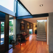
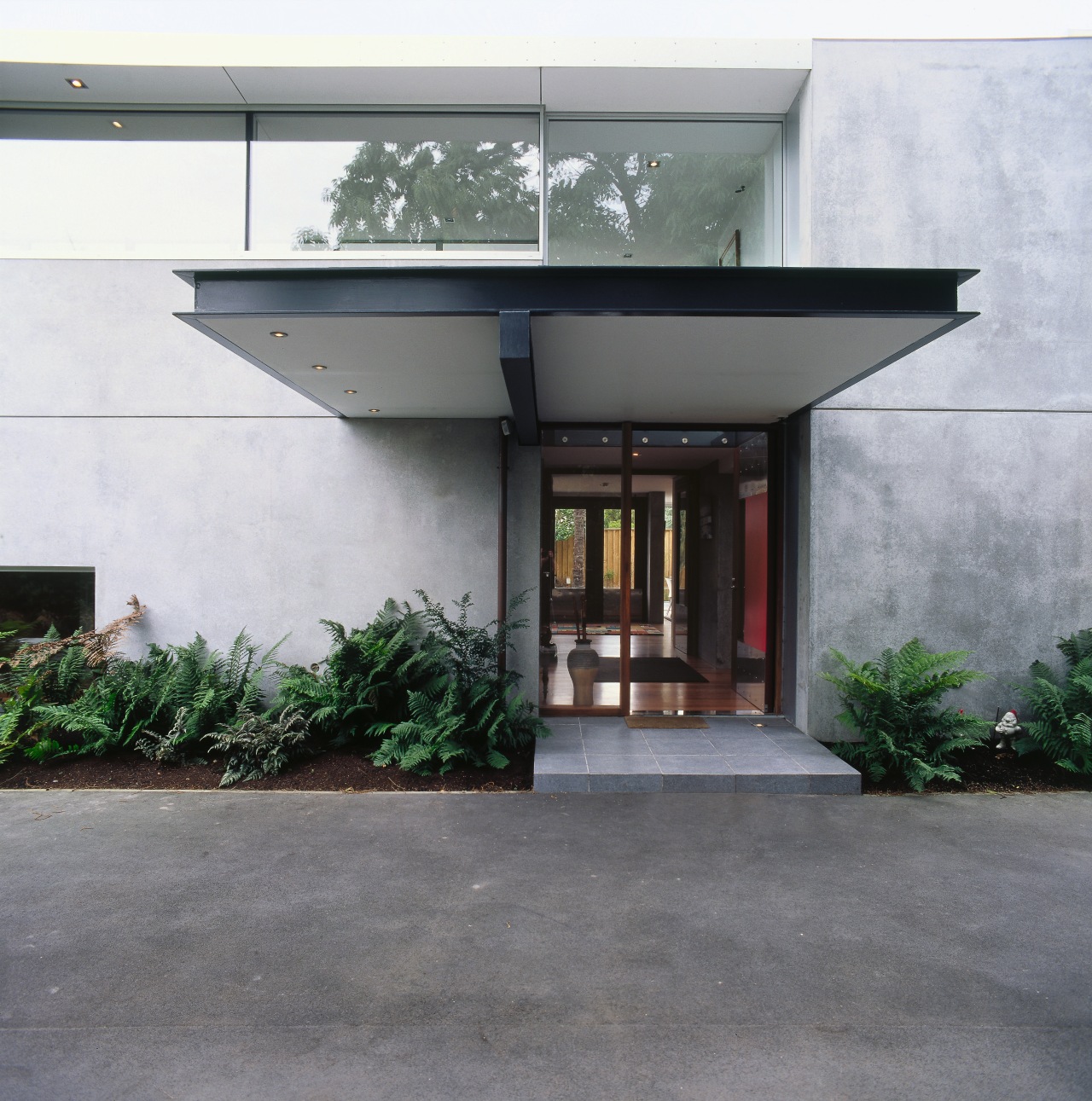
These solid concrete planes help direct more than just heat flow in the home, they also create dramatic entrances and indicate pedestrian flow throughout. The south-facing entry, for example, is an opening punched through the large concrete facade, which offers an anonymous public face. A visitor might then enter straight ahead through this door, flanked by two interior concrete walls on either side, and emerge on the sunnier, more private northern side of the residence.
"These monoliths also provide degrees of separation between the living, dining and kitchen areas," the architect says. "From one angle a room has a reasonably private feel, yet from another there might be a sight line from the living area diagonally across to the indoor pool."
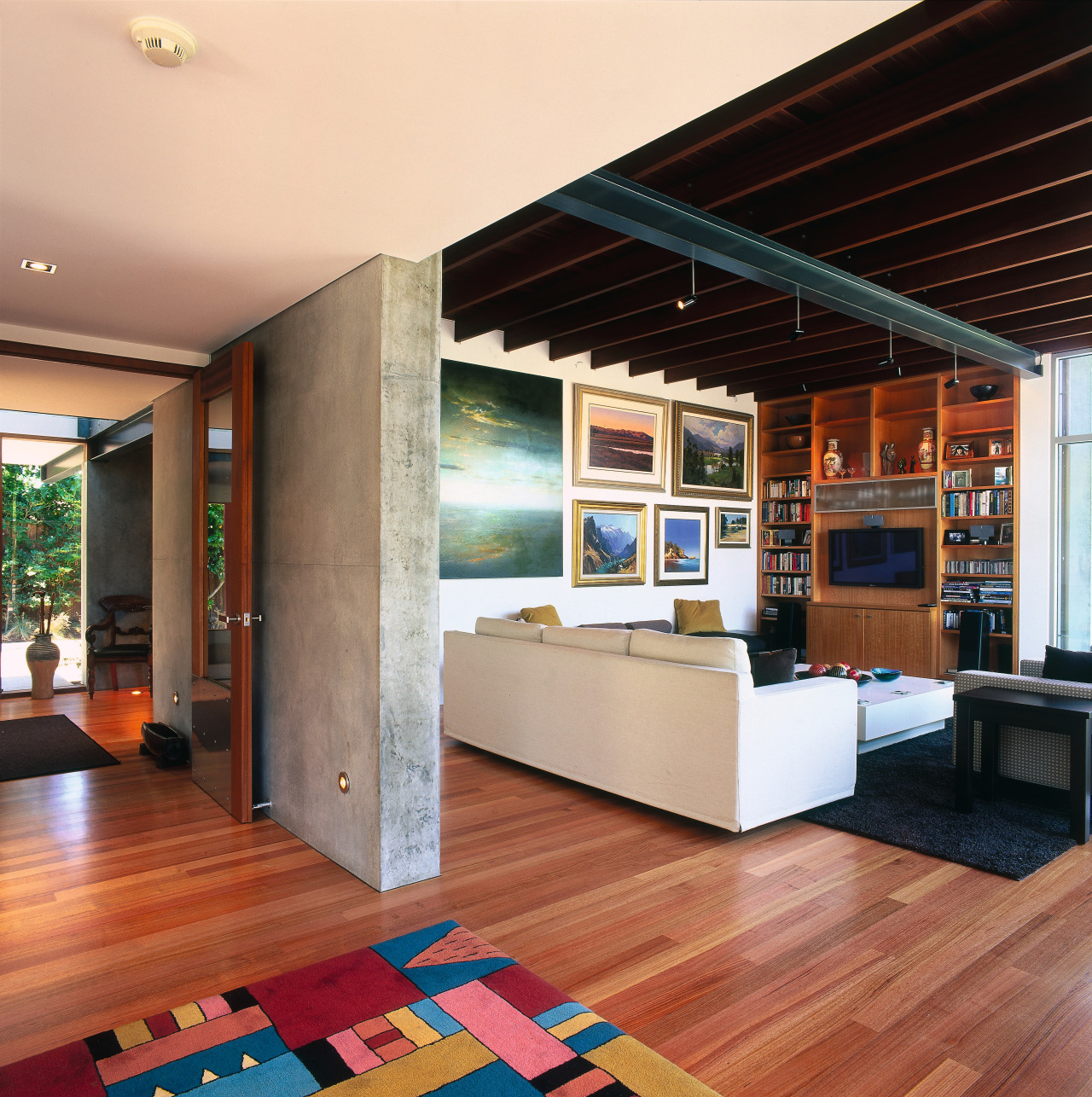
Every aspect of the home has the same feeling of honesty. In the living area, the only space without rooms above it, a raised ceiling has benefited from exposed timber structural beams. These help make a feature of this central living space and add to the masculine feel of the interior.
The kitchen decor is also an exercise in understated simplicity and strength. Its cabinetry is fronted with a concrete slab that is in keeping with the larger slabs that partly frame all the living areas.
To further emphasise and enhance the solidity of the walls there is the contrastingly thin and translucent look of glass. Perhaps the most powerful example of this juxtaposition is when visitors at the front door look up into the glass-walled gallery space on the upper level. This seems to be almost hollowed out of the grey concrete mass that surrounds it.
Not only does the home's Bauhaus design maximise the use of all available space, it also goes further visually.
"We designed the home so that sight lines run the length and breadth of the home. Seeing is believing in a psychological sense, and these vistas bring an even greater feeling of space," says Dagg. "Between the cool concrete, warm cedar floors and panels and visual corridors, the home is a very relaxing place to spend time."
Credit list
Main contractor
Blinds
Roofing
Wallcoverings
Lighting
Kitchen cabinetry
Splashback
Furniture
Story by: Trendsideas
Home kitchen bathroom commercial design


