Picking the colours for your kitchen
Not sure where to start when it comes to kitchen colour schemes? Matt Prall and Stephen Garland of Papilio have you covered
1. Warm neutrals, golds, browns and organics
Golds have been on trend for a while now but the move to combining them with browns and organic materials is going to be big for 2018.
Combining the use of neutrals, golds and organic textures makes for a warm environment with a slight seventies feel, hitting the mark in terms of both style and substance.
The boho look is not only easily adaptable with other colours but also comes hand in hand with good quality and timeless design - something which a kitchen needs to present.
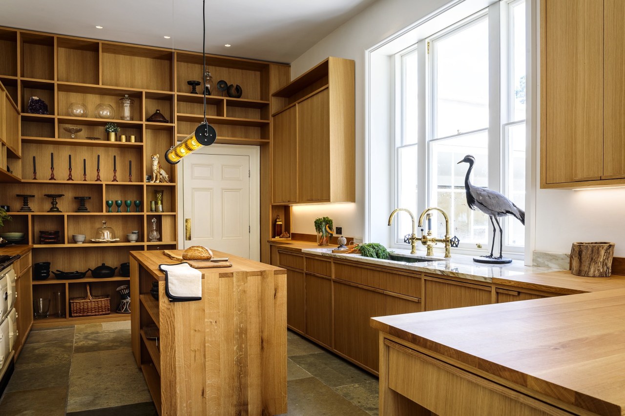
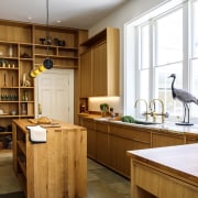
Our recent kitchen completion ‘The Georgian Manor’ kitchen combines warm accents of gold and brass in the lighting and hardware with wooden textures coming through in the shelving, island and bespoke furniture systems.
2. Vibrant colour schemes

Vibrant colour schemes will continue to be popular for 2018 with a focus on both Scandinavian application - pops of bright colour - or complete maximalism - with colour clashes similar to ‘House of Hackney’ style.
The use of colour in the kitchen is extremely important and should reflect homeowners personalities and their needs. For instance, a space for cooking should be light and bright while spaces designed for entertaining could have a darker essence to provide a suitable ambience.
Our Scandinavian kitchen provides the perfect example of how to integrate a small amount of bright colour while keeping the space clean and minimal. The boost of yellow adds vibrancy and energy to the room.
3. Colour Clash
Colour clashing is going to be huge for 2018 with the likes of fashion house Peter Pilotto recently championing the trend in their London Design Festival Townhouse Takeover.
One for the bold, the trend incorporates clashing complimentary colours such as mustard yellow and lilac, bubblegum pink and lime green, to create a bright and beautiful setting with plenty of inspiration in terms of hues and saturation.
However, homeowners don’t need to go all out and can instead incorporate colour clashing furniture while keeping the walls and floors neutral. Perfect for if you decide you like the look and want to go even bolder at a later stage.
4. Dark hues
Dark hues are also staying on top with dark blues, forest greens and dark greys becoming even more popular at the latter stages of 2017.
We’ve seen plenty of Farrow & Ball’s Hague Blue gracing the walls of interior’s most loved journalists, bloggers and influencers so we know that consumers will be looking to apply darker shades to their walls as a result.
For something a little different and for those loving the lilac trend but not brave enough to go for it, shades of Plum are also coming through. Darker shades are perfect paired with brass which is another big trend for 2018.
We love Farrow & Ball’s range of muted colours and have been using them for years in many of our projects.
Story by: Matt Prall and Stephen Garland
Home kitchen bathroom commercial design