Colour my world
As anchor tenant occupying levels one, two, five and six, AkzoNobel asked interior designer Cameron Woo to create the vibrant, stimulating environment required for the now renamed AkzoNobel House


The tone of your brand new car, the shiny marine paint surface on your speedboat, the mood of your domestic decor everything we see and do is pervaded by colour and the emotion it evokes. So when global paint, surface and chemical giant AkzoNobel consolidated its Asian businesses into one expansive flagship address, it made good design sense to infuse the premises with dramatic visual reminders of the company's stock in trade.
With a brand presence in over 80 countries and now well established in Singapore as well, AkzoNobel wanted to give the new offices a strong sense of local identity inspired by the local culture, national spices and colours.
The interior design also had to demonstrate what colours can do in the work environment when used creatively, says Jeremy Rowe, managing director, AkzoNobel Decorative Paints, South East Asia and Pacific.
"In essence, the design of the new AkzoNobel House had to reflect our identity, not only to suppliers and clients but also our own staff."
As anchor tenant occupying levels one, two, five and six, AkzoNobel asked interior designer Cameron Woo to create the vibrant, stimulating environment required for the now renamed AkzoNobel House.
A key word for the project is synergy, says Woo.

"I wanted the decor to reflect the ways AkzoNobel offers a world of colour that touches us all, with its automotive, aviation and maritime and domestic paints, including household brand Dulux.
"At the same time I wanted to show another side of AkzoNobel a company at the leading edge of chemical innovation and surface advancement, in the true spirit of scientific adventure and discovery."
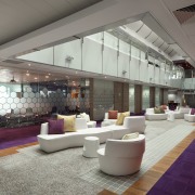
Paints and surfaces are used in unexpected ways throughout the interiors, with four key colours used in myriad applications. The emphasis is on dexterous, sometimes unusual combinations of finishes evoking the ideas of collaboration and stimulation, both major reasons the multinational company has consolidated its many businesses under one roof.
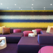
"As part of the design brief was to include an evocation of the local Singaporean context, I drew inspiration for the colour palette from nearby multi-cultural Arab Street, with its sometimes riotous, always dazzling profusion of purples, blues, yellows and fuchsias," says Woo.
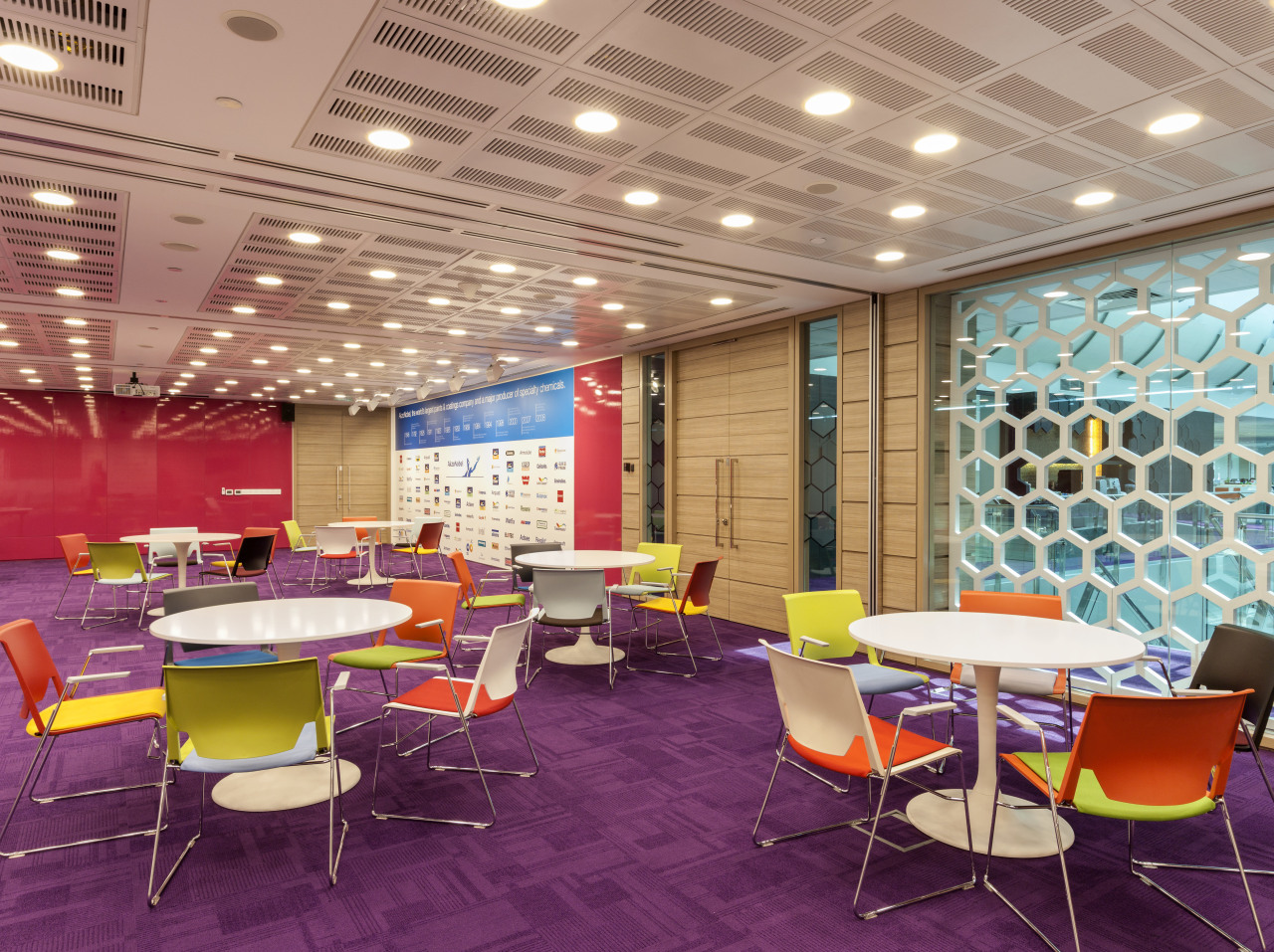
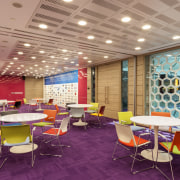
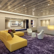
In the central atrium of levels five and six, visitors look over glass balustrades to an existing rug' of glass tiles and wood now floating on a sea of purple carpet. Fuchsia automotive paint has been used to back vibrant murals, graced with a batik motif painted by hand in household paint.
"The main reception area, on level five, features a lush purple carpet and paint can lids used to make a pattern around the AkzoNobel logo. An element of fun runs through these spaces," says Woo.
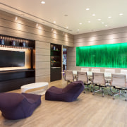
"Inspiration rooms for the various business sectors are just as visually stimulating. A backdrop for a wall-mounted television in one features a Sikkens gold metallic paint, a major AkzoNobel brand, imbued with sand and then sidelit to show the resulting textured surface. Few people have ever seen paint used in this way."
To reference the scientific, questing nature of the multinational company, Woo introduced a motif that runs right through the AkzoNobel levels.
"A molecular-style symbol, like a honeycomb, features on walls, facades, dividing screens and other surfaces even on artworks. It is also prominent on the glass wall of the Town Hall room."
This is a multipurpose space featuring an end wall in automotive paint, which slides back to reveal a whiteboard and projectors. The hall is used for events such as product launches and training seminars with capacity for 150 people seated and 300 standing. The four principal design colours all feature in this room.
"Staff have responded well to the colour and design. The fluidity of the space encourages connectivity and collaboration the best way of generating great ideas," says Rowe.
Story by: Trendsideas
Home kitchen bathroom commercial design
Homely, inviting – and lived in
Light-filled and harmonious
Nature infused